Welcome Guest
Login
 
 
Forgot password?
   

Job Seeker|Employer
UXD Jobs News & Events

Publish your UX related news & events. Mail to publish@uxdjobs.com.


5 Ways to Design for Customers and Search Engines

Business owners and web designers are pulled in many different directions when determining what features and content they should add to their website. Variables like site colors, button designs, animations, copy and messaging, user flow, search engine optimization, fonts, photos and video, page performance and more all play a role in how an overall design and user experience come together.

Of the variables mentioned—and there are certainly some that were left out—SEO is probably the most heavily weighted as most businesses want to be at the top of search results for their industry.

…by designing your site for Google, and not for your customers, you are actually hurting your rankings, not helping them.

However, designing for search engines can mean sacrificing too much of the user experience for the sake of appeasing the robots that crawl your site and determine ranking on SERPs (Search Engine Results Pages). This, in turn, will cause visitors to spend less time on your site, or to leave the site before performing an action such as submitting a lead form.

Ironically enough, search engines like Google then factor in metrics like session duration, bounce rate, and average pages per session to determine whether your website is worth ranking. In other words, by designing your site for Google, and not for your customers, you are actually hurting your rankings, not helping them.

You should, instead, design your website with your customer in mind.

 1. START WITH USER EXPERIENCE

Start by asking yourself a couple of questions regarding the user experience (UX). For example, why do I want customers to visit my site? Am I trying to sell them something directly on my website, or am I trying to entice them to contact my business or sign up for a newsletter? Do I want them to visit various webpages on my site in a certain order (i.e. the home page, about page, services page and contact page) or am I simply wanting readers to visit blog articles?

How you answer these questions will determine how you create your user flow. You want to start with the first page in the user’s journey (i.e. the Home page), then connect pages within the user experience that ultimately lead a visitor to the final goal (i.e. submitting a contact form or making a purchase).

Once you have determined how visitors flow throughout your site, you’ll want to make sure that the copy, or site text, contains subject matter that is concise and informative, with keywords your visitors are searching for prior to landing on your site.

Do not keyword stuff, as readers will find this sort of copy very annoying and search engines will penalize you for such a style of writing.

You’ll also want to make sure that your copy uses proper grammar, and is easily readable (i.e. doesn’t use super long sentences or big words).

Finally, you want titles that describe the main points of the text so that visitors can skim through the copy to find what they are looking for.

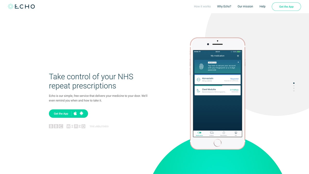
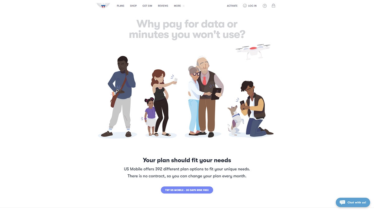
 2. ALWAYS PROPERLY MANAGE IMAGES ON YOUR SITE

Within the various paragraphs of text, you’ll want to link users to the next page or product that is a continuation of the copy. And, you’ll want the link—which is the next step in the user flow—to be as obvious as possible, such as a nice big button right under the last paragraph of text.

For example, if you write a paragraph talking about how great your organic men’s t-shirts are, link that paragraph to your Men’s Organic T’s products so that customers are taken to the next stage in the purchase funnel. In this scenario, it may be helpful to have the button read “Click Here to Buy Organic Tees” or to just have a picture of the product and a button within the picture (sort of like the format for a Google Display ad).

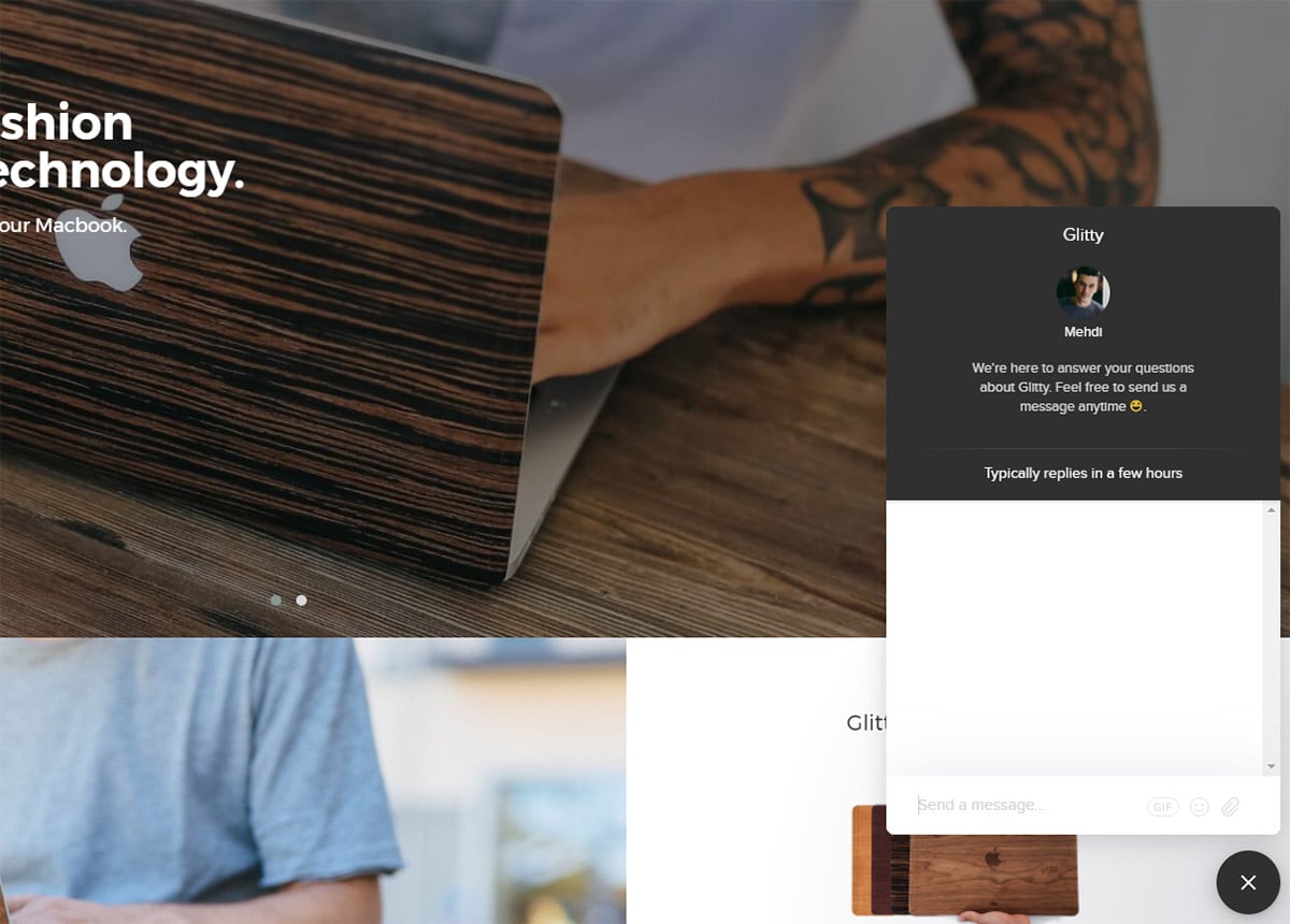
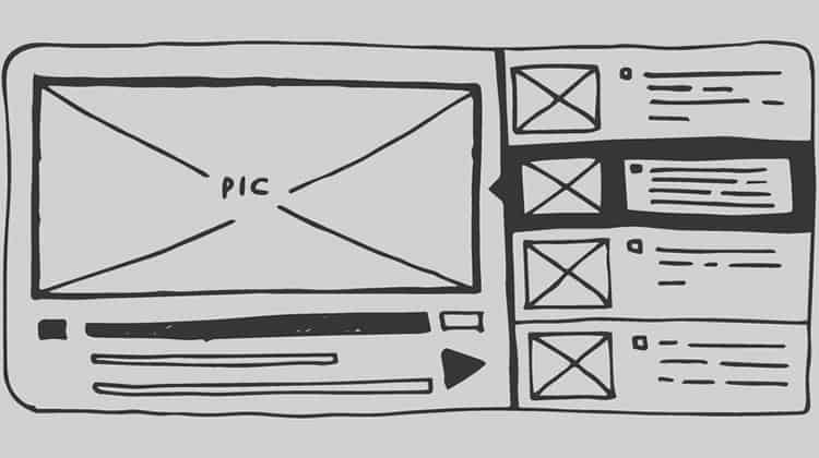
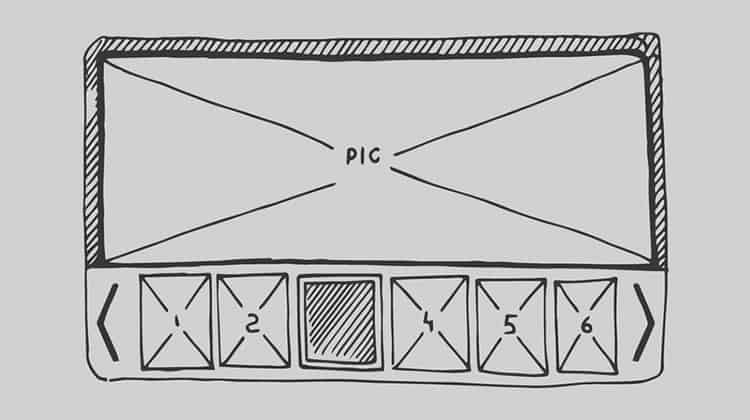
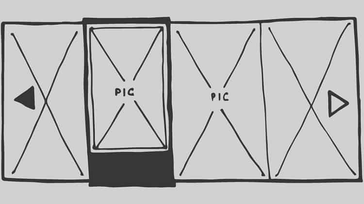
It also helps to include images alongside your paragraphs that represent the subject matter within the corresponding text, even if the images aren’t linked (though they should be). Just be sure to compress and/or resize your images beforehand in a photo editing software like Photoshop or GIMP to maintain faster page loading speeds. Larger images slow down your site as they are larger in file size.

Plus, be sure to add a title to your image so that the Google crawl bots know what is in the image. Google’s bots can’t see images but Google loves recommending images to people in search results, so Titles and Meta-tags with relative keywords are the way they can “see” what’s in your image.

Finally, be sure to look up how to save your images in “Progressive” format, as this helps speed up the loading process of larger images on your site. Proper management of images on your site appeases both website visitors and search engines alike.

3. MAKE SURE YOUR WEBSITE FOCUSES ON A NICHE

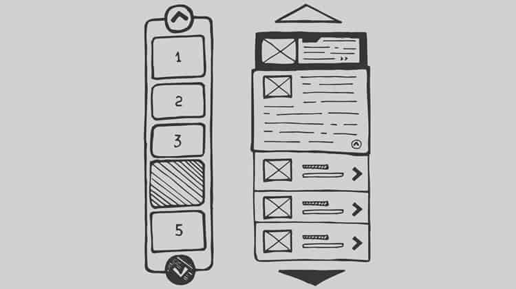
Make sure that everything important on your site is accessible within 3 clicks.

The key thing to remember at all stages of your web design is that people are looking for something specific when landing on your site, and are wanting to obtain that specific thing as fast as they can without having to be on your site too long or having to visit too many sites.

Your site should be centered around a specific thing or niche so that customers or visitors will know they have landed on the right site immediately. In other words, you are attracting a very specific type of site visitor with a higher chance of performing an action when they land on your site.

Once they have recognized that your site has what they want, you must make it easier for visitors to obtain the item they came for. This means not making your visitors navigate to 5 different pages to finally land where they were wanting to land or find what they were after. In other words don’t bury the lead! This keeps visitors from getting frustrated and giving up, thus exiting your site and increasing your bounce rates or exit percentages.

 4. KEEP YOUR SITE SECURE

People usually rate security as one of the most important factors when visiting someone’s site and deciding on a service. If your site is extremely slow, looks outdated, and doesn’t have any indication that it is secure, it will turn away visitors faster than the pages can load.

However, if your site uses an SSL Certificate to secure the transfer of information between customers and the site, you’ll immediately make visitors feel more secure and thus increase your chances of a conversion.

Some websites go so far as to add a logo of the type of security certificates or software they use to add more security to something like, for example, a checkout page on an eCommerce site. Surprisingly, this has been proven to comfort customers during the checkout process.

It should be noted that you should only add the logo of the security programs you are implementing, as adding a logo of a program you don’t use to create the illusion of security is highly illegal.

 5. OFFER WHAT VISITORS WANT

In the end, it comes down to whether or not your site has something to offer its visitors. This is why so many marketing companies talk about the importance of good and consistent content. Think of content in a variety of ways – it can be blogs, videos, new products, or new images.

These things should be continuously added or enhanced throughout your site. Your website and web design should consistently be getting better each day.

Additionally, good content should be matched with a high-performance, easy-to-navigate site that delivers what they need fast and in an aesthetically pleasing way. Add to that the comfort of security, and you’ve got yourself a site that will not only perform well for visitors, but also for search engines.

Source : webdesignerdepot

Author : Mike Davies


Posted in Knowledge sharing | Tagged , | Leave a comment

Design Management (An Introduction) – Taking Charge of Processes and People

Design management is a complex field; it doesn’t relate to a single design discipline and the exact responsibilities attached to a design manager will depend on the organization they work for, the size of that organization (and the tier in the hierarchy at which the manager operates), the industry they work in, the current market position and to a large extent the perceived importance of design to the business.

That means that defining “design management” becomes a near impossible task. However, it is fair to say that design management in general works to support design within a business, the business and its objectives and the business’s interface with the market it operates in. This leads to three general roles that design managers will fulfill:

  • Ensuring that design strategy and activities are in keeping with the larger business strategy
  • Ensuring the quality of the outcomes of design activities within their remit
  • Ensuring that user experience is prioritized and ensuring that it is user needs that create new products and differentiation from the competition

<img “=”” src=”https://public-media.interaction-design.org/images/uploads/1ee32d880035a4231f65b2ad90d4e818.jpg” class=”layzr-loaded”>
Author/Copyright holder: Wiki4des. Copyright terms and licence: Public Domain.

An example of how design management might be incorporated in a UX design working environment.

Design and Management

We take design at its most simple definition that of a practical approach to problem solving. This remains true from industrial design to service design – designers build products and/or services to solve user and customer problems.

Management, in any business activity, is the act of working with people and processes to reach organization objectives in the most efficient manner possible. It can include planning, organizing, controlling, staffing and directing people and processes.

What it does not include is leadership. While some managers are leaders many are not and leadership is effectively bestowed upon a person by those who follow a leader and cannot be dictated by corporate position. Leadership is a proactive pursuit and leadership may change within a group dynamic depending on the situation currently being faced – management on the other hand is constant and more reactive. As Peter Drucker, the world renowned management consultant says; “Management is doing things right; leadership is doing the right things.”

The Evolution of Design Management

Design management has only been formalized as an individual discipline quite recently (in the latter half of the 20th century) however; the tasks of design management have been taking place since the earliest corporations began to invest in design.

  • Before the 1960s design management was mainly concerned with managing the aesthetic components of design in terms of products and the corporate brand.
  • In the 1960s and 1970s design management became concerned with systemizing the design function so that output became more reliable – checklists and tools for quality control became more widely used.
  • Then in the 1980s and 1990s design managers became more high profile as their contributions to a business’s success became better understood and the focus of design management became more strategic with the objective being to secure design as a strategic asset. Design began to work alongside production and marketing at the highest levels of organizations.
  • In the 2000s (and until now) the focus shifted again. Design started to become a proactive strategic tool and managing design was now all about ensuring the ability to innovate and lead markets rather than to respond to market needs.


Author/Copyright holder: Wiki4des. Copyright terms and licence: CC BY-SA 3.0

Design managers aren’t just involved with the needs of design – they’re also involved with the larger needs of the business as this cartoon shows.

Areas of Design Management

As we said at the start of this piece; design falls into a large number of disciplines and thus so too does design management. Some of the more common areas in which design management can be found include:

  • Product design. The manager here will be looking at managing all functions related to product development and release and securing relationships with other business units to facilitate this. A user-centered (or UX centered) approach is commonly the guiding force for this work.
  • Brand design. Responsibilities here are for brand experience, developing touch points, and creating reliable, trustworthy perspectives that are strongly recognizable to clients.
  • Service design. The flip side to product design and something that is becoming increasingly importance with the rise of the product-service hybrid. Service design takes a customer experience (CV) or customer-centered approach.
  • Business design. Business design is an emerging concept – it’s the understanding that businesses can be designed from within to operate more efficiently and at higher levels of effectiveness. Typically, a business design manager will need to be very effective at persuading others of the utility of their designs.
  • Engineering design. Engineering design is more concerned with technological outputs than other disciplines of design – be it a technological process (such as manufacturing) or technological artifacts (such as a system).


Author/Copyright holder: Chris Baxter. Copyright terms and licence: CC BY-SA 3.0

Where design management is best employed often depends on the processes of the business. Like this industrial engineering process – there’s design management throughout the process if you look carefully.

Why Does Design Management Matter?

Design management matters because, for the vast majority of companies not engaged in simple reselling, design offers the only opportunity for a company to innovate and differentiate itself from competitors.

Design management allows companies to better control their design process and enhance:

  • Their internal business processes – cutting out waste and inefficiency in processes may not be visible to the company’s clients but it will be clearly beneficial to the company in terms of reduced costs.
  • Their learning and growth curve – design knowledge can be applied to learning and development too, thus focus is brought to strategic integration and the quality of employees on the ground.
  • Customer and brand relationships – design as applied to brand ensures strategic positioning and market differentiation in customer’s eyes.
  • Finances – design efforts should either increase sales or reduce costs to demonstrate strategic value and measurable value for the business.

Where Does Design Management Fall Within Businesses?

Design managers will find themselves operating in businesses with one of these strategic orientations:

  • Product-driven companies. In this instance it’s likely that the majority of design will fall within the company’s research and development function.
  • Market-driven companies. In these businesses design is likely to belong within the marketing department.
  • Brand-driven companies. These companies will often place design within the corporate communications department.

There are also three levels of corporate hierarchy that design managers operate from within:

  • Operational. This is the “doing” of design and is concerned with managing projects and teams that deliver on the business strategy. Good managers will be able to measure performance in terms of outcomes. Common job titles for design managers here include: operations design manager, design team lead, senior designer, etc.
  • Tactical. This is the “structuring” of design within a business – determining how projects are coordinated to achieve higher objectives, managing the skill and competency frameworks for design in a business, creating high-level systems for cooperation or support of design, etc. Common job titles at this level include: brand design manager, tactical design manager, design director, etc.
  • Strategic. This is the “direction” of design within a business – the determination of how design will meet corporate strategy and the development of the individual design strategy. Common job titles at this level include: design director, vice-president for design, chief design officer, etc.


Author/Copyright holder: Aevans75. Copyright terms and licence: CC BY-SA 3.0

Management structures can vary significantly from one company to another (this is a snapshot of Macy’s the American brand’s hierarchy) and thus it’s hard to say with certainty where design management will be in any given company.

The Take Away

Design management is both necessary and complex. Designers who want to enter design management will need to think about their objectives and where they want to direct their career long-term. It is not always easy to move from one type of management to another (whether sideways or up the ladder) and it’s better to position yourself early to be where you want to be. However, that doesn’t mean that a manager stuck in a role that they no longer enjoy should not pursue a change even if there are obstacles to achieving that change.

Resources

The Design Management Institute examines design management here – http://www.dmi.org/?What_is_Design_Manag

Hero Image: Author/Copyright holder: VFS Digital Design. Copyright terms and licence: CC BY 2.0

Posted in Knowledge sharing | Tagged | Leave a comment

How to Improve the UX of Your e-Commerce Website Visitors

One of the main parts of a high-level website is undoubtedly a great user experience.

This will, ultimately, tell if you have an increase in your exit rate or an increase in your conversion rate.

You will find that a lot of companies nowadays invest in the user experience of their website, in order to stay competitive. You must guide and help users navigate when they’re using your website or application.

Providing access

UX of Your e-Commerce Website

The fastest, and by far the easiest way, to get feedback from your users, is with your customer support team.

The team spends most of their time in talking to the customers, and they are the ones who are most familiar with what customers would like to see implemented, and what they think should be improved.

If you want to know if the user interface is confusing, you might just ask the user of the app what he or she thinks of it.

That way, you get immediate feedback and you can go ahead and add that to your list of priorities. Regardless of what the specific problem is, talking to your customers can give you an idea of how they would expect you to solve it.

Onboarding

If you want onboarding to be successful, you want to let your users achieve success. The only way of achieving success is knowing what your customer thinks is a success for them, what they hope to achieve with your product or website.

Every new user that uses your website, has a definition of what success is. What you should do, is make sure they think they’re on the path of getting their success. Here are a few tips and tricks to achieve that:

Understand the roles your website or product is most commonly used for

Onboarding

For example, with a project management tool, your platform may be used as a way to boost productivity, or for users to improve themselves at remote working.

These are all problems that can be solved with project management, but this gives your product a lot of other use cases as well. You should know them all, if possible.

Understand what each of these roles considers ‘success’

Understand the roles your website

People want to get promoted, or prove themselves, or gather a group behind a problem, they aren’t using your product or website just for the sake of using it.

A simple step would be just asking your users what they want to achieve with your product. You will find that this gives you an opportunity to make a lot of changes in a short time period.

Teach the users how they can get the most out of what you offer

Teach the users

You should have specific paths that guide your users through the features, and those features will help them get to what they consider ‘success’.

Once you know what their end goal is, you can design your website or tool’s flow to guide them there. This is done easily by asking what your users what to achieve, what they consider success.

Talk to users, and help them get there

Talk to users

The time spent since sign-up doesn’t necessarily signify how many things the user has done, and how many of those things are useful.

Activity and usage are important, and you should know where your user is, where he wants to go, and give them appropriate directions.

Improve abandoned cart rate

Improve abandoned cart rate

Most websites will wait until someone doesn’t convert, and only then will they ask how can they get the customer back.

Instead, make sure you know what failure looks like, and start talking to the customer before they have already made up their mind.

How to improve your customer service

Live chats and virtual assistants have been around for a while, but with the recent technological advancements, things are bound to become more interesting in a while.

You will achieve cost savings by using automation, but you should be sure that personalization isn’t sacrificed for that automatization.

Know how people experience your website or product

When you get no feedback, or someone says that everything is great with your prototype, that can mean either that they haven’t spent enough time to find the flaws, or that you aren’t asking the right questions.

A good thought to keep in mind is that nothing is perfect. There is always a place to improve, and you should make use of it.

A user may not tell you about a problem because they think it’s minor, but if you initiate the conversation, you will most likely get real insight into how people use and experience your website or product.

Constantly improve your navigation

Constantly improve your navigation

You can see this is a problem by asking any non-designer friend what irritates them most, and the most likely answer you’ll get is that they often aren’t able to find stuff. And testing out the navigation on your website is one of the easiest things you can do.

Have a stack of 10 to 20 cards, and have a description of a goal your system supports written on each one.

On the back side of the card, write the main headings from your current navigation structure.

Give your users the cards, and ask them to select the heading they would use if they want to do that task. This is known as a tree test and is only one among many ways to see how your users think.

You have a UX gold mine ahead of you

Whenever you have a customer telling you about a problem, that isn’t a problem, but an opportunity you can seize.

The raw information isn’t always useful, and you won’t always come up with new solutions on every conversation, but those few situations when you do, and when you can indeed use the information, are more than worth it.

What you should remember here is that everyone wins. The user gets the support and help, they have a feeling they’re being listened to, and an opportunity to directly influence the product.

You, on the other hand, get a real-life situation on how usable your product is, and a specific direction in which you can improve. At worst, you have a fixed bug, and you have solved a short-term problem.

At best, you get a huge leap forward in terms of UI and UX, or a brand new feature. Your designers will be glad to implement this because it means that your users are actually engaging with your product or website.

Downsides

The user experience can be a tricky process. There are a lot of moving parts, a lot of stakeholders you have to deal with, and you have your own desire to make something that fits your ideas and standards.

The perfect process isn’t something you can achieve overnight, instead, it takes time. However, it is very important to evaluate your UX, and constantly work to improve it. You should look back at your last release every once in a while, and ask yourself a few questions.

Do you need to improve the interactions? See what works and what doesn’t, and fix it. Did everyone understand what your vision is? Make a whiteboard sketch, and make sure they do. Or have a targeted collaboration session with your teammates.

Did everyone know how the product should work? Try getting them to tell you their stories, you will see if you did anything wrong. Do you need to do more user testing? Take any five people from the office, get them a coffee and do some quick usability tests.

Wrapping things up

Innovation has much more to do with making things better, than taking a huge leap of faith. You should offer your consumers new ways of interacting with a service, business or product.

A website has to adapt to the users’ needs and to the way their competition works.

However, it should also respond to what the users expect. You should understand and accept the fact that innovation is important if you want to grow, and you should know how to tackle it and be effective.

If an action is based on the process that may lead to success, make it a priority. Make sure you’re ahead of the innovation, that will give you a competitive edge over anyone else.

And, last but not least, have an innovative thinking environment in your page’s mission, which enables systems’ growth in the future.

Source: Design Modo

Author: Bogdan Sandu

Posted in Knowledge sharing | Tagged , , | Leave a comment

An Introduction to Animation in Web Design

Animation is not just for cartoons anymore. From full-screen moving images to small hover effects, touches of animation are popping up everywhere. Animation is trendy, fun and user friendly.

And the obstacles to using animation have started to fall. With most users on high-speed connections and the ease of creating anything from simple movements or a silly gif to several minutes of action, animations have become practical and useful web design tools.

Animation Basics

website animation
website animation

Animation happens when something created in still or two-dimensional form is “brought to life” and appears to move in a way that follows laws of physics. It’s the way a cartoon character walks across the screen or how an app icon bounces like a ball while it is loading on the desktop of your Mac.

One of the words that is almost synonymous with animation is Disney. In the early 1980s, two of the companies’ top animators wrote a book detailing the 12 principles of animation. The “Illusion of Life: Disney Animation” by Frank Thomas and Ollie Johnston still provides the framework for animation today.

  1. Squash and stretch
  2. Anticipation
  3. Staging
  4. Straight Ahead Action and Pose to Pose
  5. Follow Through and Overlapping Action
  6. Slow In and Slow Out
  7. Arc
  8. Secondary Action
  9. Timing
  10. Exaggeration
  11. Solid Drawing
  12. Appeal

Web animations are often saved as GIF, CSS, SVG, WebGL or video. They can be anything from a simple underline that appears when you hover over a word to a full-screen video or background image. As with any other design technique, animations can be subtle or they might be in your face and hard to avoid.

Emerging Trend of 2017

website animation
website animation
website animation

Animation in web design is something that we are starting to see more of every day. The key to animation as a design trend is moderation. Small, simple animations are engaging and interesting; the user might not even think about their being an animation at all. Large-scale animations can be an interesting visual that pull you into the design. But if you start mixing up too many different moving effects, it can cause complete chaos.

What makes animation trendy is realism. In today’s design landscape with so many flat and minimal style designs, users need more cues to tell them what to do. Simple bits of animation can guide the user without changing the aesthetic. It helps add instruction and order to design schemes that may be too simple visually to provide enough direction for users. In this instance animation creates a happy medium between stripped-down simplicity and usability.

The other contributing factor to this trend is access to tools on the back- and user-ends of the design. You don’t need Flash for more complicated animations anymore. (And if you are still building in Flash, it’s time to stop.) It can be accomplished in a number of other ways. Today’s animations don’t bog down websites or web servers, making effects quick to load for users and with high-speed internet access animations don’t skip of get stuck midway through the event cycle.

Large vs. Small Animations

website animation
website animation

When it comes to animating for the web, it falls into two equally easy to understand categories: large and small. (You can probably guess how these look.)

Large animations are ones that have a scale to them. Often in the form of a video with a run time, large-scale animations fill a significant portion of the screen and are characteristic of a short movie. These animations serve as a focal point in the overall design. Users often don’t have to perform any action to see the animation in motion. If you watch closely in the Studio Meta site, each of the large images zooms as you read the copy.

Small animations are the little bits and pieces that you discover as you start interacting with a website. These divots might be in the form of hover states, tiny bits of ornamentation or usability guides or tools. Small animations are an accent that contribute to the overall aesthetic, but are unlikely to be the focus of the design. In the site for Henry Brown the simple animation is that if you look closely, the eyes in the illustration actually blink.

When to Use Animation

website animation
website animation
website animation

The problem with every trend, including this one, is knowing when to use it. Animation can be a great little trick for your design tool kit, but is not for every project. Animation should be smooth and seamless, not jumpy or mechanical. It needs to serve a purpose for the user and not get in the way of the content.

The primary reason to use animation is to increase usability. Simple animations can be great guiding tools to help people understand what buttons to click or where to go next in the map of a website. Many designers using complex scrolling effects pair a simple animation with a user tool to scroll or click. (This includes everything from a simple bouncing icon or words that pop up an say “scroll down.”)

Usability comes in a few forms:

  • Communication function or how to use a website
  • Show change, such as filling in a form correctly or highlighting that an element is clickable
  • Create flow or direct users to a call-to-action

The second reason to use animation is an aesthetic one. Animation can be a great “decoration.” Sometimes the goal of an animated element is purely visual and that is an acceptable use. This decorative animation can help tell a story or create an emotional connection between the interface and the user. The purpose of an animation can be to spark visual interest and keep a user engaged with your site for a longer period of time.

When creating a purely visual animation consider what it is supposed to do. Think about the connection you want a user to have. Is it supposed to be fun or surprising? Is it a bit of unique content that is designed for sharing? Even a pure visual should have a goal.

Resources

Ready to start animating? Here are a few resources for further reading and tools to help you get started.

Conclusion

When it comes to animation, the rule of thumb is this: Good animation will make the user’s experience better. This can be in the form of an emotional connection – such as a fun, positive experience – or by making a site easier to use.

Animation is a fun technique that is become much more standard for a variety of applications. If you are looking for inspiration, make sure to go back through this article and click the links to the visual examples throughout, visit the sites and play with the animated features therein. Have fun!

Source: Design Shack

Author: Carrie Cousins

Posted in Knowledge sharing | Leave a comment

Every Design Needs Three Levels of Typographic Hierarchy

One of the most important elements for people looking at anything you design is the type. It needs to be clear and readable and it should direct users through a design, from most important elements to least.

And that, in a nutshell, explains typography hierarchy. But to really master the art of type, you need to understand how to layer type throughout a design to achieve maximum impact. Read on to learn how to master typography hierarchy and create effective type in every project.

What is Typographic Hierarchy?

Typographic hierarchy is another form of visual hierarchy, a sub-hierarchy per se in an overall design project. Typographic hierarchy presents lettering so that the most important words are displayed with the most impact so users can scan text for key information.

Without typographic hierarchy, every letter, every word and every sentence in a design would look the same. Can you imagine reading something where everything is the same font and size and color? Where do you start? How do you know what matters most?

Typographic hierarchy creates contrast between elements. Designers achieve this through the use of typefaces, size, weight, capital and lowercase letters, bold or italics, orientation and color. Combinations of those design tools are used to create type that falls into distinct layers.

Primary Level

The primary level of typography is all of the big type. It’s headlines and decks – also known as “furniture” – that draw readers into the design. This is the biggest type in the design (unless you are using typographic art).

Secondary Level

The secondary level of typography are the nuggets of scannable information that help readers stay with the design. This includes elements such as subheads, captions, pull quotes, infographics and other small blocks of text that add information to the primary level of text. The design of these text blocks is on the large side, but typically much smaller than lettering in the primary level of typography.

Tertiary Level

The tertiary level of typography is the main text of your design. It is often some of the smallest type in the design, but it needs to be large enough to be completely readable by all potential users. The typeface should be simple and consistent in design, spacing and overall usage.

Other Levels

The other levels of typography include effects applied to type in the tertiary level for small areas of impact. Effects such as bolding, italics, underlining and color can bring attention to specific areas of the main text. These effects work best when applied to text of the same size and typeface used in the tertiary level. Effects are used sparingly and for only a few words in sequence. Examples of other levels include links that are underlined, bold words for impact or italics or color for emphasis.

Hierarchy in Print Projects

type
type
type
type

Visual hierarchy in print projects is strictly visual. Using size, color and other effects to make certain bits of type appear large and more important and scaling accordingly is all you really have to do to get a good start.

Looking at the step-by-step example above, you can clearly see different levels of typographic hierarchy and how it makes the design both easier to read and more appealing visually. You can apply this same technique to any design project by adding emphasis in key areas.

Create It

There are a variety of ways you can create a sense of hierarchy. Here are some of the most common techniques:

  • Typeface selection: More interesting typefaces can appear larger and draw the eye faster than ones with less visual intrigue. When using novelty, script or elaborate typefaces be aware of readability concerns and make sure the type is plenty big.
  • Size: It almost goes without saying, but the bigger the type, the quicker the eye will be drawn to it. Type sizing should correlate to the order of importance in reading the text.
  • Weight: The thickness of letters can make text look larger (bold, thick strokes) or smaller (thin or compressed typefaces).
  • Capital and lowercase letters: You’ve heard that sending an email in all capital letters is like yelling at someone. The same is true of all caps in design. Be wary of use. Capital letters will appear larger and come to the forefront while lowercase letters appear smaller and often fall into the background.
  • Bold: Bold lettering is a good point of emphasis for a single word or phrase. It works especially well in the tertiary level of type.
  • Italics: Italic lettering can highlight a single word or phrase in a less dramatic and more subtle way than bolding. It works especially well in the tertiary level of type.
  • Orientation: Turning letters on their side, upside down or with any other orientation that horizontal can have immediate eye-appeal, because they are placed in a way different than what is expected. This can work well for short words or phrases in the primary level of text.
  • Color: Adding color to letters that typically do not have color creates specific and immediate interest. This effect can work in any level of text, but should be deliberate as to not create readability concerns or confusion.
  • Placement: Where text is located on the canvas can establish hierarchy as well. Typically you read from top to bottom (a natural hierarchy of sorts) but this can be changed by employing some of the techniques above.

Hierarchy in Digital Projects

All of the tools that you use in print projects also apply to digital projects, with some additions. Digital typographic hierarchy must also include consideration for HTML in the creation of web type. This additional level of thinking ensures that your visual levels will translate to other users on screen.

Create It

Make sure to use common conventions, including header, body and bold styles when working on projects that will be published online. Each of these commonly-used style definitions falls within carrots (< >) in the HTML.

  • Title (title): Defines the document title for web crawlers and users.
  • Body (body): Defines the body text in a document.
  • Headers (h1 to h6): Defines different layers of header styles. H1 is typically the biggest and most important, moving down through H6. You only need to use as many as you like.
  • Bold (strong): Defines heavier, more important text.
  • Italic (em): Defines text with a tilt for emphasis.

Hierarchy and Usability

type
type

When it comes to mobile applications, you need to think about visual typographic hierarchy, HTML typographic hierarchy and usability in typography hierarchy. Not only does text have to look good and work properly, but it also has to be designed in such a way that users know what to do with it and it interacts as expected.

This action-based typography includes some key things for designers. Type has to be big enough to tap, spaced so that each tap-able item is clearly defined, and usable elements have some sort of visual definition (such as a button).

Create It

The thing to keep in mind when creating usable typographic hierarchy is to separate type elements that users will interact with from ones they will not and from each other. Important considerations include:

  • Space: Give each element that is supposed to be touched or tapped, plenty of room. Consider the size of the space and the amount of room it takes for a finger to touch it. Users can be quickly frustrated if type is so close that the wrong element is clicked.
  • Color: Create a color palette for usability. Consider making every word that is intended for touch a different color than the main text.
  • Shadows: Drop shadows are a common indicator of a button that can be pressed in some way.
  • Borders: Consider adding borders to independent elements that you want users to interact with. Make sure they are set apart from the background. (Trendy “ghost buttons” are a good example of this, as in the Spacecraft website example above.)
  • Animation: Moving text, while difficult to use, can be a quick way to help draw the eye to certain words.
  • Direction: Remember to tell users what to do on the screen, from tapping to scrolling to calls-to-action.

Conclusion

Chances are you design with some sort of typographic hierarchy even without thinking about it. But considering how type will align in a big picture way can improve your overall design.

Use typographic hierarchy to add emphasis, impact and create calls to action that users can see and react to quickly. Remember to think about readability, scanability and overall comprehension when making decisions about a typeface, size and effects applied to it. Your readers (or users) will thank you.

Source: Design Shack

Author: Carrie Cousins

Posted in Knowledge sharing | Tagged , | Leave a comment

Design Trend: Obstructed Text

Some websites look great, even if they defy conventional wisdom or tenets of design theory. A new design trend is showcasing that very idea with elements that cover or obstruct some of the text in the design.

It’s an interesting trend because it goes against everything we commonly talk about with design – that it must be readable to connect with users quickly.

Needless to say, this can be a tricky technique to pull off effectively, but the designs are striking and impactful when done well. Here’s a breakdown of the trend and some ideas for how you can try it yourself.

Simple Obstruction

web design trend

If text is covered in a design, then everything else must be super simple visually so that the user doesn’t get lost in too many effects.

At every responsive breakpoint, the text is no more obscured than any other.

Root Studio does a great job of this with a first impression that grabs attention with color and the simple animated giraffe that covers part of the oversized lettering. The trick here is that even though some of the letters are obstructed there’s no question what the word on the screen is. The letters are still readable, due to size, simplicity of the typeface and placement of the obstructive element.

The design team took special care with the text obstruction to maintain the integrity of “ROOT,” which is the brand of this particular website. At every responsive breakpoint, the text is no more obscured than any other. (This is where many of these designs fall short. They look great on desktop resolutions, but the text is too obstructed to be readable on smaller screens.)

Three-Dimensional Layers

web design trend

Adding a three-dimensional layered effect can help elements jump off the screen so users almost feel like they can reach out and touch them. Text can serve as that background element in some cases.

Just make sure that the layer on top of the text doesn’t cover too much of the word (or words). And it is always vital to make sure that text obstructions don’t result in unwanted words because of the placement of other elements.

Simply Chocolate uses this layering effect well. It works mostly because of the combination of oversized lettering that uses common words in a bold typeface and a top element that’s not really large and contains the exact same words that are obscured by the candy element.

This treatment makes the big letters in the background more of a graphic element than readable one, creating a fresh bit of contrast and superb layering effect. (You might find yourself scrolling through all the different candy flavors to see how they create the effect in different ways.)

Forget the Rules of Space

web design trend

Sometimes text obstructions don’t actually cover the letters but encroach on their space.

It’s one of those rules that North Street breaks without the design feeling cluttered or disjointed. The company description bumps right up against the center vertical rule on the screen (the rest of the design uses this divider for a split-screen aesthetic.)

If anyone said they were going to use this treatment, you’d probably try to convince them otherwise, but here it works. The visual composition is so light – thanks to plenty of white space – and they typeface choices are bold enough that the lightweight gray line almost just falls into the background even though it gets in the space that should be reserved for text.

A second gray line further splits text in the navigation, but most users probably won’t even notice the obstruction.

For Large Lettering Only

web design trend

Looking at all the examples here, you’ll probably notice a common theme. All of the obstructed lettering is quite large and uses simple typefaces.

Small lettering won’t typically give you enough room to cover part of the text in a way that appears purposeful. If you plan to design with a text obstruction, it should be intentional and have meaning.

Complicated scripts of novelty styles are just too difficult to read with an element on top of them.

Covering small lettering is incredibly difficult, in terms of purposeful design and readability. That’s why the technique is paired with oversized typography.

These large, often sans serif, typefaces are easy to read at a glance and often have medium stroke widths and large bowls and counters that make layering elements more practical. To make this concept work, you need letters with shapes that lend themselves to this concept. Thin or condensed type styles don’t often work, and complicated scripts of novelty styles are just too difficult to read with an element on top of them.

Elements With Little Contrast

web design trend

Sometimes the text obstruction isn’t an element that’s on top of text; it is the relationship between the text element and what surrounds it. A lack of contrast between text and background elements can result in a text obstruction as well.

Again, this can be a difficult concept to pull off effectively. Text innately exists to be read. A lack of contrast can make that difficult.

When paired with highly readable text, low contrast text elements are subtle reminders on the screen. These elements will be read after other higher contrast elements.

In the design for Anew, above, the description of the business is more important than the name brand. That’s what the design tells users because of the type treatment. They key words “rooftop + test kitchen” are easy to see and read. The name “Anew” appears in a low contrast location under the brand mark. The eye is still drawn to it because of the large logo, but it is not the primary focal point when it comes to reading and information gathering.

Part of the reason this treatment works in this space is because of the content of the design. Think about the symbiosis between the word “Anew” and the bright white dinner plates. It feels fresh, different and enticing.

Conclusion

Obstructed text designs are becoming more popular all the time. Not that long ago you would have been hard-pressed to find anything with this style online. (Print designs have used it more consistently because designers didn’t have to worry about responsive breakpoints.)

Just take care in creating something with text that’s not fully visible. Make sure that words still say (and mean) what you intend. If you have any doubt about how a design will be perceived, or read, when using obstructed text, consider another option. You never want to make your design difficult for users to understand.

Source: Design Shack

Author: Carrie Cousins

Posted in Knowledge sharing | Tagged | Leave a comment

Sliders in Web Design: To Use or Not to Use?

Many designers have strong opinions about the use of sliders and slider controls in website design. Some love them; others hate them. A poorly-timed carousel or automated gallery slider can distract users from more critical site aspects. On the other hand, a manual slider allows mobile and website users to navigate through a range of content features or options quickly. Explore sliders and slider controls and find out when they are most useful in web design.

What are Sliders?

A slider is a term that refers to a slideshow on a website. An example of a slider can be a revolving carousel that displays products or photos. Web designers can incorporate sliders into all kinds of sites, but they are most useful for businesses wanting to show relevant content or showcase professional portfolios. When designers want to quickly show multiple options and help users sort through them quickly, a slider helps narrow down choices.

Why the Love Hate?

If you conduct a web search for sliders, near the top of the SERP, you will find critics who hate them, and just as many designers arguing in their favour. Here are some viewpoints on each side.

An example of a slider (Image source: Depositphotos)

Critics argue sliders are confusing since they present users with several options at once, all of which have the same weight or importance. Since UX is about making choices clear, they say anything that creates confusion should be avoided. They also offer the following reasons they are bad UX:

  • Visitors often view sliders the same way they do ads and skip over them.
  • Sliders slow down pages, impacting SEO and conversion rates.
  • Some sliders do not transition well to mobile.
  • The space they take up reduces available room for other content.
  • Sliders might give the impression that the company was not sure what to highlight, so opted to display all choices at the same time.

Some say a moving slideshow can have the same negative impact as auto-playing video. Instead of sliders, critics recommend using static images and copy.

Diagrammatically opposite, some designers love sliders and argue just as vehemently in favour of their use. Here are some ways adequately used content sliders can be good UX:

  • They save space: Consolidate content so more is visible on one screen.
  • Users stay engaged: Visitors linger in one place to view content, and visuals provide a break before continuing down the page.
  • Sliders consolidate images: While media on the page can draw attention away from text, sliders put it all in one place to prevent distractions.
  • Users control content: Always allow users to proceed through sliders at their own pace or skip them altogether if that’s not what they are looking for.

When to Use Sliders

While sliders are not right for every website, there are some they enhance. Start by analysing what your user is looking for and how each page of your website can help them toward completing that goal. If sliders solidify the brand and enhance the user’s trust, they can be a critical part of UX. If they create distraction and confusion, they will negatively impact conversions. Each organisation is unique, so what works flawlessly for some might have a detrimental effect on others.

Another example of a slider (Image source: Depositphotos)

Avoid making sliders a distraction by minimising transitions and choosing soft fades instead of jerky horizontal slides. Make navigation easy with noticeable arrow buttons for moving backwards and forward. Allow mobile users to swipe. Optimise page load time by using the smallest possible image size and wait to load slides later in the carousel, since viewers may not require them.

Use Sliders for Product Tours

When site visitors see large chunks of information, it can be overwhelming. If you offer a product that works in a series of steps, use sliders to show the series and create a visual for the user.

For example, a company that uses smartphones to process credit card transactions might feature on its site a slider that shows a customer presenting the card as payment, an employee swiping it through the device, and funds being transferred to the desired account. What would have taken the user several minutes to read through text, they quickly understand through a slider in seconds. The same process can be adapted to user onboarding for new sites and mobile apps.

Make New Content Stand Out

First-time website visitors often want to know what their options are and what the website has to offer. Homepage content sliders provide a brief overview and allow visitors to make a decision quickly.

Alternative ways of showing updates using sliders (Image source: Depositphotos)

If you regularly update your site, sliders can emphasise updates. On news websites, the latest and most sensational material is usually the focus of their content slider. Every update stands at the forefront for as long as it is the latest news or newest offering. Users know at a glance when things have changed.

Present Photo Galleries

Sometimes a single image makes a powerful statement about your brand. Other times, a collection of images provides compelling evidence of an organisation’s quality, value and trustworthiness. A slider goes beyond simply displaying images. It both organises and displays images irrespective of whether you choose a photo gallery with several small images or screen after screen of full-page high-quality graphics.

Photo gallery sliders (Image source: Depositphotos)

Photo galleries can be indispensable for organisations that sell real estate or cars. Home buyers want to see multiple photos of a home before they view it in person, and sliders allow them to quickly thumb through.

Car manufacturers present screen after screen of their vehicle’s elite features and innovative design to interest buyers in further details. Instead of having to select individual images, shoppers can quickly flip through. The reduced friction enhances user experience.

Display Portfolios Online

Artists, graphic designers and web developers often seek to demonstrate their products, skills and abilities. Clients want to see a taste or a brief overview that allows them to assess overall quality and tone. A slider enables designers to display work in a flexible format. Visitors can see as much or as little as they wish, but even if they do not stay long, they leave with a general impression.

Showcase Ecommerce Options

Online entrepreneurs can display a few of the company’s most popular or recognisable products to draw users in, emphasise new varieties or flavours, or show categories to make it easier for users to shop. Designers who research e-commerce web design trends for better sales know some of the most effective layouts use a minimalist approach and plenty of white space, so the slider is allowed to shine.

Test for Effectiveness

Sliders are useful if they tell a story and leave control over viewing with the user. If you are not sure if your slider improves user experience, test it. If you are just designing your page, run an A/B test to see how users interact with the slider and which version they prefer. See which version had the higher conversion rate or increased revenue.

If the slider is on an existing page, track user interaction and click-through data. Note the point at which clicks begin to diminish. Often interest wanes as users proceed through multiple slides. This can be because designers usually put the most compelling content first, but if subsequent material fails to hold user interest, it just slows page load times.

In Conclusion

Each site is different, and each receives different types of visitors. Designers who start with what the user needs and design content around their preferences and interaction style use a wide range of tools to present content. When used correctly, sliders can be implemented to create an even more immersive browsing experience.

Source: Usability Geek

Author: Alan Smith

Posted in Knowledge sharing | Tagged , | Leave a comment

5 Tips for Creating a Memorable Logo Design

A logo might be the single most important visual connection a brand makes with users. It identifies the company or organization and sets a basic tone for interactions with users.

From color to shape to words, every element in a logo design says something. (That’s why such a small element is so important to your brand.)

Logo design takes a lot of planning and thought and it is important to create a mark that represents your business and is something that users can identify and remember. It’s doubtful that you’ll develop the next Nike swoosh, but with the right approach you can create a memorable logo design.

Branded in Memory

I recently saw a fascinating project called Branded in Memory. They asked asked over 150 Americans to draw 10 famous logos from memory as accurately as they could.

It lead to a collection of over 1,500 drawings created over a period of 80 hours. And the results aren’t what you might expect. These brands certainly aren’t stamped perfectly in our minds — they’re surprisingly fuzzy! Here’s an example of how people fared with the Apple logo, but be sure to take a look at all the other brands involved as well. The results are fascinating!

With that in mind, creating a memorable logo is more important than ever. Here are some tips to create a simple mark that resonates and sticks around:

1. Simple Sells

logo design

The best logo designs are classic, simple and easy to understand. They often include a simple mark and company name. And that’s it.

Think of companies like Apple or Google or McDonald’s – each uses a simple representation that people around the world can identify with. Users see the mark and think of the company. That’s the essence of a memorable logo.

Simple logos also tend to work well in a number of applications and uses. Look at the mark for Nike, above, and all the different ways the mark is used. Regardless of the application, you know the brand every time.

The mistake that most designers make when creating a logo is that it contains too much information. To ensure simplicity in the logo design, consider these guidelines:

  • Use no more than four words (or 30 characters).
  • Stick to three or fewer colors.
  • Don’t use more than one design trick or effect.
  • Avoid thin elements for type and artwork.

2. Consider Who/What You Want to Be

It is important that your logo is an accurate representation of your company or product. It should have a meaning that’s unique to what you do.

Think about the meaning of colors and shapes when planning the design and how those associations can impact users. (You don’t want to communicate the wrong thing by mistake.) It’s also important to think about the logo in context of your overall industry.

  • Does the logo show what you do or sell?
  • Does the imagery communicate the right thing?
  • Can it stand alone?

One of the best starting lists for how to think about imagery in a logo design comes from AdWeek. The magazine noted how certain logo marks resonated with users. Here’s a snippet from that article (go read the rest to learn more):

  • Powerful: Geometric shapes
  • Traditional/sophisticated/respected: Serif wordmarks
  • Warm/caring/innovative: Organic lines
  • Trendy/fun/cool: Illustrations
  • Approachable: Shapes that touch
  • Edgy: Initial lettering

3. Use Color Wisely

logo design

Color might be one of the most important elements of a logo design for two reasons.

  • Color choices can draw users in to the design and say something about your brand.
  • A good logo works in full color or in single-color applications.

In the vein of keeping the logo design simple, stick to a simple color palette – no more than three colors – for the logo design. Flatter logo design styles are trendy right now. (Even MasterCard recently moved to a much flatter version of its pair of interlocking circles.)

Paired with flatter styles and logo design ideas borrowed from Material Design is the use of bright color. And that’s a good thing. Bold color choices can help draw users into the logo design. But don’t go too crazy.

You want to create something that you can use for years to come and using too many trendy elements or colors can date the design. Pick one trendy color to incorporate into the design. You can add a trendy accent color to the logo if your brand colors don’t have hues from trendier palettes.

It’s also important to remember that you won’t be able to use a full color logo all the time. Does it also work as a single-color element (often black or white)? If not, the logo design probably needs some more work.

4. Stay Away from Clip Art

What every logo does need is original artwork that tells users who and what the company is.

If this is the only tip you pay attention to, read it closely: don’t use clip art. Not every logo will have a mark that’s as recognizable as Apple’s apple. That’s OK.

What every logo does need is original artwork that tells users who and what the company is. Whether it is a mark or logotype is up to you. (Some logos work best as a logotype because of an interesting name or lettering.)

Just don’t force it with clip art. The logo will look somewhat silly and amateurish. It won’t feel special in any way. And if you want to design a logo that memorable, it has to be special in some way. It has to be different from everything else out there and stand apart from competitors. Using clip art might be quick, but it won’t help you meet any of those other needs.

(This is why hiring an experienced designer to create a logo is your best bet. And designers: Have these conversations with clients so you can explain how to best create a logo that they can use for years to come.)

5. Create Something That’s Flexible

logo design

A memorable logo likely has multiple iterations that are clearly identifiable to the user.

Think about something as simple as the logo for this website. The gray letters of Design Shack on a white background are clear and easy to read on the site itself, which uses green accents throughout.

On social media, where logo space is more limited, the logo collapses to a simple “d” on the same green background used throughout the website. The colors and typography are the same and there’s an obvious connection. That’s flexibility, built into the logo design.

There are plenty of other places where logo flexibility is also important:

  • Can you use it over an image?
  • Can you add a tagline to it?
  • Does it work really large or really small?
  • Do you have in icon version for mobile devices or websites?
  • If you make a product, does the logo work on labels?

Examples from the Design Shack Gallery

You don’t have to be a big company to have a great logo. Here are a few handpicked examples from the Design Shack Gallery that are quite memorable.

logo design
logo design
logo design

Conclusion

Creating a memorable logo isn’t something you’ll do overnight. It can take time and plenty of revisions. But stick with it. Don’t expect to get as lucky as Carolyn Davidson, who created the Nike logo, every time.

You can find success though with a simple design that uses typography, color and design principles well. The most memorable design is one that tells users something about the brand and business so it sticks with them. Good luck!

Source: Design Shack

Author: Carrie Cousins

Posted in Knowledge sharing | Tagged , | Leave a comment

10 Rules for Perfect Type Design, Every Time

Do you ever notice that some projects just seem to glow with great type? Some designers have a certain knack for designing perfect typography for every project.

You can do it too. With a handful of simple rules, you can improve the look and design of typography in all your projects, digitally and in print. If you struggle with picking typefaces and pairing fonts, these rules will help you design perfect type, every time. (Just make sure to follow them.)

1. Set Goals for the Project

Good typography starts with a solid understanding of what your project is supposed to do. Before you even start to browse Google Fonts or Typekit, jot down the answers to a few questions.

  • Who are you trying to reach with this project?
  • What are users supposed to do with the design?
  • What are the conversion points?
  • What’s the mood of the project?
  • Do you need to match or coordinate with other designs or branding?

The answers will help you start to frame an idea of what kind of typography you are looking for. (Here’s a guide to meaning and mood of typefaces in design projects.)

2. Look for Similar Shapes

typography design

When it comes to matching multiple typefaces in a design, something as simple as the shape of lettering can make or break the font combination.

So how to you ensure that you make it?

Look for typefaces with similar shapes. Think about whether each typeface is more round or oval, thick or thin, has a short or tall x-height or includes a slant or tilt.

Pick a primary, or body, typeface that you like and then match complementary typefaces with similar shapes.

  • Look at the lowercase “o” in each type family. Is the inside “bowl” round or oval? Match typefaces where the inside of the “o” is the same.
  • It’s OK to pair thick and thin typefaces. It’s better to pair a thick or thin and regular typeface.
  • Look for typefaces with similar x-heights (the vertical size of an “x”).
  • Don’t be afraid to mix and match different type styles. Try a serif and sans serif combination. Just make sure that if one typeface is complex, the other is simple. And use the simple typeface for the widest application, such as body text.
  • Pay attention to slant and italics. (You can look at the center of the “o” again as a guideline.) Don’t use more than one slanted typeface and avoid typeface pairs that slant in opposite directions. They can be jarring for users.

Still unsure? Here’s a guide to mixing typefaces.

3. Set a Type Scale for Sizing

The size of lettering can make or break a project. If text is too big, it results in an unnatural reading patterns with too many pauses and stops. If text is too small, it can strain the eyes and cause users to leave the design.

When text is just right, users move through the words freely.

Text that’s sized just right also comes with a scale for different sizes in the project. Body text is one size, headlines are another size, and subheaders are yet another size. And all of the sizes and use should be consistent throughout the design.

What this does for users is make everything easier to read.

  • Text size prioritizes information by importance. Bigger type is more important and is more likely to be skimmed by most users.
  • A scale increases the scannability of text so that users can look at it quickly.
  • Related items have the same appearance.
  • Bigger text elements, such as subheaders, help break up long blocks of text, making it easier to read.

4. Pay Attention to Spacing

typography design

It’s isn’t the type per se, but type spacing matters.

Kerning, leading, tracking and padding can render your type beautifully or turn it into a hot mess.

There’s a fine art to getting spacing just right. And a lot of it depends on the actual letter combinations used, size and typeface. There’s no kerning rule – other than to do it when necessary – and there’s not a perfect amount of padding for text and other elements.

You’re going to have to eyeball it.

The test is feel. If the design feels “off” in a way you can’t pinpoint, problematic spacing could be to blame. It just takes practice – and a good eye – to get it right.

5. Align Left for Reading

In English, as well as other languages, users read from left to right. That’s also the ideal alignment for optimizing readability within blocks of copy.

Small bits of text – menu elements or hero headlines – don’t have to align to the left because they are quick to read. Large amounts of copy – anything more than a sentence – should probably be left aligned. (Justification is arguable, although it can cause some off spacing concerns if you aren’t very careful.)

6. Pick Two Type Families

This rule has probably been pounded into your head already: Use just two typefaces for a project.

It’s being said here again because so few designers actually pay attention to this rule. Scan the web or a portfolio website and you’ll see plenty of projects with “fonts gone wild!”

If you are planning to break this rule, think again. What are you gaining by adding another typeface to the mix? Instead, look at the typeface you have selected and see if another style – bold or thin or italic – might be a better solution.

7. Don’t Alter Fonts

Never ever stretch or twist or slant a typeface. If you need something different from what you have, pick a different option.

Type designers spend a lot of time creating lettering that works as presented. Altering the form of letters hurts readability and can cause fonts to “break apart” in the way a photo gets pixelated when you use larger than original size.

8. Use Plenty of Contrast

One of the things that gets designers into trouble is putting type on an image or background element. It only works when you have plenty of contrast between elements to create separation and ensure readability.

If you have to add a drop shadow to lettering, there’s not enough contrast.

Light on dark or dark on light can ensure readability. It also helps to use a typeface with a regular or wider stroke.

But that’s not always the case. A photo might include light and dark spaces or letting might include thick and thin strokes.

Options include boxing text, picking a heavier typeface or adding a color overlay to the image. All of these techniques can help create more contrast and make text more readable. (Plus, they tend to hold up when used in multiple responsive breakpoints where text and images move around.)

9. Remember Mobile Typography

When it comes to typography for the web, mobile readability should be a top concern. Fun techniques like adding a pattern or texture to letters can work in print and some desktop screens but will fall short on smaller devices.

You need to think about how typefaces will render in all uses. (Go back to your typography scale and remember to include specifications for type on large and small screens.)

Mobile typography is often a little large and includes a little more spacing than typography on desktops. It also helps if the paragraphs are shorter so that you don’t end up with blocks of text that take multiple scrolls to read, which can intimidate users.

10. Stick to a Style Guide

Once you have a solid idea of how type should look in a project, create a style guide with all of your exact rules for usage.

Make copies. Put it online in an accessible location. And use it whenever you make changes to the design. Consistency is a key component of perfect typography design.

Conclusion

The thing about good versus bad typography is that most users can identify one or the other. They only know when the design just isn’t quite right.

The key concern when it comes to creating perfect typography is readability. Type must be easy to read and understand. It should match the mood of the copy. And it should feel almost invisible to users; it works when they don’t have to think about it and can read with ease.

Source: Design Shack

Author: Carrie Cousins

Posted in Knowledge sharing | Tagged , | Leave a comment

7 Steps to Creating a Solid UX Strategy

Everyone knows that the first step in any business venture is research on the path to creating a strategy. This strategy determines how you’ll function and guide the decision-making process.

A website project – whether it is for a business or not – should follow the same concept. Without a solid user experience strategy, the design is likely to lack the features, elements and overall usability that make the website popular among visitors.

While the idea of creating a UX strategy might not sound like a lot of fun, it’s a valuable exercise. And when done well, and with purpose, can definitely be enjoyable!

1. Start with What UX Strategy Is

Before you can plan a UX strategy, you really need to know what it entails.

Jamie Levy, a UX strategist, defines UX strategy this way:

UX strategy is the process that should be started first, before the design or development of a digital product begins. It’s the vision of a solution that needs to be validated with real potential customers to prove that it’s desired in the marketplace. Although UX design encompasses numerous details such as visual design, content messaging, and how easy it is for a user to accomplish a task, UX strategy is the ‘Big Picture.’ It is the high-level plan to achieve one or more business goals under conditions of uncertainty.

ux strategy

UX Planet has one of the most comprehensive guides to defining UX strategy available. (You should definitely read it.)

To differentiate between UX strategy and UX design, we can say that UX design is concerned with usability, content, interaction design while UX strategy is concerned with the big picture, the direction of the product and achieving business goals.

Exactly how you proceed with your UX strategy should fall in line with business goals and common user experience trends.

2. Do Some Research

Creating a solid UX strategy requires plenty of research. You need to communicate with several different groups to gain a full understanding of what people connected to your website want and expect.

  • Primary stakeholders: The decision makers and people in charge of the company or product will have a lot to say about how the website works. Involve them from the beginning. Ask what they want to see and what is or is not working well with the current website (if there is one). What metrics will they track?
  • Secondary stakeholders: These are people related to the company but aren’t part of the project or management team, such as financial partners or other employees. Find out how they plan to use the website or app. What do they see as important? What features would enhance the experience?
  • Users: Survey current or prospective users about what they want to see in the website design. Ask a handful of direct questions and keep the conversation short. Observe how users interact with the current website (if applicable).

The other research component is to look at the competition and what else is available for users. How can you create a website experience that is on par with what users want and expect but isn’t a duplication of something already available? Your website must be unique enough to draw users, whether it is because of the content (if should be) or product featured.

The research phase concludes when you have outline the goals for the project including what the company or business wants to achieve with the website and what metrics will determine that success.

3. Outline the Design

ux strategy

One you’ve done your homework and have a good idea of what users want and need from your website, you can start sketching out the design.

The design team will do a lot of brainstorming before developing a “final” set of wireframes or prototypes for feedback. Map the path of the user experience through the design. How and what should each user do as they engage with the website? Set metrics to measure those outcomes.

While it sounds simple, this process can be exhaustive with multiple versions going out for feedback before the first complete design is ready for testing.

4. Test the UX

Usability testing and beta launches can be some of the most nerve-wracking days in the professional life of a website design team. Will users do what you expect? Will people visit the website at all? What happens if it fails?

The testing phase is why so many website launches include a beta version that’s labeled as such. Knowing the website is in a test phase can temper the expectations of users.

But don’t just put a beta version out there and forget it. Plan for a specific timeline and collect data through A/B testing, use log, feature requests or support issues and analytics.

5. Evaluate Test Results

Then take a hard look at all that data. Collecting user information means nothing if you don’t do something with it.

Look for elements of the design that are working – users stay on those pages for longer times, move to the next step in the user path or convert on a desired action. What makes these things different from pages that aren’t working? Can you take those principles and apply them more universally across the design?

Examine elements that aren’t working as well. (There will always be pages or content that users just don’t gravitate toward.) Try to identify what about that content isn’t working for users and make adjustments.

6. Revise and Release a New Version

Now take all that research and testing and make revisions to improve the user experience. Changes could be small or large.

Release and test again.

You don’t have to make a big deal about it. Most of the time the changes that occur here – particularly if your research is on target – are small in the eyes of the user. Things might work better, but they might not even “see” the changes that improve their experience.

7. Stay Current and Evolve

Once you are satisfied with how users are connecting with the design, you’re all set, right?

Wrong.

The best website user experiences never stop evolving. Technology and design trends change all the time. You have to stay on top of these elements and keep evolving the design as well.

While this might sound a little overwhelming, it does have some major benefits:

  • Users will continue to engage with the website because of the positive UX.
  • Your website won’t degrade as quickly because of tweaks that keep it current.

Conclusion

A solid UX strategy will help you design a digital product that users want. And that’s the trick to getting visitors to interact with the design.

Just throwing a website on the internet with no thought process is a dangerous proposition and is not recommended. You wouldn’t open a business without a plan; don’t showcase your business online without one either.

Source: Design Shack

Author: Carrie Cousins

Posted in Knowledge sharing | Tagged , | Leave a comment