
Many designers have strong opinions about the use of sliders and slider controls in website design. Some love them; others hate them. A poorly-timed carousel or automated gallery slider can distract users from more critical site aspects. On the other hand, a manual slider allows mobile and website users to navigate through a range of content features or options quickly. Explore sliders and slider controls and find out when they are most useful in web design.
What are Sliders?
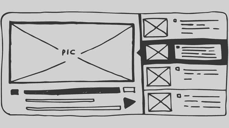
A slider is a term that refers to a slideshow on a website. An example of a slider can be a revolving carousel that displays products or photos. Web designers can incorporate sliders into all kinds of sites, but they are most useful for businesses wanting to show relevant content or showcase professional portfolios. When designers want to quickly show multiple options and help users sort through them quickly, a slider helps narrow down choices.
Why the Love Hate?
If you conduct a web search for sliders, near the top of the SERP, you will find critics who hate them, and just as many designers arguing in their favour. Here are some viewpoints on each side.
Critics argue sliders are confusing since they present users with several options at once, all of which have the same weight or importance. Since UX is about making choices clear, they say anything that creates confusion should be avoided. They also offer the following reasons they are bad UX:
- Visitors often view sliders the same way they do ads and skip over them.
- Sliders slow down pages, impacting SEO and conversion rates.
- Some sliders do not transition well to mobile.
- The space they take up reduces available room for other content.
- Sliders might give the impression that the company was not sure what to highlight, so opted to display all choices at the same time.
Some say a moving slideshow can have the same negative impact as auto-playing video. Instead of sliders, critics recommend using static images and copy.
Diagrammatically opposite, some designers love sliders and argue just as vehemently in favour of their use. Here are some ways adequately used content sliders can be good UX:
- They save space: Consolidate content so more is visible on one screen.
- Users stay engaged: Visitors linger in one place to view content, and visuals provide a break before continuing down the page.
- Sliders consolidate images: While media on the page can draw attention away from text, sliders put it all in one place to prevent distractions.
- Users control content: Always allow users to proceed through sliders at their own pace or skip them altogether if that’s not what they are looking for.
When to Use Sliders
While sliders are not right for every website, there are some they enhance. Start by analysing what your user is looking for and how each page of your website can help them toward completing that goal. If sliders solidify the brand and enhance the user’s trust, they can be a critical part of UX. If they create distraction and confusion, they will negatively impact conversions. Each organisation is unique, so what works flawlessly for some might have a detrimental effect on others.
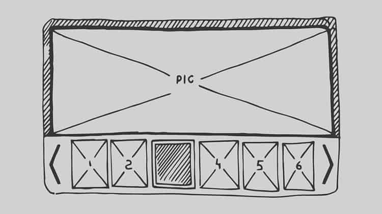
Avoid making sliders a distraction by minimising transitions and choosing soft fades instead of jerky horizontal slides. Make navigation easy with noticeable arrow buttons for moving backwards and forward. Allow mobile users to swipe. Optimise page load time by using the smallest possible image size and wait to load slides later in the carousel, since viewers may not require them.
Use Sliders for Product Tours
When site visitors see large chunks of information, it can be overwhelming. If you offer a product that works in a series of steps, use sliders to show the series and create a visual for the user.
For example, a company that uses smartphones to process credit card transactions might feature on its site a slider that shows a customer presenting the card as payment, an employee swiping it through the device, and funds being transferred to the desired account. What would have taken the user several minutes to read through text, they quickly understand through a slider in seconds. The same process can be adapted to user onboarding for new sites and mobile apps.
Make New Content Stand Out
First-time website visitors often want to know what their options are and what the website has to offer. Homepage content sliders provide a brief overview and allow visitors to make a decision quickly.
If you regularly update your site, sliders can emphasise updates. On news websites, the latest and most sensational material is usually the focus of their content slider. Every update stands at the forefront for as long as it is the latest news or newest offering. Users know at a glance when things have changed.
Present Photo Galleries
Sometimes a single image makes a powerful statement about your brand. Other times, a collection of images provides compelling evidence of an organisation’s quality, value and trustworthiness. A slider goes beyond simply displaying images. It both organises and displays images irrespective of whether you choose a photo gallery with several small images or screen after screen of full-page high-quality graphics.
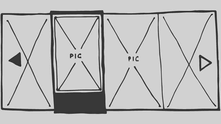
Photo galleries can be indispensable for organisations that sell real estate or cars. Home buyers want to see multiple photos of a home before they view it in person, and sliders allow them to quickly thumb through.
Car manufacturers present screen after screen of their vehicle’s elite features and innovative design to interest buyers in further details. Instead of having to select individual images, shoppers can quickly flip through. The reduced friction enhances user experience.
Display Portfolios Online
Artists, graphic designers and web developers often seek to demonstrate their products, skills and abilities. Clients want to see a taste or a brief overview that allows them to assess overall quality and tone. A slider enables designers to display work in a flexible format. Visitors can see as much or as little as they wish, but even if they do not stay long, they leave with a general impression.
Showcase Ecommerce Options
Online entrepreneurs can display a few of the company’s most popular or recognisable products to draw users in, emphasise new varieties or flavours, or show categories to make it easier for users to shop. Designers who research e-commerce web design trends for better sales know some of the most effective layouts use a minimalist approach and plenty of white space, so the slider is allowed to shine.
Test for Effectiveness
Sliders are useful if they tell a story and leave control over viewing with the user. If you are not sure if your slider improves user experience, test it. If you are just designing your page, run an A/B test to see how users interact with the slider and which version they prefer. See which version had the higher conversion rate or increased revenue.
If the slider is on an existing page, track user interaction and click-through data. Note the point at which clicks begin to diminish. Often interest wanes as users proceed through multiple slides. This can be because designers usually put the most compelling content first, but if subsequent material fails to hold user interest, it just slows page load times.
In Conclusion
Each site is different, and each receives different types of visitors. Designers who start with what the user needs and design content around their preferences and interaction style use a wide range of tools to present content. When used correctly, sliders can be implemented to create an even more immersive browsing experience.
Source: Usability Geek
Author: Alan Smith