
Animation is not just for cartoons anymore. From full-screen moving images to small hover effects, touches of animation are popping up everywhere. Animation is trendy, fun and user friendly.
And the obstacles to using animation have started to fall. With most users on high-speed connections and the ease of creating anything from simple movements or a silly gif to several minutes of action, animations have become practical and useful web design tools.
Animation Basics
Animation happens when something created in still or two-dimensional form is “brought to life” and appears to move in a way that follows laws of physics. It’s the way a cartoon character walks across the screen or how an app icon bounces like a ball while it is loading on the desktop of your Mac.
One of the words that is almost synonymous with animation is Disney. In the early 1980s, two of the companies’ top animators wrote a book detailing the 12 principles of animation. The “Illusion of Life: Disney Animation” by Frank Thomas and Ollie Johnston still provides the framework for animation today.
- Squash and stretch
- Anticipation
- Staging
- Straight Ahead Action and Pose to Pose
- Follow Through and Overlapping Action
- Slow In and Slow Out
- Arc
- Secondary Action
- Timing
- Exaggeration
- Solid Drawing
- Appeal
Web animations are often saved as GIF, CSS, SVG, WebGL or video. They can be anything from a simple underline that appears when you hover over a word to a full-screen video or background image. As with any other design technique, animations can be subtle or they might be in your face and hard to avoid.
Emerging Trend of 2017

Animation in web design is something that we are starting to see more of every day. The key to animation as a design trend is moderation. Small, simple animations are engaging and interesting; the user might not even think about their being an animation at all. Large-scale animations can be an interesting visual that pull you into the design. But if you start mixing up too many different moving effects, it can cause complete chaos.
What makes animation trendy is realism. In today’s design landscape with so many flat and minimal style designs, users need more cues to tell them what to do. Simple bits of animation can guide the user without changing the aesthetic. It helps add instruction and order to design schemes that may be too simple visually to provide enough direction for users. In this instance animation creates a happy medium between stripped-down simplicity and usability.
The other contributing factor to this trend is access to tools on the back- and user-ends of the design. You don’t need Flash for more complicated animations anymore. (And if you are still building in Flash, it’s time to stop.) It can be accomplished in a number of other ways. Today’s animations don’t bog down websites or web servers, making effects quick to load for users and with high-speed internet access animations don’t skip of get stuck midway through the event cycle.
Large vs. Small Animations
When it comes to animating for the web, it falls into two equally easy to understand categories: large and small. (You can probably guess how these look.)
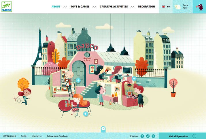
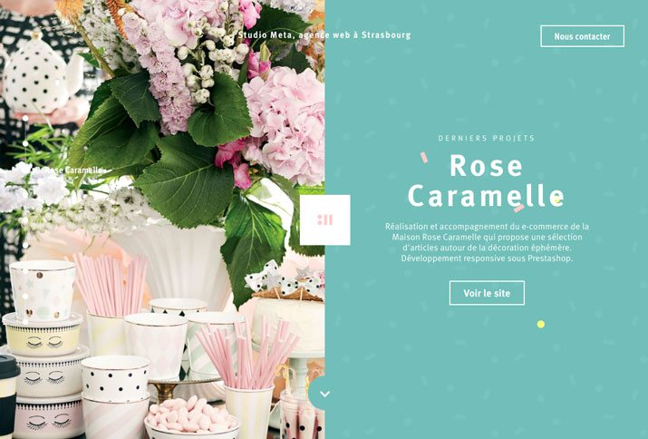
Large animations are ones that have a scale to them. Often in the form of a video with a run time, large-scale animations fill a significant portion of the screen and are characteristic of a short movie. These animations serve as a focal point in the overall design. Users often don’t have to perform any action to see the animation in motion. If you watch closely in the Studio Meta site, each of the large images zooms as you read the copy.
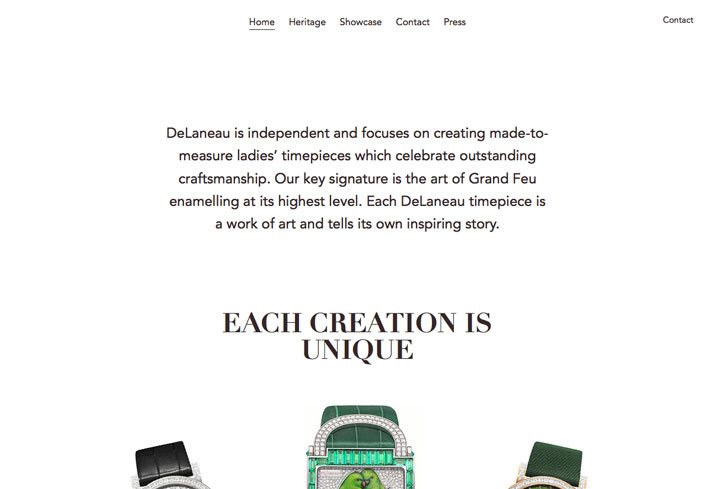
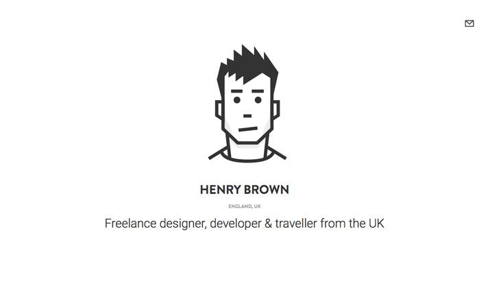
Small animations are the little bits and pieces that you discover as you start interacting with a website. These divots might be in the form of hover states, tiny bits of ornamentation or usability guides or tools. Small animations are an accent that contribute to the overall aesthetic, but are unlikely to be the focus of the design. In the site for Henry Brown the simple animation is that if you look closely, the eyes in the illustration actually blink.
When to Use Animation
The problem with every trend, including this one, is knowing when to use it. Animation can be a great little trick for your design tool kit, but is not for every project. Animation should be smooth and seamless, not jumpy or mechanical. It needs to serve a purpose for the user and not get in the way of the content.
The primary reason to use animation is to increase usability. Simple animations can be great guiding tools to help people understand what buttons to click or where to go next in the map of a website. Many designers using complex scrolling effects pair a simple animation with a user tool to scroll or click. (This includes everything from a simple bouncing icon or words that pop up an say “scroll down.”)
Usability comes in a few forms:
- Communication function or how to use a website
- Show change, such as filling in a form correctly or highlighting that an element is clickable
- Create flow or direct users to a call-to-action
The second reason to use animation is an aesthetic one. Animation can be a great “decoration.” Sometimes the goal of an animated element is purely visual and that is an acceptable use. This decorative animation can help tell a story or create an emotional connection between the interface and the user. The purpose of an animation can be to spark visual interest and keep a user engaged with your site for a longer period of time.
When creating a purely visual animation consider what it is supposed to do. Think about the connection you want a user to have. Is it supposed to be fun or surprising? Is it a bit of unique content that is designed for sharing? Even a pure visual should have a goal.
Resources
Ready to start animating? Here are a few resources for further reading and tools to help you get started.
- The Illusion of Life video shows each of the 12 principles in a way that’s easy to understand.
- ”Web Animation at Work” from A List Apart is a great resource about what makes animation work.
- The “Beginner’s Introduction to CSS Animation” shows you how to turn a square into a circle using CSS properties.
- Elastic animated SVG elements is a tutorial on how to integrate and animate an SVG component.
- The Art of UI Animations presentation by Mark Geyer uses animation to explain the concepts.
- ”15 Top HTML5 Tools to Create Advanced Animation With” is a great next-level step and list of tools if you are already understand the basics.
- The Animator’s Survival Kit teaches basic principles that apply to all forms of animation.
Conclusion
When it comes to animation, the rule of thumb is this: Good animation will make the user’s experience better. This can be in the form of an emotional connection – such as a fun, positive experience – or by making a site easier to use.
Animation is a fun technique that is become much more standard for a variety of applications. If you are looking for inspiration, make sure to go back through this article and click the links to the visual examples throughout, visit the sites and play with the animated features therein. Have fun!
Source: Design Shack
Author: Carrie Cousins