Welcome Guest
Login
 
 
Forgot password?
   

Job Seeker|Employer
UXD Jobs News & Events

Publish your UX related news & events. Mail to publish@uxdjobs.com.


Don’t Make Me Think – Key Learning Points for UX Design for the Web

Don’t Make Me Think is the title of a book by the HCI and Usability engineer Steve Krug. It teaches UX designers how to deliver great user experiences in a very simple and accessible way. Since its release in the year 2000 it has become one of the defining texts in the industry and an invaluable guide to UX professionals around the world.

Don’t Make Me Think was written by Steve Krug to help people think like usability experts do. It was designed to be short, concise and very much to the point. The idea being that if it can be read in less than 2 hours and covers all the most important concepts of usability; it would be much easier to get people who don’t normally have responsibility for UX to get on board with the ideas and to promote them from within their organizations.

Author/Copyright holder:Austin Kleon. Copyright terms and licence: CC BY-NC-ND 2.0

This has made it one of the most popular books in the UX and usability field and to date it has sold nearly 500,000 copies and been published in 20 different languages!

Steve has also written a sequel; Rocket Surgery Made Easy is a practical guide to usability testing that can be used by just about anyone to examine their web site, software or app to see that their products are as usable as possible.

Key Ideas from Don’t Make Me Think

We strongly recommend that you read Steve’s book. It really is incredibly short and it will ensure that you get a strong grounding in usability without spending half your life studying the research that surrounds the area. As a way of introduction (or refreshment if you have already read the book), here are some key lessons in the book that are worth highlighting:

Usability Is…

Usability is simply the idea that a normal person should be able to use your products without finding the process frustrating or annoying. Usability is making sure things work well and are easy to use. Spoons, for example, are incredibly usable .

Author/Copyright holder: Scott Bauer. Copyright terms and licence: Public Domain

Self Explanatory is the Way Forward

Whenever a user opens an app or a web page they should be able to tell you at a glance what it’s for. It should be as obvious as can be what the purpose of things is.

Don’t Make Me (or Anyone) Think

If you make people think, you make them unhappy. Users don’t want to treat your site or app like some sort of cryptic crossword – they want to know what they should do immediately and then do it. The more you make people think, the more likely they are to go elsewhere to get the job done.

Time Wasting Sucks

Author/Copyright holder: PROangie werren. Copyright terms and licence: CC BY-ND 2.0

People go online to save time not to spend it. If you waste people’s time they move on. This should be obvious when you think about the fact that even page loading times are considered in Google ranks.

Let Me Go Back

As long as the back button works, mistakes don’t matter too much from a user’s perspective. The back button is the most used feature on the internet today. Make sure people can get back to where they started if they get lost.

People are Habitual

If something works well – people will tend to stick to using that. Even if there’s a better way to do something out there – it’s unlikely that they’ll go looking for it. That doesn’t mean that they won’t eventually have it called to their attention but if you make things usable; you make them sticky.

Get to the Point

Again with the time saving – people don’t look for pleasantries on the internet; they want to get to the point. Make sure your sites and apps do just that.

Some People Love Search

You need to have a search facility within your web app or site. There’s a certain group of users who have become search-dependent. If you don’t give them the option; they’ll go elsewhere.

Author/Copyright holder:Panagiotis Georgiou. Copyright terms and licence: CC BY-NC-ND 2.0

People remember the experience of interacting with web sites and applications. They learn where to find what they want and how to do what they do. When you mess with the site map – you mess with their ability to recall these steps and make things confusing for returning users.

Show Them the Way to Go Home

The home button is the ultimate emergency exit for users. If they get really, really lost and even the back button isn’t helping – they need a single click to get them home. Make sure it’s obvious and immediate.

The Take Away

Don’t Make Me Think is all about simple ideas and simple ways to put them into practice. Of course, there’s more to usability than Steve’s brilliant guide can contain but all the major fundamentals for UX designers are there and they’re very easy to get at. Usability is one of the four main building blocks of UX (along with desirability, value and adoptability) and it’s vital to get to grips with it to build awesome apps and websites.

References

Don’t Make Me Think by Steve Krug can be purchased at Amazon here (please note the Interaction DesignFoundation is not an Amazon affiliate and does not receive any commission on purchases made) – http://www.amazon.com/Dont-Make-Think-Revisited-Usability/dp/0321965515/ref=dp_ob_title_bk

Hero Image: Author/Copyright holder: keso s. Copyright terms and licence: CC BY-NC-ND 2.0

Posted in Uncategorized | Tagged | Leave a comment

HOW TO DESIGN GESTURE-DRIVEN UI

Remember the days when hovering and clicking with the mouse were the most used triggers for interaction with a site or app? Those days are gone. When Apple introduced the first iPhone, multi-touch technology became mainstream and users learned that they could not only point and tap on the interface, but also pinch, spread, and swipe. Gestures became the new clicks.

Today the success of a mobile UI can be made by how effectively it uses gestures.

How to Choose a Good Gesture

When it comes to incorporating gestures in your UI it’s essential to know your market and the other apps your target audience may be using. Try to employ the same types of gestures in your app. This way, you aren’t only optimising your UI based on your target market’s behaviour, but also designing a more comfortable approach for users right from the beginning.

Teaching Gestures

Gestures are a must in every mobile app but it’s always a challenge to make them obvious for users. Touch interfaces provide many opportunities to use natural gestures like tap, swipe and pinch to get things done, but unlike graphical user interface controls, gesture-based interactions are often hidden from users. So unless users have prior knowledge that a gesture exists, they won’t try.

Therefore design for discovery is crucial. You need to be sure you provide the right cues—visual signifiers that help users discover easily how they can interact with an interface.

Avoid Tutorials and Walkthroughs During Onboarding

Tutorials and walkthroughs are quite a popular practice for gesture-driven apps. Incorporating tutorials in your app in many cases means showing some instructions to the user to explain the interface. However, a UI tutorial isn’t the most elegant way to explain the core functionality of an app. The major problem with upfront tutorials is that users have to remember all of those new ways of using the app once they get in. Too much information at once might lead to more confusion. For example, the Clear app starts with a mandatory 7-page tutorial and users have to patiently read all the information and try to commit it to their memory. That’s bad design because it requires users to work upfront even before they actually try the app.

1

Educate in Context of the Action

When it comes to teaching users to use your UI, I would recommend doing so mainly by educating in the context of the action (when a user actually needs it). In order to teach people a new gesture you have to start slowly. Given some iteration, instructions can be transformed into a more gradual discovery. Use just in time tips and focus on explaining a single interaction rather than trying to explain every possible action in the user interface. Hint at gestures by providing obvious, contextual clues.

Below you can see a gesture education screen from the YouTube app for Android. The app has a gesture-based interaction but doesn’t use a tutorial to instruct users. Instead, it uses hints that appear on the first launch for new users, one at a time as the user reaches the relevant section of the app. The technique is based on text commands which prompt users to perform a gesture and describes the result of the interaction with a short and clear description.

2

Use Animation to Communicate Gestures

Gestures, usable as they are, would be nothing without animation. As a designer, you can make use of animation to convey information about available actions. For example, in order to make users aware that they can interact with a certain element, you can create a text command right on the interactive element and animate the result of interaction as shown in example below.

3

There are three popular techniques to help educate users, based on the use of animation. The first is a hint motion. Hint motion, or animated visual hint, shows a preview of how to interact with an element when performing the action. It aims to create associations between the gesture and the action that it triggers. For example, Pudding Monsters’ game mechanics are based solely on gestures, but they allow users to get the basic idea of what to do without having to guess. Animation conveys information about functionality—a scenario is showcased with animation and it immediately becomes clear to users what to do.

4

A second technique is content teases. Content teases are subtle visual clues that indicate what’s possible. An example below demonstrates a content tease for cards—it simply shows that other cards exist behind a current card and this makes it clear that swiping is possible.

5

The third and last technique that I would like to mention is affordance. You can give some elements of your UI a high affordance to point users to features in an interface, and use bounces or pulses as an indicator of an available gesture. An example of this technique can be found in Apple iOS. When a user taps the camera icon, the lock screen bounces up, revealing the camera app underneath.

6

Conclusion

While it’s true that touch gestures are mostly invisible to us, there are a number of design techniques that can give users a peek at what’s possible. Just in time tips, animation cues and content teases are some of the ways hidden gestures can be revealed.

Posted in Knowledge sharing | Tagged , | Leave a comment

Prototyping in Design Thinking: How to Avoid Six Common Pitfalls

The Design Thinking process cannot be done without prototyping and testing. However, for companies or teams unfamiliar with the Design Thinking method, there might be some common mindsets about prototyping that potentially undermine its effectiveness in helping you craft the optimal design solutions. Let’s look at six of the most common misconceptions about prototyping, and how to combat each so that you can avoid these pitfalls and build better products or services.

If you were not (or if your team is not) familiar with Design Thinking, you might have some ideas about prototyping — what it’s meant for, when it should be done, etc. — that are actually counter-productive to the process. Thankfully, we have listed below six of the most common misconceptions or incorrect mindsets, as well as solutions to each to help you reframe your mindset or rethink your process. Let’s get started!

1st Pitfall: Diving into the First Good Idea

It’s attractive to want to grab at the first glimmer of light you see and run with that as your final solution. This is often inspired by a senior manager, not necessarily involved in the process of prototyping or ideation, who might not have enough understanding of how it works. Often, teams try to save time and move headlong into implementing their very first promising idea.

This leads to an issue, because most problems we are trying to solve are more complex than they look on the surface. The way people behave, constraints in the environment, and a thousand other factors might cause matters to turn out differently from your or your team’s expectations. A promising idea, pushed all the way into a fully formed solution without any prototyping or validation, may turn out to have a couple of assumptions wrong (if you are lucky). The result is a solution that doesn’t work, and lots of time and energy wasted.

Solution: Explore a Range of Different Approaches First

One of the keys of successful prototyping is working through a number of models and exploring different approaches, before finally including the best characteristics and removing the problematic ones for the final solution. Test out many ideas. Test them by building prototypes — no matter how rough and simple — and test them on team-mates, internal stakeholders, and users. Test many alternatives even within one idea, explore variety, and don’t discount possibilities until you’ve tested them. Most times, you will be inspired to create more ideas, or merge a few solutions into a better and more successful one, by testing alternative ideas and making quick and dirty prototypes.

2nd Pitfall: Falling in Love with Your Prototypes

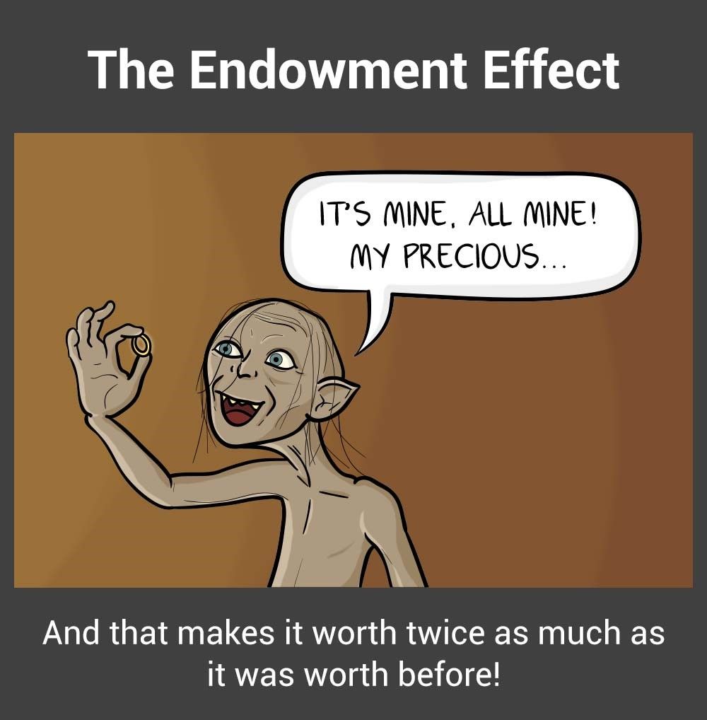
The endowment effect, otherwise referred to as “investment bias”, can interfere significantly with the value derived from prototyping. The endowment effect happens when people ascribe more value to an object simply because they have ownership over it. In prototypes, the endowment effect can create the dangerous situation wherein prototypes become too “precious” to fail or give up on.

This is when the creators of a prototype becomes overly invested in their creation, resulting in their overlooking of faults and insistence on implementing the current model due to the amount of time, effort or resources invested in creating the model. It can happen when designers become too emotional about prototypes or ideas that they have conceived, even when it becomes clear that the ideas are problematic. This usually happens when designers spend too much time creating and perfecting a prototype, when a rough and dirty model would suffice. Additionally, executing early prototypes at too high a fidelity may result in this kind of bias. If we were to do this with a prototype, the effort we’d put into making it as realistic and looking as refined as possible (without reckoning on refining the actual faults in it) might help us dupe ourselves into believing we’d landed on a miracle discovery—a winner that would be sure to resonate with users. Usually, low-fidelity prototypes, such as paper mock-ups or sketches, are sufficient for early stage testing. Only towards the end of the project do you need to create higher-fidelity prototypes that require more energy and time investment.

Author/Copyright holder: Teo Yu Siang and Interaction Design Foundation. Copyright terms and licence: CC BY-NC-SA 3.0

Avoid the endowment effect by creating quick, low-fidelity prototypes using cheap materials.

Solution: Start with Cheap and Fast Prototypes

Start simple. Make quick and fast prototypes. Make use of low cost, readily available materials in early-stage, low-fidelity prototypes. Always make sure that your prototype has just the level of detail required for what you are testing for, never too much. This would prevent you or your team-mates from becoming too attached to a prototype.

Also, be prepared to break, completely destroy or throw those models away once the questions they pose are answered. You can achieve this mentality by using low-cost materials in your prototypes. Test out a number of ideas and models as rapidly as possible in order to avoid becoming anchored to one stream of thought. Having an expendable prototype is a million times better than having an expendable concept—i.e., one that won’t latch with anyone, least of all your usership, no matter how fancy the model of it looks.

3rd Pitfall: Wasting Time Explaining and Pitching

Another problem you should avoid is spending too much time pitching and explaining ideas — and too little time making things and figuring out issues with and challenges to your ideas. This results in a theoretical focus and could lead to moving forward with ideas that you will not have tested. Show; don’t tell. To explain how a solution works, create a model and show how it will work. If you are unable to show it working, you may find there are holes in the idea — and that’s a learning opportunity right there!

Solution: Have a Bias Towards Action

Embrace the bias towards action mindset by opting to show the value of the ideas instead of telling everyone how great your combination of these notions will be. When you build simple prototypes to show what your ideas are, you also make them much easier to understand and allow others to build on them. Illustrate what you want to explain physically. It’s the best way to know whether you’re on to something or not.

For instance, when IDEO was approached by Gyrus ACMI, a medical visualisation and energy systems company, the team met with specialist surgeons so as to understand their needs better. After one of the surgeons explained (or tried to explain) how their surgical instrument could be improved, an IDEO designer immediately created a rough prototype of the idea. The team was able to understand instantly what the surgeon meant, and the discussion was brought forward, thereby saving the team many more meetings. Prototype to show, because showing is much more productive than telling.

4th Pitfall: Prototyping Without a Purpose

Rushing a promising idea into a solution is a bad idea, but creating prototypes without a purpose is equally bad. Prototypes exist for a reason: to test and validate assumptions, test our ideas for solutions, or explain and flesh out ideas. Prototyping for the sake of prototyping can result in a lack of focus, or prototypes with too much detail (i.e., a waste of time) or too little detail (i.e., ineffective in tests).

Solution: Have a Question in Mind

Before you create a prototype, ask yourself, “Why am I creating this prototype?” Make sure you have a central purpose (i.e., to test my assumption X, or to test the usability of my solution, etc.), and then build your prototype to match that purpose. For instance, if you need to test your assumption that your users will not be willing to use a piece of equipment heavier than 2 kg, then you might not even need to create a functional prototype. Simply create a prototype that weighs below 2 kg, and another that weighs above 2kg, and test both on users. You’ll save time by creating prototypes at the right level of fidelity, and still be able to learn exactly what you want to learn.

5th Pitfall: The Failure Roadblock: Feeling Discouraged by Failed Prototypes

When prototyping, you might feel a sense of failure at times. This is because the steps involved in prototyping might fall into what we generally label as “failure”, especially when tests reveal your false assumptions. However, being disillusioned when your ideas don’t work out can cause a negative state of mind and inhibit progress. The point of prototyping is to ensure ideas will work and to validate the assumptions made when conceptualising the ideas. To be productive when prototyping, we should unlearn what we are taught about failure. When doing Design Thinking, you should embrace the right kind of failure. Failure provides massive learning opportunities, which will eventually lead to new insights and eventual success.

“Fail faster, succeed sooner.”
— David Kelly, founder of IDEO

Solution: Reframe the Idea of Failure

Author/Copyright holder: Teo Yu Siang and Interaction Design Foundation. Copyright terms and licence: CC BY-NC-SA 3.0

“I have not failed. I’ve just found 10,000 ways that won’t work.”
– Thomas A. Edison, American inventor who developed the motion picture camera and the electric light bulb.

Reframe the idea of failure in prototype testing into a learning mentality. Remind yourself that wrong ideas and failed prototypes allow you to learn more than successful tests and prototypes do. Embrace the principles of learn methodology by working validation into every decision that you make or have a hand in making. Validation reframes the concept of failure and makes it part of the process of learning instead of being a destructive influence. When you think of prototypes and tests as learning opportunities, you set yourself up for a kind of positive failure that leads to a new, more informed experiment.

6th Pitfall: Seeing Prototypes as a Waste of Time

By constantly having to build prototypes for every idea and assumption that you have, wouldn’t you be wasting time? Many times, designers and teams who are not used to Design Thinking feel that prototyping is a waste of time and resources. “Wouldn’t building prototypes slow us down?” they ask. “Wouldn’t we be better off to stay focussed on the drawing board before we get around to putting things together in the real world?”

The truth is the opposite. Although we might spend time when we build prototypes, they actually allow us to move faster in the long term. It’s because, through prototyping, we are able to see whether our ideas would work out, and be able to refine or tweak them further… or abandon them when we’ve realised that what seemed good on paper won’t hold water in the sea of harsh reality and unforgiving consumers. In the long term, we will be able to reach the ideal solution faster.

Solution: Adopt a Long-Term View

Build with a long-term view in mind. When making prototypes to test your assumptions or learn about your users, remember that the small amount of time you are spending now will help you save days and even weeks of time in the future. Communicate to internal stakeholders who may be concerned about the time “wasted” on prototypes, so the whole team (and ideally, the whole company) is on the same page. It may be counter-intuitive, but spending time on prototypes will save you time. Tim Brown, CEO of IDEO, says it best: “They slow us down to speed us up.”

The Take Away

Prototyping is crucial in every Design Thinking project. However, there are pitfalls that could undermine your efforts to let prototypes work for your team. Specifically, you have six of these to avoid, everything from becoming discouraged by the insight-giving nature of failed prototypes to putting inordinate amounts of effort into your first prototype and clinging to it because it seems infallible. Learn to embrace the idea of constantly and rapidly prototyping, and make sure you have the right mindset when making prototypes. The old saying goes that nothing is more powerful than an idea whose time has come. That may seem all very well, but a series of prototypes will bring such an idea into the real world where people can make it truly powerful.

References & Where to Learn More

Tim Brown, Change by Design: How Design Thinking Transforms Organizations and Inspires Innovation, 2009

Peter Manzo. Sep. 23, 2008. Fail Faster, Succeed Sooner. Stanford Social Innovation Reviewhttp://www.ssireview.org/blog/entry/fail_faster_succeed_sooner/

Tom Kelley and Dave Kelley, Creative Confidence: Unleashing the Creative Potential Within Us All, 2013.

Hero Image: Author/Copyright holder: Unknown. Copyright terms and licence: CC0

Posted in Knowledge sharing | Tagged , | Leave a comment

9 CONSUMER PSYCHOLOGY TACTICS TO IMPROVE CONVERSIONS

When it comes to first impressions, design is everything. From colors, copy on buy buttons, to the layout of a website.

Tapping into what makes brains tick is important for this, and certain aesthetics as far as design goes are much more persuasive if you want the visitors to take some kind of action on your website.

When you combine behavioral and brain science with practical experience, you will get a much deeper insight into how and why humans behave like they do, and what you can do to get them to do what you want on your website.

What is Consumer Psychology?

Understanding why and how individuals evaluate objects and events is one of the main aims of consumer psychology.

Numerous studies have gotten us to an understanding that those choices and evaluations aren’t only driven by the value and quality of an object, but by internal factors, such as subjective perceptions, as well.

People may abandon a website due to numerous reasons. If you’re lucky, they will come back and finish whatever they started, but this seldom happens and people just forget about it. Abandoners can actually be hot prospects, and you’ll find that companies spend a lot of money to re-engage them, in order for them to come back and finish what they started.

1. Use Psychological Distance

The way we construct an object, cognitively, is impacted by our conceptual distance from that object.

Low-level construal will relate to the specific, concrete features, such as price, function, color, and size, while the high-level construal will relate to the experience one has with that object, as an abstract concept.

If you describe a broken link as unclickable, that is low-level construal. However, if you describe that the interaction leads to frustration, that is high-level construal.

2. Understand the Primacy Effect

The primacy effect tells us that whenever we have a choice between a list of things, our brains will remember the first couple of things more than the ones later on.

Things that are at the beginning of a list are regarded to be more important. One of the major reasons this works is because an individual will pay more attention at the start, and later on drift off, because their brain is either bored or tired.

3. Design for Humans

One often overlooked concept when building your website is to design for humans first. More importantly, design for your specific target market first.

Does your product, be it an app, or a website, or software, engage your audience?

Does it push people into taking action?

If something makes sense to you, that doesn’t necessarily mean that it’ll make sense for a visitor, or your business. Your visitor’s behavior on the page is directly related to how their body and mind respond to the combination of copy and design you have placed in front of them.

4. Color Influences Shoppers

You will find it fascinating that certain colors can actually convey different actions and emotions.

001

Mostly due to the fact that personal preference, history, and other things, can influence the meaning of certain colors, has led to there being a lot of theories about color.

Red might mean one thing to me, and a completely different thing to you, so understanding the color theory fundamentals is pretty important.

5. Decision Making Can be Simplified with Contrast

Two of the biggest enemies of our brain are complexity and ambiguity. If a visitor has too many options, that can stifle their process of making a decision, and lead to them abandoning your website simply because they had too overwhelming a decision to make.

Some services or products are complicated by themselves, and you should go with a softer approach that will support the process of making a decision, instead of focusing on pushing the sale.

002

Our brains love clear contrast and simplicity, and that knowledge can be used to push your visitors towards taking an action.

HICK’S LAW DICTATES THAT TOO MANY OPTIONS MEAN NO DECISION

Have you ever found yourself at the grocery store, trying to decide which kind of chocolate to go for? That same thing happens to your visitor when he has far too many options.

003

This can be too much for a visitor to handle, regardless of whether you have too many products, or too many images, or too many shipping options.

They will leave, not complete a purchase, and not take the desired action.

6. Informational Social Influence

This (aka social proof) is a phenomenon that dictates that in order to conform to their choices, people will adopt the actions of others. Social proof has a lot do to with a herd behavior.

You’ll find that our brain goes where other people are going, and the decision-making center of our brain has a direct link to the area which is responsible for rewards and social learning.

Seeing what choice someone else made, will activate that center and cause us to follow their lead.

004

7. Nudge Visitors Toward Making Smaller Commitments

A visitor will often abandon your site because they aren’t ready to buy yet. Over half of online shoppers actually use the shopping cart to see how much the total costs are. And, the same number of shoppers actually add items over several visits before they check out.

Although they may convert later, you’ll find that the Foot in the Door technique can help their decision to buy from you. This will involve you asking for small commitments first, before moving on to things that require a larger commitment.

8. Faces are Sincere and Humanizing

Who doesn’t want to see a smiling face?

It is most likely one of the most pleasant, familiar things in the world. It is one of the rare things that everyone understands, regardless of their background or the language they speak.

Our brains actually have cells that only respond to faces, a part called the Fusiform Gyrus, and there isn’t a single other object that can get this part of the brain to spark.

005

So, if you have a picture of someone that is looking directly at what you want your visitor to pay attention to, that may very well help you.

9. Encourage Visitors to Complete with the Illusion of Progress

You might’ve seen frequent buyer cards that have a few items pre-stamped on them, and you may be wondering what is the psychology behind that.

A study has actually shown that people who get pre-stamped cards actually buy more frequently than those with empty cards.

The existing stamps will give your customers a feeling of being closer to their goal. This will motivate them to complete their card, and reach the goal. This same principle can be used to get your abandoners to come back and finish their purchase.

Final Thoughts

Now that you have a few design tactics to implement, you can go ahead and get started with them, putting them into play.

When you’re looking at your website data and the abandonment history, you’ll find some visitor journeys a little illogical. However, psychologists have actually shown that a lot of consumer behavior tendencies aren’t only explainable, but also predictable.

If you understand these tendencies, you can easily develop a strategy that works with these mental processes, instead of against them. If you know what will make your visitors tick, that is the key to developing a remarketing message that will make them click.

SOURCE : webdesignerdepot.com

AUTHOR : Bogdan Sandu

Posted in Knowledge sharing | Tagged , | Leave a comment

Key Question in User Experience Design – Usability vs Desirability

The question of what usability is compared to desirability comes up a lot in UX design and it’s important to be able to distinguish the two. Why? Because usability is the base level of the user experience and without usability it is difficult to create a worthwhile user experience; however, without desirability it is unlikely that the user experience will leave a lasting mark on the user and the UX may not be memorable or recommendable to others.

There are four simple levels of User Experience as defined by the Nielsen Norman Group Conference in Amsterdam in 2008. They are:

  • Utility
  • Usability
  • Desirability
  • Brand Experience

The two levels which the user experience designer has most control over are usability and desirability. But first let’s take a look at each level in turn before examining why the difference between usability and desirability matters.

1. Utility

The very first step of the user experience is utility. The questions that must be answered for a product to have utility are:

  • Is the product useful to the user? Does it have a purpose that the user accepts? (In short the product must not be a solution in search of a problem but rather one that solves an established problem the user is looking to solve).
  • Does the product meet the needs of the user? (A product can solve a problem but still not be of any value unless it meets the user’s requirements in other areas – such as cost or size).

Without utility it’s pretty clear that there is no user experience. A potential user who does not see a product as any value to them or does not perceive that product to meet their needs is not going to become a user in the first place.

Author/Copyright holder: Jon Duhig. Copyright terms and licence: CC BY 2.0

2. Usability

Usability is the next step up the user experience ladder. It answers the question (positively):

  • Is the product easy and intuitive to use? (Many a great idea has failed when translated into a product by falling at this hurdle – a user only has so much time, if they can’t quickly get to grips with using a product – they will abandon it and move on).
  • Does the user like the way that this product looks and feels?
  • Does the user want this product more than similar products

Usability was often mistaken for the user experience until fairly recently. The assumption, that a product which solved a problem (e.g. it had utility) and was easy to use (e.g. it had usability) was enough for users, was a sensible idea but it turns out that this is not enough. The user expects more from a user experience and products that go beyond the usability phase are those that compete best in their market place. Apple’s iPod, for example, was not the first MP3 player. It may have had slight usability advantages over existing products but these advantages were not sufficient to propel the iPod to a world-changing market leading product; it was moving up the value chain of user experience that enabled that.

3. Desirability

Which brings us to desirability. There are some big questions associated with this level of the user experience:

In any category of product, there are many competitors. Assuming that the market for the product is established; it’s likely that almost all products within the marketplace pass both the utility and usability tests. It is the desirability of the product which separates market leaders from the pack.

It is also desirability which commands a premium in market places. Think about cars, for example, a Skoda and a BMW may both have utility and be usable but there’s a significant difference in their desirability by users.

Desirability enables the user experience designer to add “cachet” to a product which would otherwise be lost in amongst other similar products in terms of utility and usability.

Author/Copyright holder: M 93. Copyright terms and licence: CC BY-SA 3.0

4. Brand Experience

Brand experience is, to a large extent, outside of the user experience designer’s control. However, brand experience is intimately connected to the desirability of products and it might even be argued that it is not separate from desirability. Brand experience answers the question:

  • Does the user feel good about the product and the company/brand that makes it?

This may explain why Microsoft has had such a hard time breaking in to the hardware market an area in which Apple, for example, excels. Windows may be the dominant operating system on the desktop but it would be hard to argue that Windows users feel good about that. Whereas Apple users do, and are highly vocal about, feel good about the operating systems of our their devices.

Apple’s brand increases the desirability of their physical products – the company has a great reputation for flawless design (there are, of course, plenty of arguments to suggest that this reputation is not always deserved but the reputation remains nonetheless). Microsoft’s reputation for Windows products is less salubrious – not because Windows products don’t work but for every great release (Windows XP, or Windows NT) there’s a poor one to contend with (Windows 7 or Windows ME).

Author/Copyright holder: Soft 9000. Copyright terms and licence: CC BY 3.0

Usability vs Desirability

As UX designers, we have major influence over these two areas of the user experience. The key difference between the two is that usability is a minimum requirement – there is no user experience without usability. Desirability changes a product from usable into something that a user wants to use.

It is important in today’s always connected world, to consider mobile when measuring usability and desirability. While many of the ways we examine mobile products are the same as the way we examine desktop products – mobile products should be examined for usability and desirability in context of their use. (E.g. where and when and how will a mobile product be used?) This is more important on mobile because desktop products tended to be used in fixed places – mobile can be used anywhere.

The Take Away

Usability is the bare minimum requirement of delivering a decent user experience. Desirability is what separates a great product from an average one – it focuses not just on ease of use but the idea that a user can want to use a product in preference to another. Utility, is an essential but one to be considered before design commences. Brand experience is something likely to be outside of the user experience team’s control and to lay more within marketing’s purview.

References

A good examination of desirability with the UX context can be found here – http://definedesirability.tumblr.com/post/76836338838/usability-vs-user-experience-ux

You can discover the key differences between usability and UX here – http://usabilitygeek.com/the-difference-between-usability-and-user-experience/

This presentation looks at how you bridge the gap between usability and desirability – http://www.slideshare.net/smercer0114/beyond-just-usability-desirability-and-usefulness-testing

Hero Image: Author/Copyright holder: Denlinkbarmann. Copyright terms and licence: CC BY-ND 2.0

Posted in Knowledge sharing | Tagged , | Leave a comment

HOW TO START YOUR DESIGN CAREER IN 2018

HOW TO START YOUR DESIGN CAREER IN 2018

May 2016 was when I started my design journey. start yours today!

Hello guys, My name is Henry and I am a Human-centered design advocate, The founder of a growing design agency in Lagos Nigeria, SENPAI, and I’m passionate about building a community of human-centered designers, developers, and creators. Hope this article helps you achieve greater things.

Designers have been in a very awkward space for a while now, stuck between pixel-pushers and font warriors. but things have begun to change as there are a “new” breed of designers breaking the barrier of mediocrity and stepping to the field to tackle bigger problems with “design thinking”. This is a trend that isn’t going anywhere anytime soon, designers are now taking the driver’s seat of innovation and we expect to see an increase in designers and the appreciation of design in the next couple of years.

So how do you get started as a designer in 2018?

1. Have a lot of empathy

Designers are simply people that have train themselves in the art of applying empathy to solve other people problems. This is the first step in the design thinking process.

In Design Thinking, empathy is, as explained in IDEO’s Human-Centred Design Toolkit, a “deep understanding of the problems and realities of the people you are designing for”. It involves learning about the difficulties people face, as well as uncovering their latent needs and desires in order to explain their behaviors. To do so, we need to have an understanding of the people’s environment, as well as their roles in and interactions with their environment.

This the foundation of every great designer and I would recommend we all spend more time here. here are some steps to help everyone gain more empathy for the people they are designing for

  • Abandon Your Ego
  • Adopt Humility
  • Be a Good Listener
  • Hone Your Observation skills
  • Care

“No one cares how much you know, until they know how much you care.”
– Theodore Roosevelt

  • Be Curious
  • Be Sincere
  • Ask What? How? Why?

2. Learn to see and draw

Before you begin to learn any design tools or any of the fundamentals of design you have to begin to train yourself to see good design and also be comfortable sketching as you would need this skill for rapid prototyping. These two are very important.

Learn to see

Looking back to when I first started designing, if there was a single thing I could go back and tell myself, that would be to train my design eye, my ability to critique and identify good design. — Jonathan Z. White

I personally learned how to see design by reading up about the design laws that apply to photography and also by following and being emerged with what I felt was good design.

Seeing not a passive act, but a conscious act of figuring out why something looks nice and why you may consider it to be good design.

It’s important to note the 10 principles of good design as you spend time looking and training your eyes.

Ten principles for good design by Dieter Rams

  1. Good design is innovative
  2. Good design makes a product useful
  3. Good design is aesthetic
  4. Good design makes a product understandable
  5. Good design is unobtrusive
  6. Good design is honest
  7. Good design is long-lasting
  8. Good design is thorough down to the last detail
  9. Good design is environmentally-friendly
  10. Good design is as little design as possible

Learn to draw

As a designer, you would have to be able to work with a vast amount of creative tools. but your most reliable tool would always be a pen and a paper. So you have to learn to get comfortable sketching out your ideas. I by no means expect you to start drawing portraits and crazy figures but you should be able to use simple lines and shapes to get your ideas into the world fast.

would recommend these resources

get the book You Can Draw in 30 days

How to Learn to Draw: Stage One, Manual Skills
We all used to draw as kids. It was easy back then, no matter if you used color pencils, a stick, or your finger on a…design.tutsplus.com

A quick beginner’s guide to drawing
6 drawing exercises to get you started right now!medium.com

3. Learn how to solve problems like a designer ( design thinking )

Designers are basically problem solvers. Your job as a design to apply the tools you have to solve problems. A global design company, IDEO, have created a system for design thinking that can be learnt and applied by anyone and everyone.

DESIGN THINKING

Design thinking is a human-centered approach to innovation that draws from the designer’s toolkit to integrate the needs of people, the possibilities of technology, and the requirements for business success.” — Tim Brown, President and CEO of IDEO

How to apply design thinking to your problem-solving process?

Empathise

The first stage of the Design Thinking process is to gain an empathic understanding of the problem you are trying to solve. This involves consulting experts to find out more about the area of concern through observing, engaging and empathizing with people to understand their experiences and motivations, as well as immersing yourself in the physical environment to have a deeper personal understanding of the issues involved. Empathy is crucial to a human-centered design process such as Design Thinking, and empathy allows design thinkers to set aside his or her own assumptions about the world in order to gain insight into users and their needs.

Define (the problem)

During the Define stage, you put together the information you have created and gathered during the Empathise stage. You will analyze your observations and synthesize them in order to define the core problems that you and your team have identified up to this point. You should seek to define the problem as a problem statement in a human-centered manner.

Ideate

During the third stage of the Design Thinking process, designers are ready to start generating ideas. You’ve grown to understand your users and their needs in the Empathise stage, and you’ve analyzed and synthesized your observations in the Define stage, and ended up with a human-centered problem statement. With this solid background, yourself and your team members can start to ‘think outside the box’ to identify new solutions to the problem statement you’ve created, and you can start to look for alternative ways of viewing the problem.

Prototype

The design team will now produce a number of inexpensive, scaled down versions of the product or specific features found within the product, so they can investigate the problem solutions generated in the previous stage. Prototypes may be shared and tested within the team itself, in other departments, or on a small group of people outside the design team. This is an experimental phase, and the aim is to identify the best possible solution for each of the problems identified during the first three stages.

Test

Designers or evaluators rigorously test the complete product using the best solutions identified during the prototyping phase. This is the final stage of the 5 stage-model, but in an iterative process, the results generated during the testing phase are often used to redefine one or more problems and inform the understanding of the users, the conditions of use, how people think, behave, and feel, and to empathize. Even during this phase, alterations and refinements are made in order to rule out problem solutions and derive as deep an understanding of the product and its users as possible.

for more about design thinking check out these resources

5 Stages in the Design Thinking Process
Design Thinking is a design methodology that provides a solution-based approach to solving problems. It’s extremely…www.interaction-design.org

Design Thinking
Design thinking utilizes elements from the designer's toolkit like empathy and experimentation to arrive at…www.ideou.com

Design Kit
Design Kit is IDEO.org’s platform to learn human-centered design, a creative approach to solving the world’s most…www.designkit.org

4. Learn the fundamentals of design

The fundamentals of design consist of the elements and the principles of design

Design elements

  • line
  • shape
  • form
  • texture
  • color

I would recommend you watch this video below :)

Principles of design

  1. BALANCE — Balance in design is similar to balance in physics. A large shape close to the center can be balanced by a small shape close to the edge. Balance provides stability and structure to a design. It’s the weight distributed in the design by the placement of your elements.
  2. PROXIMITY — Proximity creates a relationship between elements. It provides a focal point. Proximity doesn’t mean that elements have to be placed together, it means they should be visually connected in some way.
  3. ALIGNMENT — Allows us to create order and organization. Aligning elements allows them to create a visual connection with each other.
  4. REPETITION — Repetition strengthens a design by tying together individual elements. It helps to create association and consistency. Repetition can create rhythm (a feeling of organized movement).
  5. CONTRAST — Contrast is the juxtaposition of opposing elements (opposite colors on the color wheel, or value light/dark, or direction — horizontal/vertical). Contrast allows us to emphasize or highlight key elements in your design.
  6. SPACE — Space in art refers to the distance or area between, around, above, below, or within elements. Both positive and negative space are important factors to be considered in every design.

The principles of design
The elements and principles of design are the building blocks. The elements of design are the things that make up a…www.j6design.com.au

Now you are officially a designer and have learned the basics of design.


5. Now time to specialize in an area of design

There are different types of designers, most designers would have to wear multiple hats some just specialize in one. but here are your options for 2018.

Graphic Design

This is a term that describes an array of different kinds of designers. Think of it like the term “entrepreneur”. It describes a wide variety of businesspeople — from founders to VC’s to “Chief Ninjas” — but isn’t all-inclusive. Graphic designers work with graphical images, whether they be illustrations, typography, or images, and on a variety of media including print and web. Graphic design is typically rendered in 2D — printed on a physical surface or displayed on a screen but not limited to 2D.

As a graphic designer, you can specialize in the following

  • Logo design
  • Brand design
  • Print Designer

Interaction Design

Interaction designers, on the other hand, focus on digital products and interactive software design. Some examples include web apps like Facebookand Pinterest, mobile apps like Tweetbot, and operating systems like OS X. While graphic design is meant to be observed, interaction design helps humans experience or manipulate software or interface with screen-based hardware in order to achieve specific goals — checking email, withdrawing money from an ATM, or “Liking” a webpage (such as this one!)

“Interaction design is heavily focused on satisfying the needs and desires
of the people who will use the product.”

and can be broken down into two parts or the same whole

  • UI design — User interface design
  • UX design — User experience design

↳ User Interface Design

User Interface (UI) design is the design of software or websites with the focus on the user’s experience and interaction. The goal of user interface design is to make the user’s interaction as simple and efficient as possible. Good user interface design puts emphasis on goals and completing tasks, and good UI design never draws more attention to itself than enforcing user goals.

“The design process must balance technical functionality and visual elements to create a system that is not only operational but also usable and adaptableto changing user needs.”

↳ User Experience Design

User Experience (UX) design “incorporates aspects of psychology, anthropology, sociology, computer science, graphic design, industrial design and cognitive science. Depending on the purpose of the product, UX may also involve content design disciplines such as communication design, instructional design, or game design.”

The goal of UX design is to create a seamless, simple, and useful interaction between a user and a product, whether it be hardware or software. As with UI design, user experience design focuses on creating interactions designed to meet or assist a user’s goals and needs.

Industrial Design

Industrial designers create physical products designated for mass-consumption by millions of people. Motorcycles, iPods, toothbrushes, and nightstands are all designed by industrial designers. These people are masters of physical goods and innovation within the constraints of production lines and machines.

“The objective is to study both function and form, and the connection between product, the user, and the environment.”

Spatial design

Spatial design focuses upon the flow of people between multiple areas of interior and exterior environments and delivers value and understanding how user interact with spaces and also how the spaces affect the user’s emotions, perceptions, and feelings.

It goes really deep into understanding how space affects the humans in them

You can specialize in the following

  • Architecture
  • Interior design
  • Service design
  • Landspace design

6. Pick and learn your design tools

As design has started to evolve so have our tools. The basic tool all designers need is a pen and a piece of paper. If you are going more technical there are a vast amount of tools to choose from. here are my suggestions.

Graphic designers: Adobe Illustrator and Adobe Photoshop.

UX/UI designersAdobe XDfigma,Invision studio,sketch

I cant recommend for the rest as I do not have much expertise in those areas. Feel free to comment the tools for Industrial and spatial designers.

As you can see we picked the design tools after learning all about design. The problem with designers of the past is that they skip steps 1–5 and go straight to the tools and think they are now designers.

No, you only know how to use a tool you are not a designer. at least not yet.

7. Learn the business of design

As a creative, we often find it difficult talking about money or interacting with clients. Well, we would need to spend time learning about business. I would recommend non-other that TheFutur. Chris Do is doing an amazing job giving us free business tips and teach us how to navigate the industry.

The Futur: Revolutionizing Business Education for Creative Professionals
We’ve walked in your shoes. We graduated from design schools, fought tooth and nail for freelance gigs, established…www.thefutur.com

8. Build your portfolio

Get busy working and designing and building your portfolio

How do you build a portfolio if you’re just starting out for the first time? The good news is you don’t need to work on real projects with real clients to build a portfolio. Make up your own side projects. Here are a few ideas:

  • Design silly ideas for t-shirts.
  • Find poorly designed websites and redesign them.
  • Got an idea for an iPhone app? Mock it up.
  • Join a team at Startup Weekend and be a designer on a weekend project.
  • Enter a 99 designs contest to practice designing to a brief.
  • Do the graphic design exercises in the Creative Workshop book.
  • Find a local nonprofit and offer to design for free.

Resist the temptation to include everything you’ve ever designed in your portfolio. This is a place for your strongest work only.

Steal, steal, steal at first. Don’t worry about being original — that will come later, once you are more comfortable with your craft. When you learn a musical instrument, you learn how to play other people’s songs before composing your own. Same goes for design. Steal like an artist.

Go to Dribbble for inspiration on some of the best designers. Check out pttrnsfor iOS inspiration, and patterntap for website inspiration.

9. Get your first design job

Once you have a solid portfolio you can start looking for jobs or you can let jobs look for you by building a social media presence or portfolio sites like dribbble and behance and by sharing your works on social media.

The biggest factor to boost your employability is to be able to work with developers. Learn some interaction design. Learn some basic HTML and CSS. Designers in the tech industry (interaction designers, web designers, app designers) are in extremely high demand and are paid well. That’s where the jobs are right now.

I personally have started my journey learning how to design with code.(take it from me it’s not as hard as you expect)

I started it out of frustration but since starting i’ve gain a lot more insight as too what is possible with code and now I’m pushing to become a full stack developer and a human-centered designer. This isn’t for everyone but if you like to write code and also want to be a designer you can be both, this would make getting jobs easier for you most of the times.

SOURCE – UX Planet

Posted in Knowledge sharing | Leave a comment

How To Use Underlined Text To Improve User Experience

(This article is supported by Adobe.) An underline is a horizontal line immediately below a portion of text. In our everyday experience, we underline to emphasize key sections of text, sometimes drawing an underline by hand below printed text. But underlines have their own place in the world of digital design. In fact, underlined text has become one of the most common, most recognizable features of our online experience. When we see an underlined word or sentence on a web page, we immediately assume it’s a link.

In this article, I’ll explain the concept of underlining and provide a few tips on how to use it to improve the web experience.

Historical ContextLink

Text has been underlined way before the web was invented. It was used by print designers to emphasize important parts of a text:

Underlinig was the only realistic method of highlighting
(Large preview) (Image credit: Marcin Wichary)

It has been used in advertising:

Wrigley's Spearmint Ad
Wrigley’s Spearmint ad (1915)

We even find it in our immediate environment:

underlined text in environment
Some road signs with important information contain underlined text. (Large preview) (Image credit: Tyler B)

Today, designers usually don’t underline text for emphasis because such styling is considered distracting.

When Tim Berners-Lee initially presented the concept of the World Wide Web in 1991, he stated: “The [World Wide Web] consists of documents, and links.” Since then, links have become a fundamental element of the online experience, the glue that holds the web together.

The toolbox of the earliest web designers was way too limited — only simple typefaces and a limited number of colors (colored monitors displayed only 16 colors, and many were just black and white). But emphasizing links with a different style was essential, so that early adopters could figure out which elements on the page were important. The simplest solution was to underline. Since then, underlining text has become the standard decoration of HTML hyperlinks. And while designers have tried different styles for links for the last 30 years, underlining remains favored by many web designers.

blue underlined hyperlink
The blue underlined hyperlink is one of the most widely understood conventions of the web. (Large preview) (Image credit: Cern)

Underlined links have a few major benefits:

  • Familiarity
    The underline is one of the most widely understood conventions on the web. Underlines provide a strongly perceived affordance of clickability — the vast majority of users understand that underlined text is a link.
  • Scannabilty
    Underlined text is a great visual cue that guarantees link visibility when scanning text. As we scan pages vertically, any horizontal line will cut right through our line of sight. Underlining guides users to important information as they skim.
  • Accessibility
    When color alone is used to differentiate clickable elements, some groups of users (such as color-blind people) might have problems identifying links. According to the WCAG 2.0, color shouldn’t be the only visual indicator of a potential action. If you want your website to be accessible, you’ll have to add another visual cue to links, and underlining is a logical choice.

Despite all of its advantages, underlining can hinder the user experience in some ways:

  • Readability
    The interruptive nature of an underline is excellent for skimming, but it can affect readability. A study by the University of Hamburg shows that underlining has a detrimental impact on text readability. Based on the study, avoid underlines when the main goal of the content is comprehension.
  • Aesthetics
    Underlines add visual noise to text and the overall design. A lot of underlining spread throughout a block of text can make for a busy look.

Designing The Perfect UnderlineLink

Before we dive into the details of how to design the perfect underline, it’s worth defining our goal. We want to create a visible yet unobtrusive underline. Users should be able to understand that the element is interactive — when they see it, they should immediately know that it’s a link — but it shouldn’t draw too much attention to itself or stand apart.

DON’T UNDERLINE TEXT THAT ISN’T A LINK

Don’t underline any text that’s not a link (even if your links aren’t underlined). Underlines provide a strongly perceived affordance of clickability, and users will be confused and frustrated if underlined text doesn’t match their expectations. If you need to emphasize certain words or sentences, using italics or bold is much safer.

KEEP IT SHORT

Try to keep linked phrases short, three to five words. Anything more will clutter the text.

MAKE ANCHOR TEXT MEANINGFUL

Anchor text is the clickable text in a link. It should be descriptive — users should be able to predict what they’ll get when they click a link. For this reason, avoid anchor text like “click here” because that says almost nothing about the content behind the link and forces users to hunt for more information on what exactly they will be clicking on. “Click here” links also make a website less accessible for people who use screen readers. Most screen readers say “link” before each link. For example, a “cars” link would be read as “link cars” by JAWS. Thus, you can expect that JAWS would read a “click here” link as “link click here,” which is utterly uninformative.

According to Google’s “Search Engine Starter Guide,” putting words that anticipate the target page at the start of the link text is critical.

click here example
By itself, “click here” is completely meaningless. The second link sets an expectation of what the user will get when they click the link. (Large preview)

DESIGN LINKS CONSISTENTLY

Consistency is the key to teaching users what links look like on your website. There shouldn’t be a situation in which some of the links on your website are underlined and some aren’t. Different visual signifiers being used on different pages can easily confuse visitors. Pick a link design and stick to it.

Design consistency is important not only for small websites. For example, different sections of CNN’s website have different styles for links. CNN Style uses underlined text:

David de Rueda
All links in the article are underlined (see “David de Rueda” as an example) (Large preview)

CNN Sport, meanwhile, uses color to visually distinguish links:

CNN example
All links in the article are visually separated with a different color (see “READ: Inside the Kodokan — judo’s spiritual home”). (Large preview)

AVOID DESCENDER CRASHES

Descender crashing is perhaps the second most significant issue caused by underlines (after clutter). This happens when characters containing descenders (such as lowercase p, g, j, y and q) aren’t taken into account and the underline touches the letterforms. This can cause a cluttered, ugly look and make the text less legible.

example of underlined text link
Descenders y, g and p crash into an underline, reducing legibility.

A good underline is positioned below the baseline and skips descenders. Hiding the underline below certain characters not only will improve legibility but also will look more refined:

underlined text in Adobe XD
Here’s an example of underlined text in Adobe XD. Underlining is used only where it does not touch or closely approach a glyph. (Large preview)

How do you prevent the descender crash issue. Links on the web are styled with the text-decoration: underline CSS property by default. Unfortunately, this property doesn’t take descenders into account.

Among the solutions that address this problem, the simplest is the text-decoration-skip CSS property. It specifies which parts of an element’s content should be skipped over by text decoration. It controls all text decoration lines drawn by an element and also any text decoration lines drawn by its ancestors.

The text-decoration-skip property isn’t supported in all browsers yet. Alternatives (such as box-shadow) would be worth exploring if your text is hard to read without it.

Update: On Nov. 8, 2017, the property has been renamed to/superseded by text-decoration-skip-ink:, with auto as an initial value in Chrome 64.

white space around underlined text
If your browser supports the text-decoration-skip property, you’ll notice that the descenders here (like y and p) have a little white space around them.

ColorLink

Color is a powerful tool in the designer’s toolkit. It can be used to distinguish links from other text.

AVOID COLORING NON-INTERACTIVE TEXT

Avoid coloring text unless it’s a link because visitors can easily confuse colored text as being a link.

SHOULD LINKS BE BLUE?

Not necessarily. According to Jakob Nielsen, “Shades of blue provide the strongest signal for links, but other colours work almost as well.” However, if you are free to select a color for links, blue is always best. It is still the color with the strongest perceived affordance of clickability — an experienced web user associates “blue and underlined” with links. And the color has one significant advantage over others: It’s the most accessible for people with color deficiencies (people who suffer from protanopia and deuteranopia can see it).

Tip: Because blue is strongly associated with clickability, avoid it for non-link text, even if blue is not your chosen link color. Blue text that is not clickable leads to frustration.

USE DIFFERENT COLORS FOR VISITED AND UNVISITED LINKS

Visually differentiating visited and unvisited links will make the user’s journey easier because users will be able to keep track of what they’ve seen. The two colors should be variants or shades of the same color, so that they’re clearly related. The color for unvisited links should be more saturated, and the color for visited links a bit duller.

two examples of underlined text links

DON’T UNDERLINE LISTS OF LINKS

For lists in which every item is a link, not underlining is OK. In this case, the layout clearly indicates the area’s function.

wiseGEEK
There’s no need to add underline for each element on this list. (Image credit: wiseGEEK) (Large preview)

Mobile ConsiderationsLink

Today, almost 50% of users access the web from a mobile device. Optimizing the web experience for mobile users is a top priority for web designers.

AVOID LINKS IN MOBILE APPS

Do not use underlined links in mobile apps. Underlined links are a part of the website model, not a part of the app model. Apps should have buttons, not links.

TD Bank app for iOS
TD Bank app for iOS

MAKE LINKS BIG ENOUGH

Using a thumb to tap links can be painful, especially when you have trouble spotting a link and then have to zoom in to tap it. On a touchscreen, the sizes of objects are critical. Make interactive elements big enough to be both easy to see and easy to interact with.

ConclusionLink

Links make the Internet what it is. In his classic book on usability, Don’t Make Me Think, Steve Krug writes, “Since a large part of what people are doing on the web is looking for the next thing to click, it’s important to make it obvious what’s clickable and what’s not.” A robust visual design is essential to making the user journey joyful. While underlining has its downsides, it remains one of the most explicit ways to indicate the presence of a link. Underlining text makes links both easy to find and easy to understand for visitors.

AUTHOR : Nick Babich

SOURCE : SmashingMagazine

Posted in Knowledge sharing | Tagged , , | Leave a comment

Adaptive vs responsive web design

A quick footnote for beginners


Really important to note that this is my first attempt at learning how to design and develop the front end code my own website. It would be great to get any tips from anymore with more experience.

It’s well known that designing with multiple screen sizes in mind is a key factor in the delivery of a website. Mobile devices can’t be ignored as more and more people rely on them to access the web. With this in mind, it becomes an interesting challenge to scale your website through adaptive or responsive web design but which one is more suitable for you?


Adaptive vs responsive web design

I figured the best place to start was to get to know more about adaptive and responsive web design after all these are the two techniques used to implement websites throughout screen design.

  • Adaptive web design uses distinct layouts for multiple screen sizes, the layout largely depends on the screen size being used so with each of these sizes in mind a layout would have to be designed for it.
  • Response web design adapts to the size of the screen no matter what the target device screen size is. The layout is ‘fluid’ and uses CSS media to change styles, this ‘fluid’ grid enables the page to resize its width and height to adapt to different screen sizes and show correctly.
 

It’s great to know all of this but what still… where do I start?

The important difference to note between the two different methods is that adaptive screen size is a lot less flexible than responsive screen design. Adaptive needs you to design for each screen size individually and, as I’ve come to learn, that’s pretty hard when you don’t have access to bigger screens.

I’m currently designing my own website and it was coming along pretty well on my small mac screen until I checked it out on a larger desktop today…


My view as i’m designing on a smaller screen

Compared to…

The view on a larger desktop computer screen

At first, I was not entirely sure what had happened but after some quick reading and look into my design I figured it out. I had been designing the grid to be adaptive for smaller screens and had not considered a screen larger than my own. The site was not able to resize anything apart from the background being stretched out and some items being given a fluid setting my chance. Rookie mistake I guess.

So my advice would be that…

Responsive design takes a lot more effort to implement but in the long run, it will need less maintaining as it will respond to new screen sizes as they are released, giving your site a longer lease of life. It will also be more useful to you when you come to designing for screen sizes you do not have access to.

SOURCE : UX PLANET

Posted in Knowledge sharing | Tagged , , | Leave a comment

Color Matters. 6 Tips on Choosing UI Colors.

User experience design involves many processes which need to be done thoughtfully so that an interface would meet the needs of the target audience. Each step requires deep attention to details, even if it doesn’t seem too complicated.

One of the time-consuming still vital stages in UI creation is color choice. Designers sometimes can spend hours to pick up the right color palette. In this article, we’ll describe six useful tips helping designers choose powerful colors for UI and make this process easier and more productive.

Tip 1. Learn 60–30–10 rule

This rule, or technique, came from the interior design, so it is often applied for house decorating. The idea is simple. To bring the balance into the composition, the colors should be combined in the proportion of 60%–30%–10%. The biggest part should go to the dominant hue, the third of the composition takes secondary color and 10% percent goes to the color which helps to make the accents.

Such a proportion is thought to be pleasant for human eyes since it allows perceiving all the visual elements gradually. Knowing the appropriate proportion designers can successfully combine the colors without risks of turning UI into a colorful mess.


Digital Agency Landing Page

Tip 2. Contrast is a friend

Color contrast is a key part of any visual composition. It brings the individuality for each UI element and makes all of them noticeable. User interfaces containing only shades from the same color family have fewer chances to draw users’ attention. Moreover, copy content in this UI will look illegible which make the interactions with a product almost impossible.

Designers control the level of contrast depending on the goals it is supposed to accomplish. For example, if you need users to pay special attention to the specific UI elements, it’s a good idea to apply two highly contrasting colors such as blue and red. High contrast is often used for CTA buttons design.

However, speaking of UI as a whole composition, high level of color contrast may not always work well. If copy content and the background colors contrast each other too much, it will be difficult to read or scan the text. That’s why designers are recommended to create a mild level of contrast and apply high contrasting colors only for highlighting elements. User-testing on various devices can help designers to make sure of the effectiveness of their solutions.


Urban Sketcher App

Tip 3. Consider psychology of colors

As we’ve mentioned in our previous articles, psychology is one of the basic studies helping in design workflow. There is a branch of psychology showing the influence of colors on human mood and behavior called color psychology. It states that our mind reacts on colors while we usually do not notice it. When human eyes perceive a color, our brain gives signals to the endocrine system releasing hormones responsible for the mood and emotions.

Each color has its own influence on our mind and the knowledge of the possible reactions can help designers to transfer the right message and call users to make the expected action. Here is a short list of color meanings.

Red. It symbolizes both good and bad feelings including love, confidence, passion, and anger.
Orange. An energetic and warm color bringing the feelings of excitement.
Yellow. This is the color of happiness, the sunlight, joy, and warmth.
Green. The color of nature which brings calming and renewing feelings.
Blue. It often represents some corporate images. May be associated with distance and sadness.
Purple. Long associated with royalty and wealth. It’s also a color of a mystery and magic.
Black. It associates with a tragedy and death and signifies a mystery. At the same time, it can be traditional and modern.
White. The color means purity and innocence, as well as wholeness and clarity.

In addition, designers need to remember that visual perception is quite individual for everyone. Such factors as age and gender have a great impact on color preferences, so it’s vital to know the target audience peculiarities. You can find the detailed description of color meanings and preferences in our previous article.


Dance Academy Website

Tip 4. Don’t forget cultural differences

Each culture has its own traditions and beliefs, so before you choose the colors, you need to make sure that they will be interpreted the way you mean. The thing is that sometimes one color may have absolutely opposite meanings in different countries. For example, in European countries white color signifies purity and it is often used at the weddings while in many Asian countries this color means death and sorrow. Incorrect usage may lead to misunderstandings which could be fatal for a product. By acknowledging the specialties of culture’s color perception designers decrease risks of being misconceived.

Tip 5. Strive to color harmony

Harmony is what UI design strives to. To make users feel pleased and comfortable, designers try to bring the balance into user interface design. The color harmony is about the arrangement of the colors in design in the most attractive and effective way for users’ perception. Harmonic colors contribute to a nice first impression from the website or application.

After years of searching, designers distinguished the basic color schemes that work effectively. Let’s see what they are.

Monochromatic. Color harmony is based on one color with various tones and shades of it.

Analogous. The scheme applies colors located right next to each other on the color wheel.

Complementary. It is the mix of colors placed in front of each other on the color wheel and it aims to produce high contrast.

Split-Complementary. This scheme works similar to the previous one but it employs more colors. For instance, if you choose the blue color you need to take two others which are adjacent to its opposite color meaning yellow and red.

Triadic. It is based on three separate colors which are equidistant on the color wheel. Professionals recommend to use one color as a dominant, the others as accents.

Tetradic/Double-Complementary. The tetradic color scheme employs four colors from the wheel which are complementary pairs. If you connect the points on the chosen colors they form the rectangle.


Source

Detailed information and examples of color harmony can be found in our article Color Theory: Brief Guide for Designers.

Tip 6. Steal ideas from nature

Mother nature is the best artist and designer in the world. Color combinations which we can see in the natural environment are always close to perfect. People enjoy watching sunsets and dawns, autumn forests and winter mountains since they are full of natural color combinations.

So, why don’t you try to borrow a few ideas? Go for a walk or search for beautiful nature photos and you will definitely find the inspiration.


Big City Guide

The success of a digital product depends largely upon the colors chosen for its UI. The right colors help users feel comfortable with a product. Designers can put people in the frame of mind that compels them to take action just by applying the appropriate color palette. Make your choices wisely.

Source : UX Planet


Posted in Knowledge sharing | Tagged , | Leave a comment

5 Web Design Trends We’re Already Over

Design trends have to be used cautiously. Just as quickly as many trends come into fashion; they can fall out of favor and make a design feel dated.

Don’t ignore them completely — testing out trends can stretch your creative muscles and help you create something you might not have tried otherwise. But do be aware of what’s fresh, what’s timeless, and what’s out of date! Here are five design trends that are over (or should be anyway).

1. “Vintage” Everything

For a while, it seemed like every design trend started with “vintage.” Vintage typography. Vintage color. Vintage textures.

Enough already!

The problem with the vintage styles is that the elaborate look is just too much. Characteristics of vintage elements include:

  • Rough overlays on images and type.
  • Scripts and typefaces with plenty of flourishes, swashes and tails.
  • Muted color palettes.
  • Overlays to add sepia or old-style coloring to images
  • Highly textured backgrounds

While none of these techniques is inherently bad, they present challenges for website design. The primary concern is readability. With so many things happening in the design, it can be more difficult for users to understand the message at a glance.

Attention spans are short, so the design needs to communicated something with impact immediately to pull users in.

2. Super-Thin Typography

It might have been one of Apple’s biggest mistakes of all time – using a super thin, condensed typeface in its OS. And while Apple scaled back immediately because of readability issues, thin typefaces started popping up everywhere. And plenty of websites still use them.

Thin type is difficult to read on screens.

From backlighting to screen size to lack of contrast between text and other elements, thin typefaces just don’t have a real place in most website projects.

If you are still using a font with a thin stroke or a variant that’s ultra-light or condensed, consider adjusting the typeface to the regular version. More website designers are leaning toward larger typefaces in general and bumping up the weight can make all the text in the design feel a little larger without a full makeover.

3. Hero Image Sliders

design trends

How many times do you actually click on one of the images (or multiple images) in a hero image slider?

Don’t try to cram six different messages into one website location.

Most users don’t regularly engage with this design technique. And there’s data to back it up. The Nielsen Norman Group did a study back in 2013 that found that users ignore these sliders and that often a slider makes it more difficult to find important information.

What you should do instead is plan for one key piece of content with a call to action in the hero header location. Don’t overwhelm users with multiple options. (If you must have multiple header elements, consider manually changing a single content element on a regular schedule.)

The problem with these auto-play sliders is that you don’t know when a user will land on the content. For many users, as soon as they see something that might be of interest, it moves away to the next thing. Finding the element that was interesting is often too much work for a user to invest in and you’ve just lost that person’s attention.

Instead opt for a highly interesting photo or video. Consider a cool animation or illustration. Don’t try to cram six different messages into one website location. It’s not something you’d try to do anywhere else in the design, so why is it so common on the homepage?

4. Heavy Video

design trends

Full-screen movie style video can be engaging, but it doesn’t work for the way many users digest web content.

The trend leans toward more high-resolution viewing. That works great for users on large screens with super-fast internet connections. For everyone else, the experience falls flat with lagging load times, video glitches or moving content that’s not viewable on mobile devices.

A long loading animation is not a substitute for loading quickly.

These are all problems you don’t want to have because they can impact whether users stick around to interact with the content or not.

The other problem with heavy video content is sound. Too many sites rely on video that has an audio component that ties everything together. While audio works some of the time, not all users will want to listen to a video. (Think of how many people are surfing the web at work; they probably don’t want the person next to them to hear an auto-play video running.)

Scale back on big video or design it so that it isn’t the only first impression the website makes. A long loading animation is not a substitute for loading quickly.

A dive into your website analytics will tell you whether heavy video is working or not. But a better option of most websites is to include a lightweight video on the homepage that provides a glimpse into the content and allow users to click into a more immersive video experience.

5. Icon Overload

design trends

Stop going crazy with icons in design projects.

While a great set of icons can be a useful tool, only use them when they are commonly understood and serve a purpose. Just packing the design with icons to create visual elements isn’t useful.

Most websites only need a handful of icons – for social media, shopping carts, search, etc. And they don’t have to be big or fancy. A simple set of solid icons is enough.

Remember why you are using icons in the first place. They serve as commonly understood directional cues for users. Icons shouldn’t be a dominant part of the design; they should be subtle, simple and almost fall into the background.

While oversized icons were fun for a while, the biggest issue was that the trend was severely overused. It seems like every site that didn’t have good images or video was using an icon-based design. Everything started looking too similar because of the nature of icons; they are designed to have universal meaning.

Conclusion

Make sure to pay attention to your designs when it comes to trendy elements. Use them sparingly and with classic design pieces so that your projects don’t get dated in a hurry.

Source : Design Shack

Posted in Knowledge sharing | Tagged , | Leave a comment