
Design trends have to be used cautiously. Just as quickly as many trends come into fashion; they can fall out of favor and make a design feel dated.
Don’t ignore them completely — testing out trends can stretch your creative muscles and help you create something you might not have tried otherwise. But do be aware of what’s fresh, what’s timeless, and what’s out of date! Here are five design trends that are over (or should be anyway).
1. “Vintage” Everything
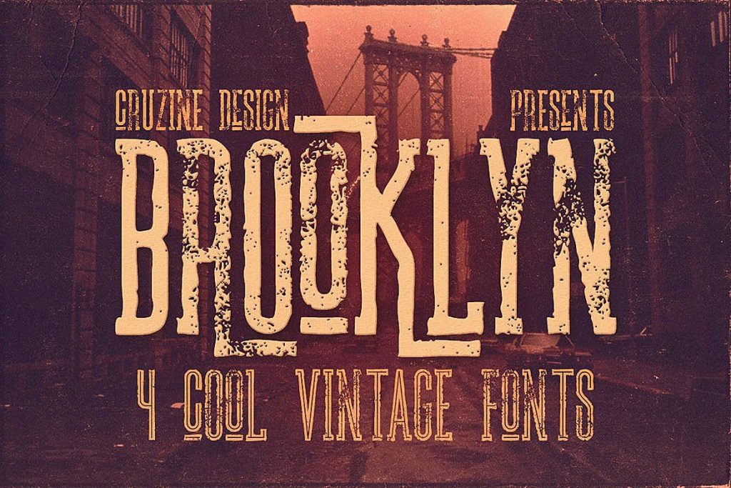
For a while, it seemed like every design trend started with “vintage.” Vintage typography. Vintage color. Vintage textures.
Enough already!
The problem with the vintage styles is that the elaborate look is just too much. Characteristics of vintage elements include:
- Rough overlays on images and type.
- Scripts and typefaces with plenty of flourishes, swashes and tails.
- Muted color palettes.
- Overlays to add sepia or old-style coloring to images
- Highly textured backgrounds
While none of these techniques is inherently bad, they present challenges for website design. The primary concern is readability. With so many things happening in the design, it can be more difficult for users to understand the message at a glance.
Attention spans are short, so the design needs to communicated something with impact immediately to pull users in.
2. Super-Thin Typography
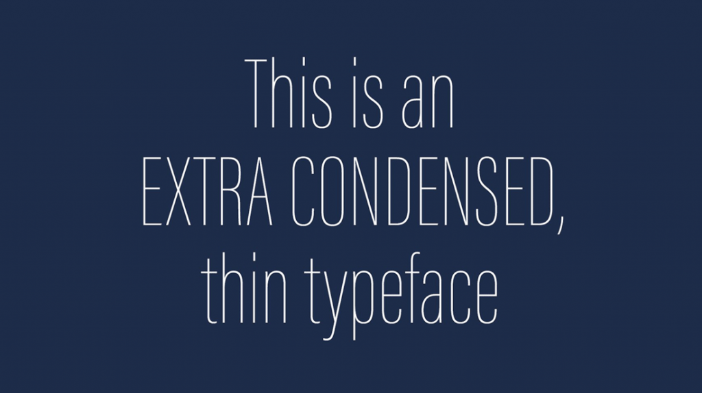
It might have been one of Apple’s biggest mistakes of all time – using a super thin, condensed typeface in its OS. And while Apple scaled back immediately because of readability issues, thin typefaces started popping up everywhere. And plenty of websites still use them.
Thin type is difficult to read on screens.
From backlighting to screen size to lack of contrast between text and other elements, thin typefaces just don’t have a real place in most website projects.
If you are still using a font with a thin stroke or a variant that’s ultra-light or condensed, consider adjusting the typeface to the regular version. More website designers are leaning toward larger typefaces in general and bumping up the weight can make all the text in the design feel a little larger without a full makeover.
3. Hero Image Sliders
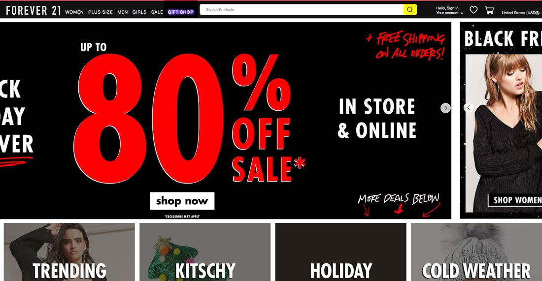
How many times do you actually click on one of the images (or multiple images) in a hero image slider?
Most users don’t regularly engage with this design technique. And there’s data to back it up. The Nielsen Norman Group did a study back in 2013 that found that users ignore these sliders and that often a slider makes it more difficult to find important information.
What you should do instead is plan for one key piece of content with a call to action in the hero header location. Don’t overwhelm users with multiple options. (If you must have multiple header elements, consider manually changing a single content element on a regular schedule.)
The problem with these auto-play sliders is that you don’t know when a user will land on the content. For many users, as soon as they see something that might be of interest, it moves away to the next thing. Finding the element that was interesting is often too much work for a user to invest in and you’ve just lost that person’s attention.
Instead opt for a highly interesting photo or video. Consider a cool animation or illustration. Don’t try to cram six different messages into one website location. It’s not something you’d try to do anywhere else in the design, so why is it so common on the homepage?
4. Heavy Video
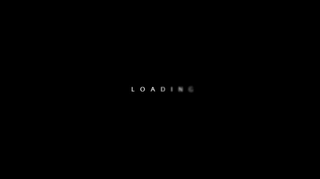
Full-screen movie style video can be engaging, but it doesn’t work for the way many users digest web content.
The trend leans toward more high-resolution viewing. That works great for users on large screens with super-fast internet connections. For everyone else, the experience falls flat with lagging load times, video glitches or moving content that’s not viewable on mobile devices.
These are all problems you don’t want to have because they can impact whether users stick around to interact with the content or not.
The other problem with heavy video content is sound. Too many sites rely on video that has an audio component that ties everything together. While audio works some of the time, not all users will want to listen to a video. (Think of how many people are surfing the web at work; they probably don’t want the person next to them to hear an auto-play video running.)
Scale back on big video or design it so that it isn’t the only first impression the website makes. A long loading animation is not a substitute for loading quickly.
A dive into your website analytics will tell you whether heavy video is working or not. But a better option of most websites is to include a lightweight video on the homepage that provides a glimpse into the content and allow users to click into a more immersive video experience.
5. Icon Overload
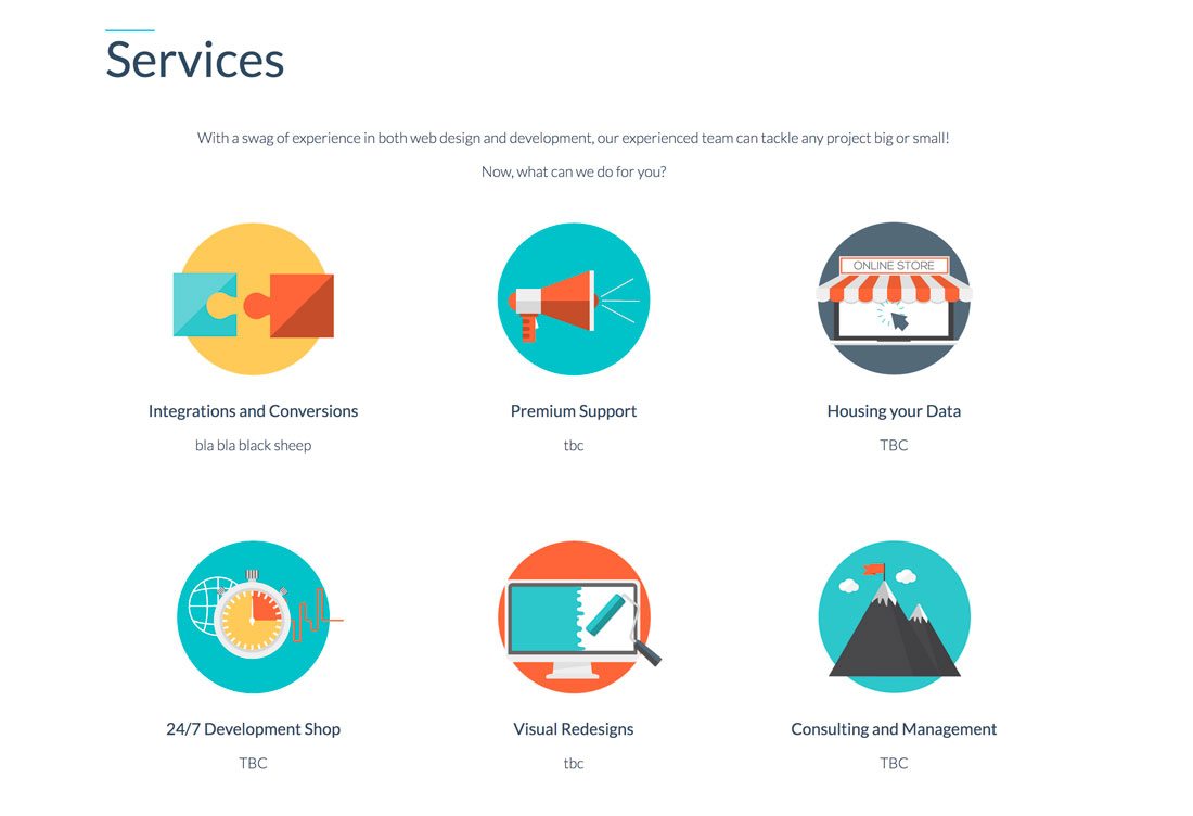
Stop going crazy with icons in design projects.
While a great set of icons can be a useful tool, only use them when they are commonly understood and serve a purpose. Just packing the design with icons to create visual elements isn’t useful.
Most websites only need a handful of icons – for social media, shopping carts, search, etc. And they don’t have to be big or fancy. A simple set of solid icons is enough.
Remember why you are using icons in the first place. They serve as commonly understood directional cues for users. Icons shouldn’t be a dominant part of the design; they should be subtle, simple and almost fall into the background.
While oversized icons were fun for a while, the biggest issue was that the trend was severely overused. It seems like every site that didn’t have good images or video was using an icon-based design. Everything started looking too similar because of the nature of icons; they are designed to have universal meaning.
Conclusion
Make sure to pay attention to your designs when it comes to trendy elements. Use them sparingly and with classic design pieces so that your projects don’t get dated in a hurry.
Source : Design Shack