
Colours do not always translate well from real life to the digital world. A mustard-coloured top can look like a burnt sienna sunset, and crystal-blue water can take on a green tinge. The wrong colour in your logo can negatively impact branding, leaving your audience confused or even put off.
The art of colour design plays a huge role in modern branding and, to create a digital experience your customers will better engage with, consider the importance of creating a seamless colour experience across all brand assets.
The beauty of colour in design lies in the range of your chosen colours in strategic, enjoyable, eye-catching ways across social media. This helps your brand become readily identifiable – like Coca Cola’s red and white or McDonald’s red and yellow. Considering how quickly visual media moves across social networks, you can leverage your customers’ “share” or “like” button by designing a robust colour scheme. Your logo’s colours, combined with smart use of other design elements, allow you to create a brand identity people remember. Here are some tips for using colour successfully in your marketing campaigns.
Basic Color Theory
Human brains connect colours to various feelings that can affect how they make a decision – crucial information for anyone in sales or marketing. Study the colours to see how they tend to affect people when they are exposed to them. This will help you select the right colours to evoke a response from your audience.
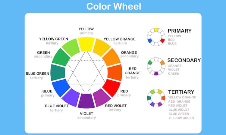
The colour wheel, pioneered by Sir Isaac Newton, helps you make use of colours harmoniously. You do that by using any two colours on the wheel that are opposite each other, using three colours that make an equilateral triangle on the wheel, or four colours forming a rectangle (two pairs with colours opposite each other in both pairs). These matches are called schemes and remain harmonious even when you turn the wheel. You are affected by these colours even when you do not realise it – consider holiday hues of red and green – opposites on the colour wheel.
But colour is not as clear as black and white. The tone of colours can have a real impact. Warm colours represent warmth, energy, and happiness, and cool colours imply stillness and harmony. The dividing line splits the colors in two, with orange, red, and yellow colours on the warm side and blue, green, and purple colours on the cool side.
Color Psychology
As in all marketing, think about your audience when choosing colours. For instance, colours speak to different cultures in different ways. If your audience is not predominantly American, you may need to reconsider some colour choices. A red dress at your wedding would be a shock to guests, but, in India or Taiwan, it is the norm. To help you understand how colour affects the person viewing it, here is a short breakdown of colour psychology.
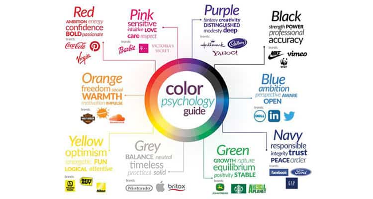
- Blue – Soothing: This colour works well for a company trying to show they are trustworthy and reliable. A darker blue conveys success, while lighter shades communicate friendliness.
- Green – Peacefulness – Revitalization: Darker shades communicate growth and financial companies tend to use this a lot. Lighter shades portray feelings of truthfulness and relaxation. People also see companies using this shade as ethical.
- Red – Excitement: This colour incites strong feelings, like passion and anger. The warm shades speak to stability like one would associate with a brick building. The brighter shades inspire energetic emotions, which works well with a younger, more excitable crowd.
- Yellow – Energetic: This colour communicates warmth and positivity. Brighter shades excite younger audiences, while darker shades connect to feelings of wisdom or experience.
- Purple – Nobility: Darker shades inspire feelings of affluence and extravagance, while the lighter shades set a romantic tone.
Colors Across Platforms
When considering your colour choices, think how these colours will look on multiple platforms. Something that looks great on a desktop site might not seem as good on mobile, or vice versa. Here are some things to keep in mind regarding colours on different platforms.
- Put the perfectionist away. Expect some differences in your colour schemes across platforms. Different devices read colours differently, so exactness is too high a standard. Efforts spent to find the exact colour scheme that will work on every platform or device are wasted. You cannot control how a person sets their hardware up or if they alter the colour schemes with software like f.lux to make it easier on their eyes near bedtime.
- Hire a professional to do the hard work for you. Figuring all this out can be challenging, and you have a business to run. Take advantage of qualified designers with the training and experience to pull together an effective colour scheme for your brand. These experts understand colour intuitively, and their skills can help you decide what colour schemes will work best for your company.
- Avoid using online or digital colour selection systems. To correctly create a logo and its colours, avoid digital representations of colour. It’s better to make your decisions from books or print charts. When you look at a printed Pantone book or chart, remember to compare them to matching colour schemes for CMYK and RGB/HEX. CMYK and RGB cannot duplicate many Pantone colours. This will save you time and money because it allows you to stay with colours that convert well to the other form factors.
Consistent Elements
Retaining a uniform or recognisable look across your branding increases recognition among customers after updates or changes happen. Your company should maintain some aspects throughout your marketing campaigns. You implement this consistency through colour choices, image design, typeface, message branding, and how you deliver the advertising to consumers.
A brand can make use of multiple palettes if it uses them consistently in different campaigns or with specific segments of the population. Use bright colours for children and the elderly, while going with cooler colours for the affluent or business-minded. When selecting images, you need them to carry through your palette choices for each customer demographic, while supporting the overall theme of your brand’s story.
Like colours, uniformity in typeface, especially a strong selection, helps create a memorable impression. Keeping typeface identical in digital and print media avoids diminishing your brand’s power. As with other elements, maintaining a consistent layout helps boost your brand’s recognition. However, some platforms require a change in layout to function. In such instances, consider these basic formatting elements to stay in harmony with your other marketing materials. Utilize a grid and keep text alignment the same on all platforms. Manage how a consumer’s eyes flow down the content, keeping it as uniform as possible. Organize a hierarchy of elements that stays true in different materials. Finally, make use of text or image emphasis in a similar fashion.
Color psychology does not guarantee more customers, but it helps in understanding the emotional associations a broad audience may feel when seeing specific colours. Effective use of colours against or with different varieties or shades boosts the likelihood of engagement and conversions.
These tips speak to only part of the larger conversation on colour in marketing. Consider this a springboard into the world of web colour scheme design – a primer for the basics on colour psychology and how colours may differ from platform to platform.
The key takeaway here is you do not have to do this yourself. Professionals with years of training and experience are available to make choosing your next colour scheme a breeze. They can navigate you through the different issues that will pop, offering you advice you can trust to make your brand logo one that consumers will remember.
Source: Usability Geek
Author: Alan Smith