
Let the UX design battle begin! It’s flat design vs material design in a match to discover which interface design favors usability and encourages better user experiences
Flat design vs material design — what’s best? We take a dive into material design as well as another design trend that’s swept over the UX design community in recent years: flat design. Known for their minimalist approach and stark UX design similarities, these design systems have us asking: which is better and which is worse?
Let’s throw our two cents into the material design vs flat design debate and discover just what the difference is.
What is flat design?
Flat design could be considered the opposite of skeuomorphism. Instead of using real-life imagery as with skeuomorphic design, flat design uses 2-dimensional visual details, as shown in the illustration above.
Flat design doesn’t employ shadows like material design does. Flat design embodies the digital landscape from which it arose. Whereas other design systems rely on metaphor and realism to convey their essence, flat design disregards this and is considered authentically digital, according to Microsoft.
Minimalism and flat design go hand in hand and so a lot of flat designs will look intentionally sparse.
Benefits of flat design
- Uncluttered, distraction-free design
- High readability with clear typography
- Easily adjusted for responsive design
- Faster to load in browsers and apps
Disadvantages of flat design
Flat design is stripped back to the minimum. Not to be intentionally minimalist but to focus on the function of design. Aesthetics do play a prominent role in flat design where bold color is used generously. However, a lack of shadow and depth can cause usability problems.
A call to action without strong clickability signifiers can go unnoticed or be difficult to find, and this can be frustrating for your end user. If something doesn’t look clickable, then people won’t know to click. Fundamental error. With flat design, users can end up clicking all over the page in desperate hope of clicking something.
Another drawback to flat design is that despite its leading role within UX design circles over the last 5 years, there are still people out there who think of it as a trend, something which isn’t as long lasting as material design, which has its own set of guidelines.
In addition to usability problems, there’s the issue of distinctiveness. While flat design celebrates function at the cost of form, there is the risk of flat designs looking indistinguishable from one another. Limited color choices and shapes create limitations where they needn’t be any. This contributes to the trend like nature of flat design and makes for overly generic design.
What is material design?
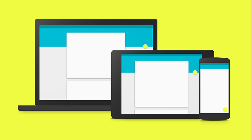
Material design is a design system developed by Google. Google came up with material design to create a coherent, practical and accessible visual language. The aim is to create web and mobile experiences that are based on and take full advantage of tactile screens, taking inspiration from paper and ink.
Paper and ink? Yes, that’s right. Material design was initially named Quantum Paper. The design principles attempt to translate the physical properties of paper to the screen. The background acts as a sheet of paper and the UI’s elements and behavior mimics paper’s ability to be re-sized, shuffled and bound together.
Materials such as paper cast shadows, are solid, can change shape and can be manipulated in myriad ways. These properties are all exemplified within material design.
Essentially, material design is a system which outlines how designers can create unified designs with fewer distractions.
The principles of material design
There are two main goals on which material design is based. The foundations are:
- Create a language which synthesizes classic design principles
- Develop a unified system to be deployed across multiple platforms and devices, with mobile being fundamental
As well as the above goals fueling Google’s design system, there are 3 principles which steer them towards those goals:
- Material as metaphor: visual cues should be grounded in reality
- Bold, graphic and intentional: take inspiration from print-based design
- Motion providing meaning: no motion should be superfluous
The material design documentation is extensive and constantly updated by the team at Google.
What does material design look like?
Material design brings back a UI element banished to the past: skeuomorphism.
Skeuomorphism style is where images and metaphor are used to give users a reassuring real-world reference. Since material design uses paper as the metaphor, it maintains flatness however it’s multi-dimensional. If something is too flat, users may find it difficult to distinguish between UI elements and their purpose such as whether an element is clickable or not.
Why is material design important
Material design gives designers a UI framework to adhere to. To avoid making terrible user interfaces, material design shows UX designers a clear path regarding how to design animations, styles, layouts, components and patterns. This is done so that anyone interacting with any of the Google products and services has a unified and pleasurable user experience.
Benefits of material design
- Unified and simplistic interface
- Principles and goals provide consistency for designers
- Z-axis creates depth
- Intuitive to use
- Uses motion to show users what is happening on screen
Disadvantages of material design
Material design helps to provide a comprehensive framework for designers to create mobile and web experiences. Although, material design is not the Holy Grail of design despite its popularity. While the principles can be extremely beneficial there are contexts in which material design would not fit.
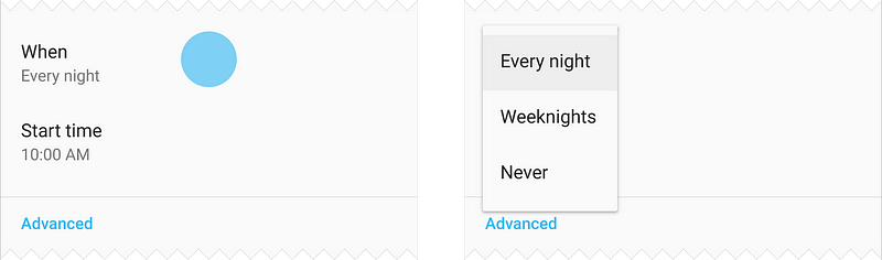
Take Facebook with material design principles. The result looks like Google+. And we all know how that turned out. Material design promotes simplicity but too much simplicity can be a hindrance. For example, in the below image, it isn’t immediately clear which parts here are clickable which can frustrate a user or result in them clicking all over the screen.
While the UI design patterns within material design aim to be clear and guide users in a meaningful way, certain components have drawbacks because they’re superfluous. Take the Floating Action Button, which at times isn’t needed on a screen. Despite its controversy, there are alternatives to floating action buttons, though.
Material design is also inextricably linked with Google and is dominant on Android. This relationship, while intentional, causes problems when designing for other systems such as iOS. Indeed, Apple has its own guidelines too, but this means that each framework is too attached to the parent company.
Flat design vs material design: how are they different?
Flat design and material design share similar characteristics. They’re minimal — no superfluous details here. Flat design also tends to use limited colors for fewer distractions and the simplicity of the UI element design encourages efficiency and functionality. Flat design takes inspiration from design movements of yesteryear, namely Bauhaus. One important tenet of Bauhaus is that function follows form. That’s why flat design is stripped back, with no frills.
Flat design aims to make the function beautiful but is this at the expense of form?
One of the ways in which flat design deviates from other design styles is that it doesn’t aim to replicate anything from reality, not like paper as with material design nor skeuomorphic design as with older iOS designs. Flat design places importance of crisp typography and a clear visual hierarchy.
Conclusion
The argument of material design vs flat design may go on ad infinitum as each designer will have their own preferred style and preferences. It’s clear that both style systems have their own merits and faults and their principles and goals do cross over slightly. The fleeting nature of flat design may signify it isn’t here to last but the well-defined guidelines of material design give it a solid foundation that can be built upon and improved.
Source: UX Planet