
“Users often leave Web pages in 10-20 seconds, but pages with a clear value proposition can hold people’s attention for much longer”. This is the summary of an article by Jakob Nielsen that throws light on how users behave on web pages. The research further reveals that the first ten seconds of a page visit are “critical” – but if the user stays on the page for 10 seconds, they are likely to stick around the site for a bit longer.
What is ‘Intuitive’ Anyway?
Nielsen’s research reveals a critical factor in an average website visitor’s thinking: Users approach sites with a skeptical mindset – almost always assuming it will disappoint them, but just that wee bit curious. Therefore, a website that helps users find what they are expecting will get the proverbial foot in the door.
Imagine you are at a car dealer’s and you see a model you would love to test drive. You enter the car only to find that there is no steering wheel. This is an example of a non-intuitive design. It creates an additional hurdle for the customer to jump over in the course of their journey. The average customer does not like to make that extra effort or rack their brains if they are to spend money, especially when presented with an unfamiliar situation.
In hindsight, this is probably why Google puts conventional steering wheels in their self-driving cars.
Why Build Intuitive Websites?
The same goes for web design. In an intuitively designed webpage, the constituent elements are built and organized in such a way that the user can access information, navigate and transact naturally and effortlessly. Intuitive design is inconspicuous, but not necessarily unremarkable.
In an effort to make sites aesthetically pleasing, designers often sacrifice usability. This is a crime, considering that if the user does not find a clear value proposition within the first 10 seconds, they are very likely going to bail out. The site needs to make its purpose obvious through its design.
In his recent presentation titled “How Marketers Can Keep Up With Google In 2017 And Beyond” at INBOUND 2016, Rand Fishkin of Moz placed “searcher engagement” as the number one goal for marketers to pursue if they wanted their website to be found on Google in future.
What Does an Intuitive Website Look Like?
You will know it when you see it. But I will show you a couple anyway. One, a small business (probably like yours) in a saturated industry. The other, a highly successful tech startup.
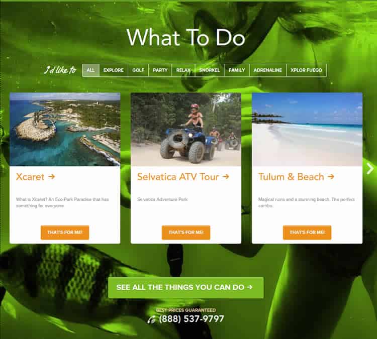
Playa Del Carmen is a tourist information site and travel booking agency for its namesake exotic city on the Caribbean coast of Mexico, 45 minutes away from the crowded beaches of Cancun. This website has intuitive design down to a T.

The home page elements give a visitor access to the essential information about the city of Playa Del Carmen and enable them to plan and book (transaction) for their stay there.
One of the most brilliant features on the homepage is the real-time weather widget. When you move your mouse over it, it drops down to show the forecast for the whole week. When looking at a vacation destination, one of the first orders of business for the traveler is checking the weather. By showing this information right out of the gate, the user is saved the trouble of having to navigate to another website and can proceed to finalize their travel dates.
Assuming the weather is desirable, the obvious Search CTA next to the weather widget intuitively goads visitors to start finding hotels available. A little scrolling will get you information on current promotions, hotel recommendations, as well as a visual grid of all the exciting things to do at Playa del Carmen.
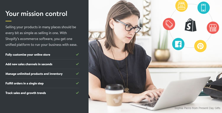
Another excellent example of an intuitively designed website is Shopify, itself an intuitive ecommerce software that has made ease of use of its own platform as well as the channel built by its end users (retailers) its USP. A cursory glance at the site would tell any visitor what it is and how it brought about the revolution in DIY online selling.

A clear, central call-to-action tells users to just get started without paying anything or even the risk of sharing financial information. There are no tricky, ambiguous T&Cs. As you scroll down, desktop and mobile screens show examples of ecommerce stores built using Shopify. Further down, you see the features of the platform and the benefits they bring to you, along with how easily they can be customized to suit individual business propositions and products.
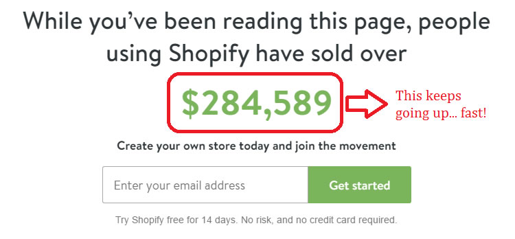
At the end is another (the same!) CTA under a real-time counter that shows you the money! This is the clincher – copy that combines the urgency of taking action while subtly exploiting the irresistible pull of future financial rewards.
Why, then, are not all Websites Intuitively Designed?
My guess is as good as yours but I reckon most designers and developers fail to see the business proposition from the buyer’s point of view, and therefore do not present it accordingly, even if it is the most obvious thing to do.
How do you Build an Intuitive Website?
Think of your website as an extension of your business operations. The UX should not only work to promote your product or service, it should also be a reflection of your brand’s values and how you hope to improve people’s lives. A couple of essentials that help you do that are:
Thorough market research
Every business venture should start with due diligence. Study upon study has proven that using the correct targeting and testing methods can exponentially increase conversion rates. Whether it be conducting A/B testing on your landing pages, surveying your customers, or simply monitoring what industry influencers are saying on social media, your primary task should be centered on bridging the “knowledge gap.”
In an excellent article, Jared Spool defines the knowledge gap as “the distance between current knowledge and target knowledge.” Current knowledge is what the customer knows about the interface prior to visiting your website while target knowledge is what you hope they will gain from your platform in order to achieve their objectives. A truly intuitive design is the one that bridges this knowledge gap.
Your market research must give you this insight, failing which it is nearly impossible to create an effective website. Ask yourself why users will visit your site in the first place. What pages do you want them to see and why? What actions do you want them to take?
The end result of your market research should be to give you an understanding of the “intent” of your target audience. This intent, in turn, varies depending on their position along the sales funnel. Therefore, you need to write and tweak the copy you present to them, using the right “natural language” terms they use.
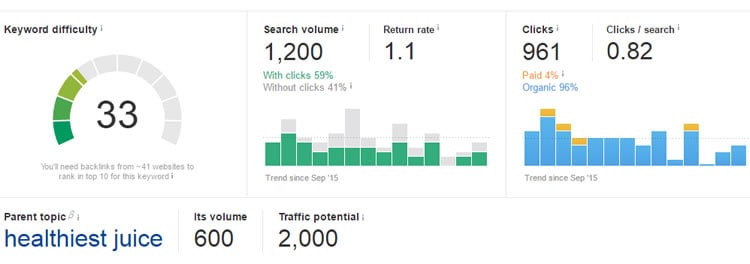
Ahrefs’ Keywords Explorer tool lets you zero in on these keywords and phrases, and figure out which ones have the maximum potential to attract traffic of the right kind, so you can tailor your copy accordingly.
The design itself
The overall layout and design is the foundation of what makes your website intuitive. Based on your market research, put yourself in the shoes of the user. Does the homepage clearly communicate what your company is all about?
Your brand personality should evident within the first few seconds of a visit. Usability and navigation should be simple, captivating, and consistent across the entire interface. Creative copy and graphics are a great way to spice up your landing pages while communicating your persona.
Dropbox does a great job in promoting their service as well as their branding on their website.

One of the main themes that jumps out with this design is simplicity: the homepage clearly conveys in a few words what the company is all about and how it can make your life easier. With short copy and the option to get more in-depth information, each element on the website is carefully designed and placed to enhance the UX, showcase the awesomeness of the product, and promote the benefits of using it.
If you still are not convinced, get this: CEB found that simplifying the decision-making process for customers increases the likelihood of purchase by a whopping 96%.
Coda
Today’s consumers are spoilt for choice. Websites selling similar products and services are jostling for their limited attention. Only those websites that are designed intuitively will hold on to the visitor, get to know more about their preferences and behavior, and eventually convert them to a paying customer or even a brand advocate.
Source: Usability Geek
Author: Tracy Vides