
Adaptive and responsive websites are very similar, as they both adjust the user interface (UI) of a website depending on the width of the browser window. However, the way in which they do this is what makes the two techniques different.
As a UX design agency, at Codal, we are always asked for recommendations based on the project, budget, and resources. Aside from that, some individuals in the field are not even aware of the existence of adaptive design.
So, let us dive into it!
Responsive Design
In responsive design, a website will change its appearance based on the viewport of the browser. Typically developers use the width of the browser as the variable which determines the size of the dynamically changing elements on the page.
A responsive website is entirely fluid and will adjust and respond to the viewport no matter the size of the browser window (or screen). That is because it uses percentage-based CSS rules to change the style based on the device size.
Whether the browser is sized to 400px wide, or 45,000px, the page elements will always adjust to a specified proportion ensuring that the page always looks good.
The benefits of this approach are countless. The most prominent advantage is that the codebase need not change for mobile, desktop, or any size in between.
Many designers believe that responsive design is more challenging since they have to design for a nearly infinite number of screen sizes. While this is partially true, it also results in cleaner code and better adaptability.
Adaptive Design
Just like responsive websites, an adaptive site will adjust the layout of the page depending on the width of the browser, but it does so in a different fashion.
Adaptive designs consist of multiple renditions of the same design – one for each size, as chosen by the designer or UI developer.
Each version of the design is assigned to specific browser widths, called ‘anchor points’. Anchor points tell the browser exactly when to jump to the next layout.
An easy way to think of it is that the page content and elements would almost “snap” into place once the viewport has passed the designated threshold.
Generally, a designer would design a different layout for each of the six most common viewport widths. These include a healthy range of sizes, including both the smallest mobile devices, and the largest desktop panel widths: 320px, 480px, 760px, 960px, 1200px, and 1600px.
Instead of using percentages, an adaptive design will utilise exactly one static layout per each anchor point, and adjust to the screen size once that anchor point has been detected.
Just like responsive design, adaptive design can also be complex, because the designers have to actively design the same page, six (or more) different times. Think about how many different layouts may be required for a site consisting of numerous pages.
Deciding Which to Use for Your Website
Adaptive
If you do not have much time to dedicate to a project – either for budgetary reasons or due to timeline related restrictions, adaptive design will ultimately give you an edge if you have access to the user analytics data for the site.
Analytics data can help you prioritize different viewports by telling you which platforms and devices are used the most on your website. Therefore, you can cater to that group and design for those specific screen sizes to save time.
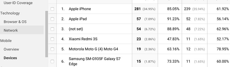
In the screenshot below, it is clear that most people are browsing this website from either an Apple iPhone or an iPad. This data could be actively used to prioritise those particular viewport sizes, allowing you to ensure that they are perfect.
Adaptive design is best used for cases in which a website just needs some fixing up. If the website is going through an overhaul, you should look to responsive design principles.
Responsive
If you are designing a website from scratch, you are better off designing it to be responsive, so that every user is ensured to have a good user experience.
While a responsive design will require more coding, in today’s world the majority of websites that are being newly designed are designed to be responsive because the result is simply better.
Here at Codal, all of our websites are designed to be responsive, no matter which designers or developers are on the project.
When deciding between adaptive and responsive design, you must consider the time that must be spent perfecting the correct element ratios.
Responsive designs will rearrange the website elements to fit the screen size, which means that sometimes the designer or developer will have to go back and forth to make sure that the design is still consistent regardless of how strange the screen size may be.
Conclusion: the Choice is Yours
UX Designers: whichever route you choose to go, remember that your choice will (at least partially) impact the overall usability of the website.
As more and more mobile devices are released, responsiveness becomes more and more relevant. Consider the fact that while 16:9 is the most popular aspect ratio for computers and many phones, it may not be the aspect ratio of the next breakthrough mobile device.
Smartwatches, for example, may currently lack the capability to browse the web natively, but they are likely to gain this feature in the not-too-distant future. How will an adaptive design look on a device barely more than 3 inches in diameter?
Source: Usability Geek
Author: Jenna Erickson