
The conflict between Apple and Microsoft is an age-old affair – one that has been perpetuated by the supporters of either platform for the better part of the twenty-first century (and the tail-end of the twentieth). In fact, the enmity between their fans is only eclipsed by that of Android and iOS supporters.
Sites like Macworld and Windows Central regularly publish slam pieces and comparative analyses of the operating systems produced by both behemoths. Those of you that frequent either page, however, know that unbiased is not a word present in either of their vocabularies.
In fact, a search for “OS X vs Windows” on Google will return enough results to make your head spin (read: 9,580,000). Try finding an unbiased comparison of the two in that mess, I dare you. There are so many cultural pretexts for this conflict, that I would need an entirely different article to illustrate them for you.
Suffice to say, rarely have I met someone who is a fan of both parties. Unlike the seemingly unpolarized fanbases of Sony’s Playstation and Microsoft’s Xbox, Windows fans rarely own Apple products, and similarly Apple supporters rarely invest in Microsoft products.
This can be, in part, attributed to the cross-platform efforts of each company’s ecosystem—a strategy seemingly devised to keep their fans from venturing too far into enemy territory. Surely the “I’m a Mac, and I’m a PC” commercials did not help to depolarize the fan base, either.

That said, I want to provide readers of UsabilityGeek with an unbiased, thorough comparison of the two titans of industry, through the lens of usability. This is as much a guide for consumers, as it is a source of inspiration and direction for all types of designers.
I would like to explain my use of the newer “macOS” moniker, rather than the more traditional “OS X”. With the release of macOS Sierra on September 20th, Apple will be changing up the naming scheme, and I am electing to keep up with the times by adopting the same naming convention, albeit a day or two early.

In this article, which is Part 1 of this series, we will focus on two key areas:
- User Interface
- Personal Assistant (AI)
Be sure to check back for Part 2, where I will discuss mobile phone integration and multitasking.
Windows 10 vs macOS Sierra – User Interface
In order for computers to be at all usable, they must be controlled through a user interface (UI). UIs act as bridges between human logic and computer logic. They represent the domain in which programming and UX intersect and exchange information, therefore the UI has become an icon of the UX world.
There are subjective qualities that can make a user interface more pleasant than the next, and there are objective qualities that define real experiences. For the sake of objectivity and fairness, I am purposefully avoiding topics that require subjective analysis, such as iconography and other aesthetic qualities.
Navigation Bar
Navigation bars are one of three key areas of UI navigation. Depending on the type of device, the navigation bar may take on many different forms. In mobile UX, navigation bars are often simplified as much as possible, in order to accommodate the context of mobile usage, and its often hurried pace.
The desktop user experience, however, makes it possible to develop more robust navigation bars by taking advantage of the increased screen real estate and the varied forms of input.
Although the macOS navigation bar, famously called “the dock”, has traditionally been regarded as superior and more elegant than its Windows counterpart, in recent iterations the two have come to resemble each other in ways no fan would like to acknowledge.

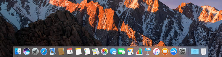
Notice that both navigation bars more or less provide a similar space for launching apps. In fact, they differ only in details such as size and shape. Otherwise, functionality and experience are very much the same.
I will point out, however, that the Windows 10 navigation bar is vertically shorter than that of macOS Sierra, and therefore leaves more screen real estate for users to browse the web and enjoy apps. This may seem like a small detail, but when you put into perspective, the fact that no UI element ought to obstruct the content that users wish to see, it becomes a bigger deal.
Application Launcher
The application launcher is the second of three key areas of UI navigation. Just as with the navigation bar, app launchers can take on different shapes and sizes, often depending on the type of device, but also depending on the software ecosystem.
Windows 10 features what was once called, the Metro UI experience – a design language that breaks down the app launcher into interactive boxes, while macOS Sierra features a cleaner app launcher that resembles the iOS start screen.
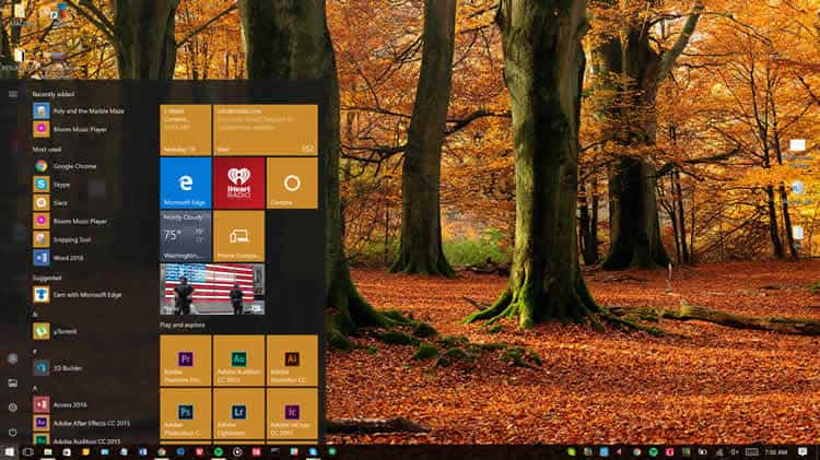
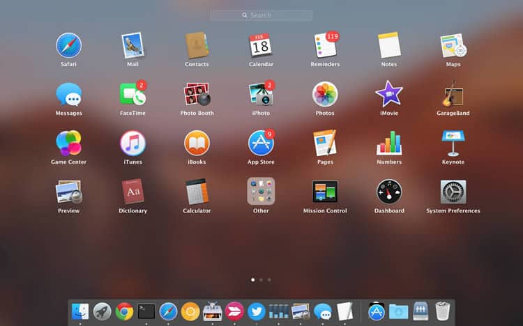
The application launcher was redesigned to take up only a small portion of the screen for Windows 10, although it is fully customizable in shape and behavior. On macOS Sierra, the app launcher takes over the entire screen when in use.
Arguments can be made for and against this type of UI behavior.
Although fullscreen app drawers appear to obscure all other content on screen, the context for app drawer usage typically implies a full focus on launching an app. Users do not typically open an app drawer, and meanwhile continue to use their browser, for example.
In terms of pure functionality, although they both fulfill the same basic task, the Windows 10 app drawer provides additional features that are not present in macOS Sierra.
I am talking, of course, about live tiles. By providing live feeds of content from within apps, live tiles bring an extra dimension to the app drawer experience in Windows 10.
Status Bar
The status bar represents one of Jakob Nielsen’s famed heuristics.
The system should always keep users informed about what is going on, through appropriate feedback, and within a reasonable timeframe. – Jakob Nielsen
This rule refers to important information, such as system time, volume, battery status, background apps, and notifications (whether messages, or system errors). In both operating systems, the status bar operates in a nearly identical fashion. The only fundamental difference is in placement.


On macOS, the status bar is at the top of the screen — a tradition that has been upheld since the dawn of Apple’s operating system. It makes logical sense to tuck the status bar away to a place where a user can easily glance and find all the information they need. The same goes for bottom placement, as it is implemented in Windows 10.
There is also the fact that the top-bar arrangement on macOS means that not only is there a slightly chunkier navigation bar, but there is also a vertical bar sandwiching the desktop space. This, of course, translates to an even smaller viewing space for applications, content, websites, and the general desktop experience.
Windows 10 vs macOS Sierra – Personal Assistant (AI)
AI is the future of all computing, and it is the death toll for traditional UX. As AI becomes more efficient and accurate, users will no longer need to interface with computers in a traditional way. Instead they would only need to speak a command and await the output.
The personal assistant components of Windows 10 and macOS Sierra are both very powerful. However they are not quite at the point where they can be considered AI. They are heading in that direction, though.
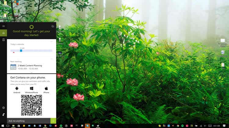
Cortana, Microsoft’s personal assistant is less robust and mature than Siri, even though it has been present in Windows 10 for over a year now, while Siri is only just now making its debut on macOS Sierra.
That is because the Siri that we know and love was born on the iPhone, and has benefited from use by millions, if not billions of users over the years.
That said, it is not a landslide victory. Cortana can keep up with Siri in terms of setting reminders, finding specific files, and answering general questions, such as “how do I get home from here?” But there is no avoiding the fact that Siri is just plain faster.
Having used the beta version of Siri for macOS, I noticed significantly faster retrieval times for just about every query. I do not expect this to remain accurate for very long, as Cortana has seen significant improvements in the latest Anniversary Update to Windows 10, and will continue to grow.
In terms of usability, however, they are roughly on par.
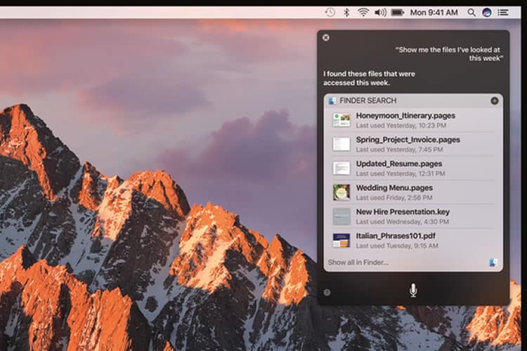
The protocol for interacting with the two desktop assistants is nearly identical: you address Siri or Cortana with an enquiry, and wait for a response. In both cases, the responses are provided in an interactive search-like window, where reminders can be set, information can be copied, and files can be opened.
Both AI components do an excellent job of understanding human speech, and interpreting the meaning behind it. Both personal assistants also do an equally good job of displaying the results in a beautiful manner and allowing the user to interact with them.
Conclusion
In Part 1, we have delved into the user interfaces and AI components of the two titans of the desktop experience world: Microsoft’s Windows 10, and Apple’s macOS Sierra. In a word, they are just about on par with each other.
Where macOS loses points in the chunkiness of its user interface, it gains points in the prowess of its personal assistant. It has been very interesting to see Microsoft’s operating system grow into a beautiful example of iconic design that is now on par with Apple’s traditionally superior design aesthetic.
And while Cortana is perhaps slightly clunkier than Apple’s Siri, it provides a nearly identical feature-set, at a performance level that is not too far behind Apple’s offering. This means as the two grow in both features and performance, they may start to resemble each other even more so than they do now.
Given that neither solution has quite reached the “AI” level, it is possible that as they draw nearer to that classification they will diverge into two very distinct approaches to AI. And while only one of these desktop AIs can be crowned king in the coming years, competition among them will almost certainly benefit the end user.
Source: Usability Geek
Author: Yona Gidalevitz