
When designing the user experience of an application or website, the stakes are often high – due in part to the fact that unusable applications and websites rarely convert users. As such, UX designers are used to the persistence with which they must critique every single feature.
There are a number of concerns that tend to dominate the thought process – ” will my users know how this works? “, ” How easily will this translate across cultures? ” You get the idea.
Perhaps the most important concern, given the rate at which technology has been advancing, is how well a design will hold up in the years to come. That’s why we’ve put together some of our favorite future-oriented UX design questions.
1. Are any features going to need updates down the road?
It’s easy to get wrapped up in the excitement of designing features for an app or website, and, in the process, forget about two key future-oriented concerns.
- Are any of these features going to be obsolete in the foreseeable future?
- How many of the features in this application / website will require consistent updates?
Remember: The cost of a feature is not just the cost of designing and coding it, but also the cost of updating it down the road—which, depending on the type of feature, can be quite substantial.
2. Ask yourself: should this feature be implemented in the future?
As important as it is to launch an application or website with as many features readily built as possible, sometimes this is not the most usable choice.
UX designers ought never to forget the importance of reducing the barrier to entry of the product. In other words, will an overabundance of innovation actually become a detriment to the “instant usability” of your design?
Research seems to suggest that this is the case. Don’t over-saturate your designs with features that may serve users better in a future release. In other words, don’t scare them away with features.
3. Should I follow the trend, or set my own?
Often times, UX innovation is stifled by the community’s tendency to follow trends. Interestingly enough, many of the trends followed by the UX community were not introduced by industry leaders, but rather by designers that never got any recognition.
A good example of this is the, so-called “hamburger menu icon”, which has become synonymous with the hidden navigation menu. I dare you to try and figure out who actually introduced the hamburger icon into the UX design community.
The point that I’m trying to make is that you don’t have to an industry-leading UX designer to actually lead the industry. All it takes is a good idea. Although there are instances where it is better to follow a trend, sometimes it can be more beneficial, and even more usable, to invent a new approach to a problem.
4. How does this feature impact the business model?
The UX designer has two major roles:
- Cater to the needs of users
- Cater to the needs of the business
UX designers often devote the majority of their efforts into ensuring that the user has the most blissful experience imaginable, while putting the needs of the business on the back-burner.
The needs of the business ought never be ignored in favor of the needs of the user. Here is why: your clients’ needs are more important. Consider a scenario where you choose to include three rows of blog article snippets on the homepage of a website.
While an application’s users may be overjoyed with your decision, how will your clients feel in six months, when the blog articles have to be moved to make room for a feature that was reserved for phase II of development?
5. Do you really need to build this feature?
Have you ever been assigned a project that is so simple that it just doesn’t need anything? It’s always interesting when you’ve already taken into account everything that a user could need and there is still too much empty space on the page.
When confronted by such a project, UX designers often feel that it is inadequate to turn in something too simple, so they overthink the work that has been given them.
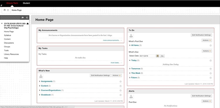
Consider a web portal, such as Blackboard. If you’ve ever used (or seen) Blackboard, there are a number of features that were implemented that, simply put, are completely unnecessary.
In an effort to take up whitespace, Blackboard’s UX designers added sections for “To Do”, “My Tasks”, “What’s New”, “Alerts”, and “Announcements”. To be frank, many of these overlap, and users could do with just two sections: “My Tasks”, and “Announcements”.
Conclusion: Every feature has risks. Calculate them
UX designers: Never forget to ask yourself what the risks are when implementing a feature. Calculate them, and determine if the research / findings actually support the need for the feature.
Always consider the longevity of your designs before finalizing them. The web and mobile industries are constantly evolving, and half of what we consider to be cutting edge today, will be obsolete tomorrow.
Source: Usability Geek
Author: Jenna Erickson