
It is easy for me to simply list the do’s and don’ts of mobile user onboarding. Do indicate progress and flow length, don’t overwhelm the user. Don’t ask permissions right away, do allow users to skip tutorials, etc.
We humans, especially product managers and UX designers, are visual beings, are we not? So what better way to absorb some valuable onboarding best practices than to show you some stellar, real-life examples of mobile user onboarding?
I have gone ahead and handpicked three mobile apps that I believe truly shine when it comes to effective mobile user onboarding. My selection does not mean that these apps are the only ones doing it right. Many apps have stepped up their game regarding user onboarding. However, I felt that these three apps, in particular, deserve some extra kudos today, and will also offer you some solid takeaways where it comes to building your onboarding process.
Mobile User Onboarding Pro #1: Slack
Slack keeps their mobile user onboarding clear-cut, sweet, and compelling. By employing value-oriented onboarding, it distinctly differentiates the higher level benefits of its product from the other messaging apps out there.
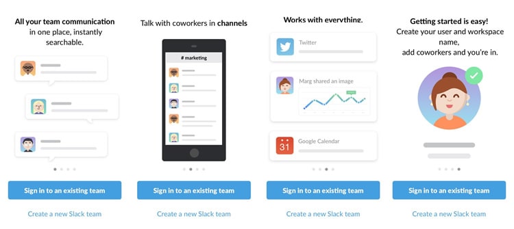
The colours and iconography are fun and delightful, while also communicating the key value elements of the app. Notice the progress dots at the bottom of each screen and the ability to create an account/login at any time? The user is in control of their first-time experience with the Slack app, which is how it should be.
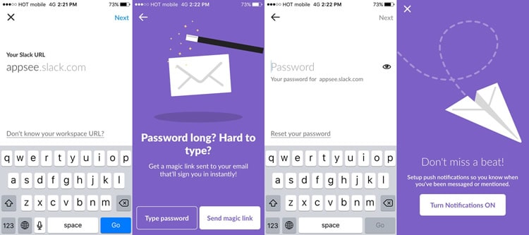
Once the user opts to enter the login screen and access an existing team, they are greeted with a slick, clean screen with a single line for the opening of their Slack URL. The Slack app even goes one step further by offering a magic link to help eliminate the friction of remembering a password for mobile.
I magically remembered my password this time around, so I went with the ‘type password’ route. Note the nifty little eye symbol next to the password line which enables me to see my password. This helps me ensure that I am entering my password correctly and that I remember it for future logins.
I am sorry to say it; nobody is perfect. Take a look at slide #3 where the header text, ‘works with everything’ is slightly cropped. If the Slack mobile apps team had utilised a qualitative analytics tool, like user recordings, they would have been able to catch this small yet noticeable error.
Mobile User Onboarding Pro #2: Trip.com
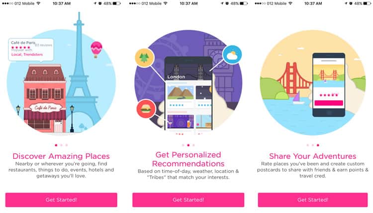
The Trip.com mobile app relies on precise customisation and personalisation to deliver a stellar user experience. Based on users’ interests, time of day, local weather, and location, Trip.com helps users discover the best things to do, eat, explore etc.
How does Trip.com supply these recommendations? Via initial user input. As an app that requires a certain level of user input to function, it can be challenging to get users to complete the onboarding process. However, Trip.com tackles this challenge fearlessly.
Let us take a look at the first three slides, another example of value-oriented onboarding where Trip.com communicates three key takeaways regarding its benefits. Slick, bold, and easy to read, they are a beautiful example of introductory onboarding slides.
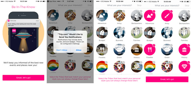
Moving onto the next slide, things get a little more interesting. I am presented with an attractive slide that communicates the benefits of enabling push notifications. Instead of prompting me instantly with an in-app permission, Trip.com first makes a conscious effort to visually convey how push notifications will improve my experience. Once I have grasped the end-benefit, I am then prompted with a standard iOS in-app permission that officially asks me whether or not to activate push notifications. This makes the in-app permission less “scary” and allows me to feel more confident with tapping the ‘allow’ button.
Next, onto the important customization element, here is my chance to tell Trip.com my particular interests so that it can provide me with the best recommendations. If I am in a rush or have no patience (like many mobile app users) I can tap the ‘skip’ button in the top right corner. However, given that I am interested in obtaining personalized recommendations, I go ahead and select a series of icons that relate to my interests. As I pick my interests, the icons turn to solid pink to clearly indicate which ones I have already selected – a nice little micro-interaction.
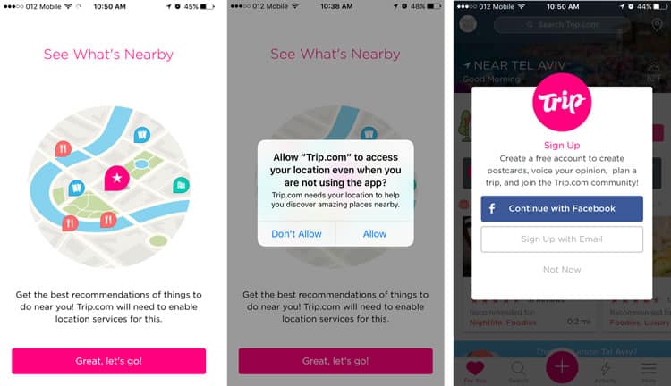
Once I have chosen my interests, the only way to obtain related recommendations given my area is to allow Trip.com to access my location. Again, Trip.com provides a distinct slide that explains the importance of enabling location access, before prompting me with the standard permission form. I allow Trip.com to access my location and I am ready to go – my newsfeed is now filled with personalized recommendations.
Last but not least, Trip.com asks me whether I want to create an account. The pop-up briefly explains the benefits of creating an account. It offers two means of signing up, but most importantly asks at the end of my onboarding experience (after I have gotten a sense of the value of the app) and does not obligate me to complete this task. Via its high quality, thoughtful user onboarding, Trip.com demonstrates a pure awareness of today’s mobile app user and their needs.
Mobile User Onboarding Pro #3: Feedly
Feedly‘s user onboarding goes a little off the beaten path of slide tutorials. Instead of a series of slides, it has the user “learn as they go” via progressive user onboarding.
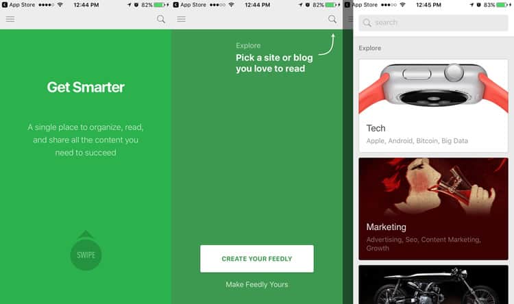
In order for users to thoroughly understand the value and usage of Feedly, the mobile app guides its users through the standard engagement flow. It starts with a user-friendly in-line hint, which prompts users to begin actively searching for topics and publications that interest them.
Once tapping the search icon, the user encounters a list of auto-recommendations to choose from. This small yet significant initiative allows users, like myself, to smoothly proceed with selecting categories, because hey, we do not always know what we want.
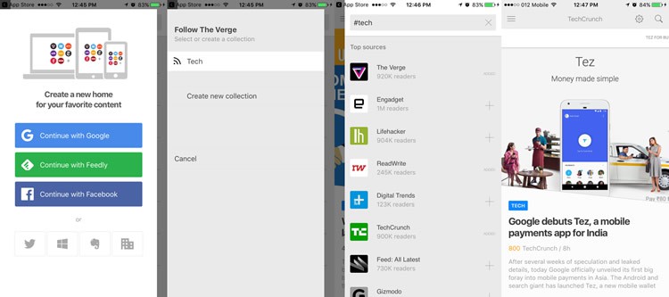
The overlay layout also allows me to easily understand which swipe gesture direction I should use in order to navigate. Once I have a selected a category that appeals to me, along with a related publication that I would like to follow, I encounter an overlay that cues me to create an account. This is a smart strategy by Feedly, as I am able to make a direct connection between saving content and creating an account. Plus, I have so many options for how to create an account which is doubly impressive.
After I have added a few publications, my feed(ly) instantly fills with content, and I am ready to go. With Feedly’s slick user onboarding, I learned how to use the app in less than two minutes and already set up customised content for me to begin my in-app experience without any hesitation. Bravo Feedly!
Wrap-up
No two apps are the same, which means there is not one prescribed blueprint for how to onboard users. As you can see, from Slack to Feedly, there are a lot of different ways to onboard your users, but one golden rule always stands firm – keep the user front and centre.
Your user onboarding might be your only chance to make a good first impression, make it count.
Source: Usability Geek
Author: Hannah Levenson