
Pop-ups, dialogues, those little boxes that appear on your screen, whatever you may call them, are not to be taken for granted. Although they are a relatively “small” element of your app, they play a significant role when it comes to your app’s user experience (UX).
On the one hand, they can help users progress through their in-app journeys. On the contrary, when done wrong, they can truly frustrate your users.
Luckily pop-ups are a ripe low-hanging fruit. You can easily improve them with the right tools and guidelines. That is where this nifty article comes in.
Since not all pop-ups are created equal, we have broken down five common uses for pop-ups and the “rules” for how to optimise each one. Follow these instructions, and you are sure to see better results for your pop up goals.
‘Refer a Friend’ and ‘Rate the App’ Mobile App Pop-ups
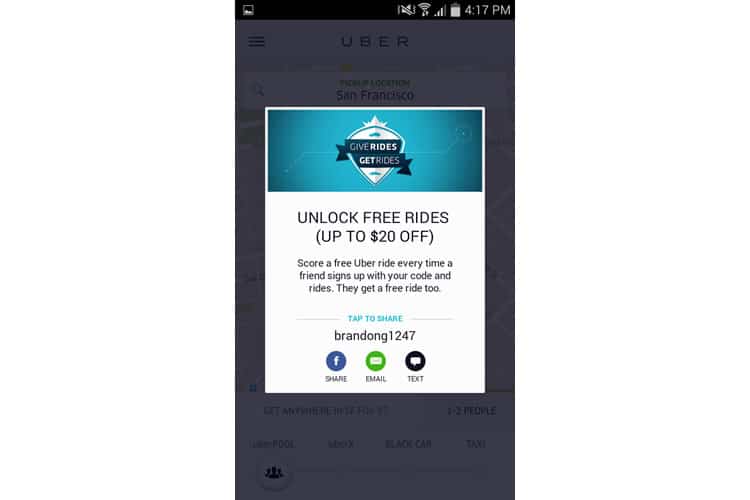
So you want to grow your user base, improve rating numbers, and increase your potential virality. Who doesn’t? However, you need to keep in mind that most users will not refer your app to a friend or rate your app unless they feel that they will receive something worthwhile in return.
“But referring a friend is such a simple, easy task! Why can’t users find the goodness in their hearts to help out a small app startup?”. Unfortunately, the reality is not this simple.
Note the word task above. That is exactly how most users see ‘refer a friend’ and ‘rate the app’ – as tasks. This is where the Rule of Reciprocation comes into play. Mainly, you need to give your users something before you ask for anything from them. This could be in the form of free rides in a transportation app or just overall value and amusement. A good practice would be to A/B test these pop-ups in a few different worthwhile locations and times in your users’ journeys. This will allow you to obtain better statistical significance as to where you should ultimately place this pop-up.
It is also important that you ensure navigation from your app to the app stores, social media channels, or messaging platforms is as smooth as possible. Is it “simple” for users to grab a referral link? How does the flow function on Wi-Fi vs. data? These are important factors to consider. Take the time to analyse and optimise these two pop-ups, and you will surely reap the benefits of more satisfied, active users and new ones.
Remember, “ask [wisely], and you shall receive.”
‘Push Notifications’ Mobile App Pop-ups
Push notifications are a super valuable tool regarding engaging and re-engaging with your users. For many users, push notifications have become the primary medium through which they interact with an app. No longer even opening an app, users access most of what they need directly via a push notification. Subsequently, earning and maintaining the right to send your user push notifications should be a pivotal aspect of your user engagement and retention strategy.
On Android, things are quite straightforward: the permission request is part of the AndroidManifest.xml and is part of the all-encompassing permissions list that users see before install.
On iOS, it is a bit of a different story. The iOS permission pop-up must be triggered within your app’s code, which will then show your user a pop-up like this:
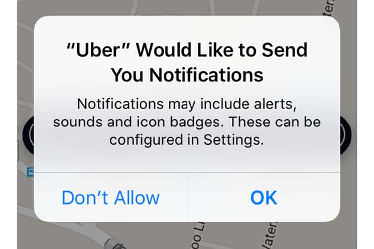
If users tap the ‘Don’t Allow’ option, it is practically game over for you. Unless the user manually accesses their notification settings, the permission disallowance is irreversible. That is why it is super critical that your users ‘OK’ the permission when asked.
We recommend two approaches for obtaining the most push notifications approvals as possible:
- Try creating your own, native permission pop-up that allows you to assess how willing are your users to accept push notifications. This will allow you to understand your users’ behaviour and preferences better while saving your permission for a time where your users are hopefully more inclined to tap ‘OK’.
- Only ask for the permission at a time that you have determined as most relevant and convincing. Is there a real need for push notifications at the time and place that you are asking? Use that context to explain to users in the permission text space clearly.
Data Access Mobile App Pop-ups
Along the same vein as push notification permissions are data access dialogues. Again, in terms of UX for these particular pop-ups, we are just referring to iOS apps. Data access pop-ups can include requesting for location, calendar, contact information, reminders, and photos. Mobile developers must tread lightly as asking for data access is not a simple checkbox activity.
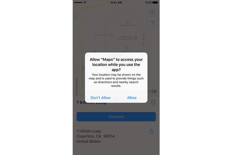
As Apple notes in their requesting permission guidelines, “although people appreciate the convenience of using an app that has access to this information, they also expect to have control over their private data. For example, people like being able to automatically tag photos with their physical location or find nearby friends, but they also want the option to disable such features.”
Aim to be relevant and transparent with these types of pop-ups. Do not be that calculator app that is asking for access to your user’s location – just don’t.
Make sure to use the text space provided by Apple to describe why your app needs the information, even if you think it is obvious. It is also a good practice to ask for appropriate permissions after certain, relevant user actions. For example, let us say a user has created video via your app and would like to share it with friends. As soon as the user taps the “share video on Facebook” button, this is the perfect time to prompt the user for a permission to access his or her social media account. Users will be more likely to accept this permission because it gives them a distinct explanation of “to do A you must do B”.
Check out our post on how to make your data access permissions less scary for your users to learn more.
‘Error’ Mobile App Pop-ups
Besides asking users to approve permissions, pop-ups are also an important means for developers to communicate with their users. This is particularly pertinent when it comes to in-app errors.
Sh** happens and so do errors. What should not happen is an error within an error. What do we mean by that? Do not make your errors worse than they already are by confusing your users further with your pop-ups.
Let us say for example that your user’s billing address is written illogically, so an ‘error’ occurs when trying to process their purchase. If you have a pop-up that reads ‘Error Occurred: Purchase could not be completed” the user has to attempt to guess the reason for the error. Instead, you should capitalise on this moment to tell the user why the error has occurred and exactly which section of the address needs to be fixed. It is important to understand that any guessing and frustration on the user’s part, augmented by a pop-up, could lead to potentially lost conversions.
Besides, for errors that require an action from the user, we recommend not only to inform the users of the error and what they need to do but to direct them to an action when relevant. Strive to use clear diction that indicates a clear action (erase, undo, go to my profile) instead of vague copy such as ‘Yes’ and ‘No’.
If a technical error has occurred within your app, you can utilise a pop-up to reach out to your users and inform them that you are working to resolve the problem. This adds a human element to your application and also signals to users that you care about their individual experience.
For more tips on ‘Feedback’ pop-ups, we recommend reading Nick Babich’s piece on 5 Essential Rules for Dialogue Design.
Pop Your Collar
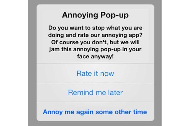
We will not sugar coat things for you. At the end of the day some of your users are still going to see your pop-ups like this:
But not everyone. You have the power to improve your pop-ups easily and ultimately boost engagement and conversions. First, make sure that you have a mobile app analytics platform, such as the one I represent, Appsee, that enables you to monitor their performance and their effect on your app’s user experience. These insights will then allow you to iterate, test, and validate with the utmost confidence. Pop-ups might have a bad rap, but when utilised thoughtfully and with finesse, they can be a big game changer for your mobile app.
Source: Usability Geek
Author: Hannah Levenson