
Learn to conduct a heuristic evaluation on any given user interface design. This article will teach you how to generate and conduct your own heuristic evaluations so you can improve the usability, utility, and desirability of your designs. The best practice is to use established heuristics like Nielsen and Molich’s 10 rules of thumb and Ben Shneiderman’s 8 golden rules as a stepping stone and inspiration while making sure to combine them with other relevant design guidelines and market research.
Nielsen and Molich’s 10 User Interface Design Heuristics
Jakob Nielsen, a renowned web usability consultant and partner in the Nielsen Norman Group, and Rolf Molich, another prominent usability expert, established a list of ten user interface design guidelines in the 1990s. These heuristics have been reflected in many of the products designed by some of the most successful companies in the world such as Apple, Google, and Adobe. Note that there is considerable overlap between Nielsen and Molich’s heuristics and Ben Shneiderman’s ‘eight golden rules’. These 10 rules of thumb further iterate upon Shneiderman’s ideas 4 years after his initial publication.
- Visibility of system status. Users should always be informed of system operations with easy to understand and highly visible status displayed on the screen within a reasonable amount of time.
- Match between system and the real world. Designers should endeavor to mirror the language and concepts users would find in the real world based on who their target users are. Presenting information in logical order and piggybacking on user’s expectations derived from their real-world experiences will reduce cognitive strain and make systems easier to use.
- User control and freedom. Offer users a digital space where backward steps are possible, including undoing and redoing previous actions.
- Consistency and standards. Interface designers should ensure that both the graphic elements and terminology are maintained across similar platforms. For example, an icon that represents one category or concept should not represent a different concept when used on a different screen.
- Error prevention. Whenever possible, design systems so that potential errors are kept to a minimum. Users do not like being called upon to detect and remedy problems, which may on occasion be beyond their level of expertise. Eliminating or flagging actions that may result in errors are two possible means of achieving error prevention.
- Recognition rather than recall. Minimize cognitive load by maintaining task-relevant information within the display while users explore the interface. Human attention is limited and we are only capable of maintaining around five items in our short-term memory at one time. Due to the limitations of short-term memory, designers should ensure users can simply employ recognition instead of recalling information across parts of the dialogue. Recognizing something is always easier than recall because recognition involves perceiving cues that help us reach into our vast memory and allowing relevant information to surface. For example, we often find the format of multiple choice questions easier than short answer questions on a test because it only requires us to recognize the answer rather than recall it from our memory.
- Flexibility and efficiency of use. With increased use comes the demand for less interactions that allow faster navigation. This can be achieved by using abbreviations, function keys, hidden commands and macro facilities. Users should be able to customize or tailor the interface to suit their needs so that frequent actions can be achieved through more convenient means.
- Aesthetic and minimalist design. Keep clutter to a minimum. All unnecessary information competes for the user’s limited attentional resources, which could inhibit user’s memory retrieval of relevant information. Therefore, the display must be reduced to only the necessary components for the current tasks, whilst providing clearly visible and unambiguous means of navigating to other content.
- Help users recognize, diagnose and recover from errors. Designers should assume users are unable to understand technical terminology, therefore, error messages should almost always be expressed in plain language to ensure nothing gets lost in translation.
- Help and documentation. Ideally, we want users to navigate the system without having to resort to documentation. However, depending on the type of solution, documentation may be necessary. When users require help, ensure it is easily located, specific to the task at hand and worded in a way that will guide them through the necessary steps towards a solution to the issue they are facing.
Why You Should Evaluate Against Your Own Heuristics
Nowadays, designers are encouraged to establish their own design-specific heuristics to evaluate their products, systems, websites, etc. Since Nielsen and Molich developed these heuristics in the 1990s, technology has advanced and they are less attuned to many of the products available in the market today. For instance, Nielsen and Molich’s heuristics would be too general to evaluate the usability of designs intended for online communities or mobile devices where the working environment is constantly changing. However, the original heuristics are still largely applicable in spite of the specific capabilities and constraints of modern designs. Therefore, as a designer it’s crucial that you learn to incorporate Nielsen and Molich’s heuristics into your designs as the first step.
 Author/Copyright holder: StockSnap. Copyright terms and licence: Free to Use.
Then, instead of dictating the process with Nielsen and Molich’s heuristics, their 10 rules of thumb should only generally be used to inform and inspire a designer’s and a company’s development of their own specific heuristics. In combination with market research, other design guidelines and requirements, using your company or product-specific heuristics will better suit the design under scrutiny.
How to Generate and Conduct Your Own Heuristic Evaluation
Choosing and developing new heuristics is a task in itself; there are no fixed recommendations, as each design presents its own set of different tasks, constraints, functions, styles and other variables. However, most heuristic evaluations involve between five and ten items, which are chosen on the basis of their applicability to the overall usability of the system, website, application etc. being tested. Less than five heuristics might lead to a lack of stringency when identifying potential problems and issues, but on the other hand, more than ten may overburden the evaluator as they must analyze the design with all of these heuristics in mind while the heuristics may also conflict with each other. Here’s how you can get started in generating and conducting your own heuristic evaluation:
- Establish an appropriate list of heuristics. Use Nielsen and Molich’s 10 heuristics and Ben Shneiderman’s 8 golden rules as inspiration and stepping stone. Make sure to combine them with other relevant design guidelines and market research.
- Select your evaluators. Make sure to carefully choose your evaluators. Your evaluators should not be your end users. They should typically be usability experts and preferably with domain expertise in the industry type that your product is in. For example, an evaluator investigating a Point-of-Sale system for the restaurant industry should have at least a general understanding of restaurant operations.
- Brief your evaluators so they know exactly what they are meant to do and cover during their evaluation. The briefing session should be standardized to ensure the evaluators receive the same instructions; otherwise you may bias their evaluation. Within this brief, you may wish to ask the evaluators to focus on a selection of tasks, but sometimes they may state which tasks they will cover on the basis of their experience and expertise.
- First evaluation phase. The first evaluation generally takes around two hours, depending on the nature and complexity of your product. The evaluators will use the product freely to gain a feel for the methods of interaction and the scope. They will then identify specific elements that they want to evaluate.
- Second evaluation phase. In the second evaluation phase, the evaluators will carry out another run-through, whilst applying the chosen heuristics to the elements identified during the first phase. The evaluators would focus on individual elements and look at how well they fit in the overall design.
- Record problems. The evaluators must either record problems themselves or you should record them as they carry out their various tasks to track any problems they encounter. Be sure to ask the evaluators to be as detailed and specific as possible when recording problems.
- Debriefing session. The debriefing session involves collaboration between the different evaluators to collate their findings and establish a complete list of problems. They should then be encouraged to suggest potential solutions for these problems on the basis of the heuristics.
In a heuristic evaluation conducted by Jakob Nielsen in 1992, results showed different evaluators identified different numbers and types of usability problems. Therefore, it is highly recommended that multiple evaluators are employed in a heuristic evaluation to ensure the highest possible detection rate so these usability problems can be solved before the final design is produced. Nielsen suggests that between three and five evaluators is sufficient because when the number of evaluators used increases, the number of problems identified increases in turn.
The general consensus is that more is better, especially when the evaluators have different skillsets (i.e. so the team is more likely to spot different usability problems), but financial and time constraints will often determine the number of evaluators on a project. In consolation, one or two evaluators are often sufficient in the early stages of development to identify the majority of usability problems.
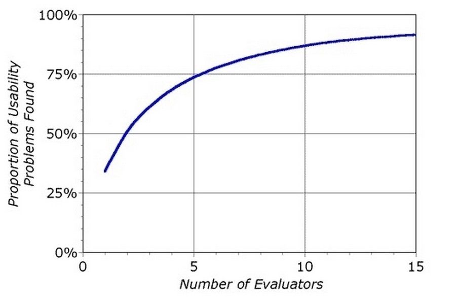
Author/Copyright holder: Nielsen Norman Group. Copyright terms and licence: All rights reserved. Img
The curve shows the proportion of usability problems identified increases as the number of evaluators used increases.
Pros and Cons of Heuristic Evaluation
Like any suggested method in research and design, there are both pros and cons in the usability inspection method of heuristic evaluation. Let’s examine a few of them:
Pros of Heuristic Evaluation
- Heuristics can help the evaluators focus their attention on certain issues
- Heuristic evaluation does not carry the ethical and practical issues/problems associated with inspection methods involving real users.
- Evaluating designs using a set of heuristics can help identify usability problems with individual elements and how they impact the overall user experience.
Cons of Heuristic Evaluation
- Choosing appropriate heuristics is extremely important; if the wrong set of heuristics is employed, certain usability problems may be overlooked.
- Heuristic evaluation might be relatively time-consuming when compared to other ‘quick and dirty’ inspection methods, such as simple walkthroughs with a small sample of users. Training evaluators takes about a week on average, not including the time it takes to conduct the evaluations and debriefing sessions.
- Unlike cognitive walkthroughs, heuristic evaluation is based on preconceived notions of what makes ‘good’ usability. However, this need not be seen as a negative point, as heuristics are often based on the experiences of real users with hundreds of designs.
- Problems identified by evaluators can often be false alarms. For example, in the article ‘Usability testing vs. heuristic evaluation: A head-to-head comparison’ by Bailey et al., it was stated that 43% of ‘problems’ identified in three heuristic evaluations were not actually problems. Furthermore, of the usability problems recorded by the evaluators, only 33% could be classified as genuinely problematic characteristics of the designs. In addition, only 21% of genuine usability problems were identified; calling into question the strength and usefulness of findings from heuristic evaluations.
The Take Away
Generating your own heuristics is an important skill to have. Utilizing both Jakob Nielsen and Rolf Molich’s heuristics as well as your own when evaluating interface design will guide you and your team in creating better experiences for your users. Heuristic evaluation can be a useful inspection method; however, some experts have identified issues with evaluators reporting false alarms, rather than genuine problem elements within designs. To limit the affect misreporting has on the applicability of findings from heuristic evaluation, it helps to use a number of different evaluators, collate their problems and carry out a debriefing session to root out false alarms at various stages in the design process.
Source: Interaction Design Foundation