
Professional ethics exists in various fields, but how does it manifest itself in user experience design? What can be done to provide users with products that put their interests up front, and how do brands do it?
User experience design is a term that has many different layers. Those who practice it are paving the way for users to interact with a product. Decisions are based on this fact. Some decisions may result in a limitation of the users’ actions or doing things that the user would not necessarily choose.
The area of ethics in user experience design lies on a scale that ranges from providing complete freedom for users, up to making all the decisions for them.
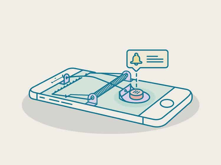
As a part of our daily routine, user experience designers “hack” into the thought patterns of their users. When they succeed, it very likely results in the success of the product itself. The process starts by choosing which options are available, while limiting personalization capabilities. It continues through stages where the flow dictates the user’s actions using learning steps, reaching the point where the system benefits from predicting behavioural patterns.
I would define an ethical challenge as the moment when the line of making seemingly-motiveless decisions that serve the interests of the system over those of the user, is crossed.
Why should we care at all? Well, if we are the ones who plan the processes and make the decisions, these are topics that ought to be addressed from a professional standpoint. No one would like to be labelled as the creator of an app that makes its users feel uncomfortable to interact with. For company owners, it is even more significant. Users today have a developed sense of critique. They voluntarily leave reviews in app stores, use stars to rate, invest time in conversations about the product/service, etc. You would probably like to avoid a PR crisis or a product failure which originated from poor planning, especially when it is relatively easy to prevent by putting your mind to it and gaining trust.

What Do Ethics Have to do with User Experience Design?
Every project requires planning from scratch, and no axiomatic assumptions should be made. Even if something proved effective for one target audience, it does not mean that the same process would work again for a different set of users.
Depending on the project, you are at liberty of taking a number of decisions. For example, you can decide how limiting the onboarding process would be or whether or not you should gamify the process that is leading to a review prompt. You can choose what data to display and what to hide (ideally, basing this on research results). You can decide what should be animated so as to create an emotion before making a decision. These are just some of the various decisions you can take for the benefit of the product. Such decisions have crucial importance for a product since manipulation attempts will very likely irritate users and cause them to leave, or close their account and delete the app. In three words: “that escalated quickly”, and in four: “influencing the user’s opinion”. Users usually make up their minds and accumulate a sense of comfort towards your product faster than you might think.
Ethics in user experience design is not a binding rule, but rather a collection of professional tips that would help you improve your product for your target users. The goal of this article is to create understanding and familiarity with this concept in various applications, so you could group these hunches with your common sense, beginning with your current projects.
Occasionally, while working, I find myself asking ethical questions regarding micro-actions and processes regarding registration, requests for permissions, monetizations and more. For each project, I consider what is the best solution. After collecting several solid ideas, I am sharing with you some of the dilemmas and the solutions I have found. I hope that you would benefit from that, regardless if you are the UX researcher, the product manager or even the CEO.
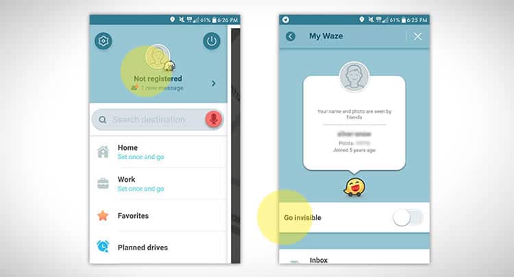
Recently, for example, I have noticed that Waze’s “Go Invisible” option was bumped up the menu. Waze stresses the social aspect of their app (traffic reports, chatter, seeing friends on the move, even carpool), and yet, they chose to put this option up front. This seemingly opposes their general philosophy. I assume they faced a choice between wanting to showcase active audience in a social network of drivers, and the freedom the drivers have to become invisible, and the latter won.
True, the notion is anything but new in social media apps, from Skype to the happy days of ICQ, we could do the ingenious action of being connected without being seen. Since then, in my opinion, values that deal with the users’ benefits (such as the need for privacy) have triumphed over the social/commercial need.
See the wisdom behind this. In such cases, potential users who would otherwise hesitate about trying the product, feel less threatened and more inclined to try it out. I assume that if Waze were not offering the option to disappear, the abandonment rate would go up or at least several users would consider the app nosey. So, flexibility towards the user’s needs can prove beneficial. Also, allowing users to choose the level of data access permissions, or not requiring many from the start, would allow more untrusting users on the bandwagon – people who are not feeling forced. In other words, users who object sharing personal data would try your product too. Therefore, a system that allows new and curious users to operate in an “unregistered” mode wins.

Every Product and its Ethical Questions
It is not always obvious, so, if you have any suspicion or ethical challenge during the creation of a flow for example, just put the question through the following filter: in a conflict of interests, do the user’s interests win? Meaning, no wasting time, no invasion of personal privacy, no unnecessary limitations and so on.
Can you answer that? Great! You are halfway there.
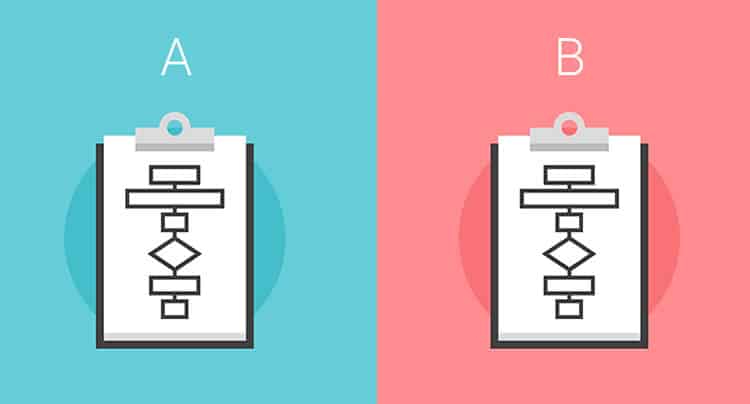
On one hand, multiple options = freedom to act
In the blue corner of the ring, we are placing the liberal principles of providing maximum personalization options and complete freedom. We expect the user to adjust the parameters however he/she sees fit. Here, all the questions are asked, all the possibilities are presented, and users are free to do as they please. Thus, they claim responsibility for their actions, whereas we, the designers of the system, are presenting the full scale of the system in the easiest and clearest way we can arrange the interface. In such cases, the user is expected to waste much time, as at any moment it is possible to backtrack and change parameters, settings and whatnot. Tinkering with the system itself can be never-ending.
Freedom is the main benefit, and the stage is set for the user, with maximum assistance for every action they might want to perform.
On the other hand, limiting the user = preventing errors
On the opposing red corner, find principles of conservatism and wrapping up the user. Here, we will not assume the user comprehends the entire gravity of their choices. We will ask as few questions as we can, with most choices being pre-made. In such cases, it is common to see a closed circuit of onboarding/tutorial that showcases the options, allowing the user to confirm only the most crucial choices (while being asked just once). Here, we strive to get the system as foolproof as we can. Consecutively, the interface would be linear, reduced and efficient, while guiding the user into performing specific actions without having to mess around with the system. Some might say that this is the optimal experience and the manifestation of respect to the user’s time.
This scenario is very much similar to how in the iOS interface, the “closeness” of elements allows the planning of streamlined processes, thus making the experience more consistent.

How much emphasis to bestow unto each approach
In reality, things are not black and white (…but rather, red and blue). Let me explain.
Let us take a banking app. Depositing a cheque would require the app to walk the user hand in hand, confirm multiple times while checking the balance and should not require any specific assistance. Meaning: when facing an action with significant consequences, where no mistakes are allowed, we need to lead our users, while confirming the understanding of each step and pacing by them.
Alternatively, think of states in which you have no direct control over, let us say, Gmail’s or Google Docs autosave features at intervals. Changes are saved automatically, sometimes allowing you to view the drafts or change history. As opposed to the banking app, there is no escorting. The decision has been made for you. Even if you are an above-average user, you cannot choose when to auto-save. Any negative implications for auto-saving? Virtually none.
Have you ever thought about the question “should your credit card details be saved for future purchases?” and whether it is toggled by default? (Hint: if it is on, someone has been relying on the statistic that a user would refrain from doing any additional action he/she is not sure about). Even though it might be easier not to retype the details, the system designer, in this case, is willing to compromise the data and to a certain degree, this decision is being taken in the light that it is in the system’s interests). The default might tell you, as users, a great deal about the intentions of the system’s planners.

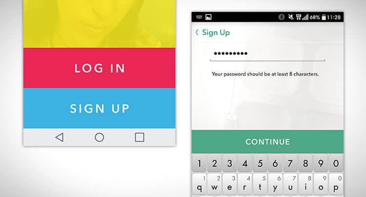
Using passwords: A problematic topic from its very core, passwords are tough to remember and to type them cumbersome. However, the system is still expected to do whatever is possible to keep the account, data and password safe. Sometimes, the experience would be “educating” to the point of frustration: “you should use at least eight characters, one capital letter, digit and special symbol at the very least”. True story. In such situations, try to think of an action that would be a reasonable compromise for the user that would save future attempts to reset forgotten passwords. Example? Social login (Google/Facebook/Twitter), external confirmation (email/SMS), or even providing a little “life hack” to your users on how to remember passwords. The system loves me!
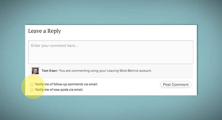
Newsletter registration: It is quite obvious that whoever builds a registration form is interested that users would sign up. On the other hand, as users ourselves, most of us can attest the problems in newsletters. You have been participating in a conversation online, and the next thing you know, you are getting a newsletter, ads and notifications of new posts without explicitly opting. So, should we pre-check opt-in checkboxes or not?
Social networks: If we think of Facebook’s default settings for a moment, when commenting, unless set otherwise, you will be notified of every new comment. It is true that it is useful (to keep track of the conversation), but there is no ignoring the fact that Facebook benefits from you returning over and over to check your notifications. The fear of missing out (or being left out, in this case) can become addicting eventually. I am quite certain that they have considered the number of notifications to walk the fine line between being informative and wasting time.
A recent feature has been introduced on Facebook. Besides (not instead) the notifications we are used to seeing, comments on someone’s wall post pop up in a seemingly “chat window”, next to the “regular” chats. For example, if I have congratulated someone, and they thanked me, it pops in the form of a conversation window, encouraging me to keep the conversation going (take note – publicly). For Facebook, it is close to a magical feature. A small change in a familiar pattern, yet one that increases user engagement. You are used to seeing private chats appear this way, so the primary instinct would be to divert attention there and keep on chatting.
There is no debate over the fact that if you want any product to survive, one major long-term goal is always to make the users come back and act over and over again. That being said, users who feel burdened by distractions demanded by less-important visuals would probably be irritated when being forced to divert their attention.

To summarise this part: The dilemmas grow more and more significant when the actions become more “critical”. As mentioned, when money can be accessed (PayPal, or apps that allow purchases and money transfers), it is advisable to make the process slightly longer to eliminate mistakes, even though it might be tempting to design a system that “compels” the user to make such an action quickly. We, as the experience planners, can make such choices. Everyone is rooting for ease of access and lightness of processes. Still, you might not want to be held responsible for making an instant loan request process too easy and impulsive, even though it might make the financial institution that provides the loan euphoric.
Guidelines to Resolve Ethical Dilemmas in UX Design
I have compiled seven guidelines that would help your users benefit from your choices, and I hope it might help you when making decisions:
1. Foolproof it
Even when that means “taking the wheel”. If the user is clearly heading for an action they might regret, plan ahead and prevent it. Think about the scenario of a highlighted save button when attempting to close an unsaved document. It is like stating: “We understand that you might regret leaving now, so, at the very least, we would like to show you the action you are assumed to prefer”. In most cases, this action should reversible.
2. Be the good guys and girls!
As a typical user, what would you expect to happen? Would you like to be signed in automatically to the mailing list? Would you like to see a summary before wiring money away to an account you have never wired money to before? Would you trust the app to have access to your personal and/or social media accounts? In such cases, keeping the best interests of the average user is probably the correct answer.
3. Yeah, science!
There are dozens of tools that allow you to conduct research. Whether it is a data analysis or the creation of an alternative page/site/app/feature, use real data to reach conclusions regarding the things your users prefer and how they react. The average developer should be able to tweak a simple form in moments, allowing you to see if the existence of a particular field affects conversion. So get it checked where doubt exists.
4. Correct data hierarchy
It is advisable to avoid any difficulty in accessing options the system is advertised to provide and making the user waste time in vain. Windows 10 users, for example, you are welcome to see whether it is easy to change the screen resolution as it used to be in previous versions.
5. Do not fear change
Even after a decision has been made, there is no reason to feel too attached to it. Gather feedback, take it into account, reply to your users and remember that the ones who bother to complain are those that are inclined to like your product. They are the users who invest the time to provide feedback. Also, you can always leverage a flow change for a new version upload that would benefit your PR.
6. Read the room
Nowadays it is safe to say that every product has a market share that used to (or expects) a certain user experience. Get to know the patterns and the audience. In case you have chosen to provide more options for a more advanced user base while giving up a bit of “streamline”-ness, make sure you understand tip #4. Alternatively, opting to provide fewer variables to more basic users should go hand in hand with having the interface teach the “game plan” in the best way possible.
7. Small bites
Facebook (and every company in the big data game) are known to be able to change the interfaces for billions of users on a whim, for better or worse. That is why they implement changes gradually: remember the frequent timeline changes? The registration for the new timeline layout (for users who wanted to see it first)? That is how you do it. Reveal features gradually or run several versions of your product in parallel (yes, A/B testing is advisable), and collect user feedback and data. This will make data gathering easier, diminish the feeling of intolerance towards existing users and reduce hurting the user base.

A Word on User Testing
User testing is a subject often raised when discussing ethics. I beleive that conducting user tests, knowingly or otherwise, yields a vast source of knowledge and provides the means for gathering data to evaluate. There are many ways to conduct research, whether it requires sitting next to users and watching them use the product, recording their actions or providing customised versions for specific crowds, and anything in-between.
As opposed to meeting your users in person or virtually, anything that is being done “behind the curtains”, whether the users are aware or not, has a layer of ethics on top of it. Every user of the Waze beta program is mindful of the fact that they get the chance to experience the latest features ahead of everyone. Whereas errors and even inability to use the app are not rare, at least, the user is aware of what to expect.
A/B testing is conducted, when versions of an active product are being operated side by side without the user being aware that they are a test subject. A particular question is in order: “is it OK to have users try things out without knowing, in the benefit of making the product better for everyone?”. Very often, the answer is yes, it is fine, as long as there is no harm done and no personal data is revealed. Indeed, a small percentage of users might face difficulties, but the aim is that the test is limited appropriately and the results are worth the trouble. This is particularly applicable in products that are provided free of charge. Some would prefer the chance for small, controlled instability, with the purpose of making the experience improve for the greater good.
There are those who have done something about it. Ind.ie are a Swedish duo who attempt to be the pioneers of technological ethics. In many aspects of it, interface planning included. You are welcome to watch them speak here:
In Conclusion
Ethical challenges often arise while planning and creating the initial wireframes, and particular ethical difficulties continue to rise during the product planning stage. It is advisable to conduct properly to avoid negative public opinion and trust pitfalls in the future.
I suggest thinking ahead about where the user is to be given freedom of choice, and where choices are to be made for him/her, in an attempt to provide the best experience possible and respect their time. In which cases we would prefer to point towards the “correct” action, so we will prevent errors, misunderstandings and keep things reversible. The field of ethics in UX planning is devoid of fixed rules and guidelines. Choices are measured in actions: how do users perceive your product and how much do they eventually trust it.
Consider the character of the product and its message. Within these frames, choose the amount of freedom you would like to provide. Base these decisions on research, tests and your personal experience as users (do not be afraid to make changes accordingly). You should strive to understand the product you are planning, both as a creator and as a user.
The most useful advice I can probably give you is to be as friendly to your users as possible. Keep their best interests in mind, and you will eventually benefit from it. Let them enjoy trusting you while feeling comfortable using the product, whether it is free or costly, simple or complex. Good luck!
Source: Usability Geek
Author: Hila Yonatan