Apps are more influential than ever in our techy society. With mobile about to overtake desktop in terms of sheer user numbers, that’s no surprise. Today, according to Pew Research, 68% of Americans have a smartphone while 73% have either a desktop or laptop. The former has grown by almost double in four years, but the latter has remained virtually unchanged in the last decade.
And all anyone seems to talk about these days is the latest, hottest app they just downloaded from the App Store.
When you’re designing for mobile, it’s more important than ever to guarantee your user (customer, shopper, reader, etc.) a simply flawless user experience. Unlike surfing the web on a desktop, surfing the web on mobile is harder from the get go, as people have smaller screens, just one usable hand, and being in transit to deal with. Under these already trying conditions, a sour UX can spoil your entire app, even if you’re designing with powerful tools.
A case study like the “Simple First Step in Building Your Mobile App” can provide powerful insight into tweaking the UX to design a successful app.
Here are 20 stellar design changes to improve your UX.
Go With Simpler Menus Instead of Complicated Ones
Remember that screen real estate is very, very small on mobile, so you can’t design big, fly-out menus on mobile. The fewer layers of navigation you have in your menu, the easier it is for your users to find their way around your app.
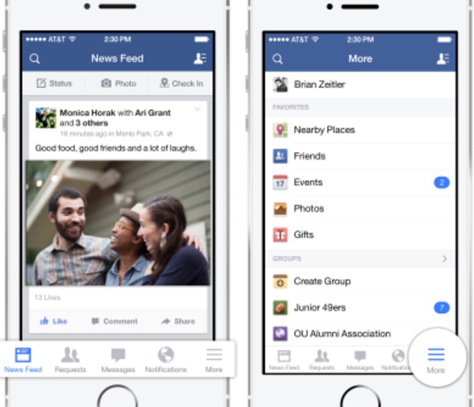
Again, due to the small screen sizes, a bottom tab bar with icons representing your menu items (think the Facebook mobile app) should be all that you’re using. You want your users to navigate easily, with just the use of their thumbs.
Try Progressive Onboarding
Onboarding is the process of showing new users that your app can do what they want to do efficiently and easily. Onboarding is super-crucial to the conversion and retention of your users.
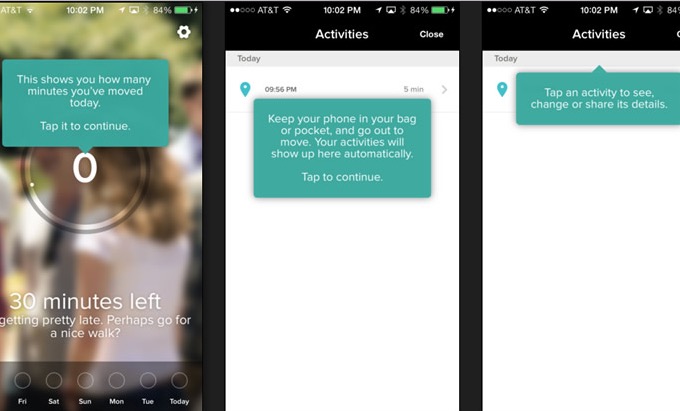
Instead of bombarding your user with aggressive requests for excessive, personal information, use progressive onboarding, which gradually walks your new users through how they should be using your app, so that they can get the most of it. By using these tooltips or online prompts, progressive onboarding becomes an immersive learning experience that’s sure to increase adaptability, regardless of whether you’re looking at it from a UX vs. UIstandpoint.
Rely on Fluid Layouts
Fluid layouts ensure that your app will display correctly on various devices of different sizes. Think of it as enabling responsiveness in your app. These are the typical device widths:
- 176
- 240
- 320
- 360
- 480
- 600
Doing anything less virtually guarantees that your app’s only going to work on devices that are consistent with your fixed break points. And that’s an enormous problem since it’ll look horrendous—and suffer from a very hampered UX—on anything else.
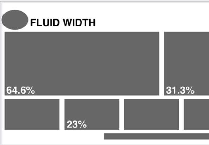
Here’s a straightforward guide to fluid layouts.
Reduce the Number of Form Fields
When it comes to forms, less is more. As UX Booth puts it, reduce less-important fields that are more optional than anything else. This will increase your app’s UX because there’s less of a chance that your users will become distracted—from the phone ringing or from a notification going off somewhere else—before they’re able to complete your form.
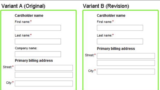
Here’s a tried, tested and true rule of mobile form design: Remove the field if it’s not specifically related to the task or goal the user’s trying to complete on the page.
Be Predictable in Design
Your app should be designed in such a way that users can predict how to use or interact with your app’s UI. This predictability is based on timeless design principles and ensures awesome UX since the margin of error is reduced.
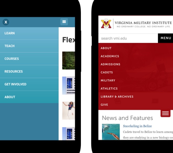
Predictability means that your app’s designed in a conventional way that users expect. Some examples are:
- Navigation is horizontal or vertical
- Icons are clearly visible and can be easily tapped by fingers
- Content can be efficiently scrolled by use of a user’s thumb
Design for One-Handed Use as Opposed to Two-Handed Use
Studies show that the majority of app users will navigate your app with just one hand. 49% of people use their smartphones with one hand; this data should be priority one when designing for UX.

You see, people don’t want to have to use two hands to perform simple tasks in an app—like going through checkout for a purchase or scrolling down to read more news—when one hand will do!
For optimal UX, make it easy for people to be able to use their thumb on one hand when navigating your app.
Use a Lot of Red When Designing Apps for an Asian Audience
You can’t design an app today without making considerations for the Asian market, which leads the entire world in app sales. In other words, your UX should be particularly considerate to the sensibilities of your Asian users. How do you do this?
For starters, understand their culture, especially the importance that color plays in the continent, where red is seen as a symbol of celebration, joy and happiness.

Some examples of apps that use a lot of red that are geared toward an Asian audience include:
Therefore, instead of using neutral or more subdued colors, boldly include a lot of red in your app’s user interface.
Use Persuasion at Checkout
The checkout process is when abandonment unfortunately happens all too often. To help lower your abandonment rate, design for persuasion to encourage your users to finish their checkout.
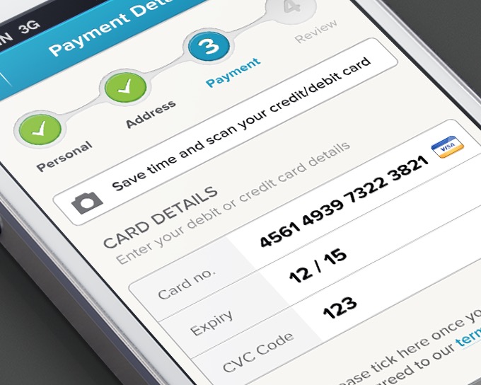
Here are a couple of approaches you can take:
- Tell users to spend a little bit more on their order to benefit from free shipping
- Stress your return policy (if it’s free) during checkout
Such basic messages shown to users at the right time during checkout can help to increase conversions.
Include Skeleton Screens for Progress
It’s bad form in mobile design to get your users to concentrate on how longthey’ll have to wait for a page to load. In fact, using spinners (those circles that indicate loading progress) can actually frustrate users.
Instead, rely on skeleton screens, blank pages onto which content is gradually loaded, to make your users concentrate on the actual progress of the page loading.
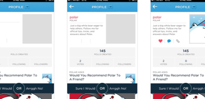
Google’s Luke Wroblewski ran a study where using spinners actually generated comments complaining about the wait times being too long.
So use skeleton screens, and make your users think that the UX is faster.
Forget About Images for Fancy Effects
One of the surest ways to achieve stellar app UX is by making your app perform fast. Since images weigh down an app’s performance by consuming a lot of resources, skip the reliance on images to create fancy effects like shadows or gradients.

Instead of utilizing fancy text as images in design, make sure that text remains just text. If you’re looking for fancy effects, then simply choose a fancy typeface. So forget about incorporating additional images into your app design for extra flashiness—your page-load times will thank you.
Be Consistent in Design
There’s nothing more aggravating than inconsistent design because it confuses users navigating your app, and confusion leads to frustration and then abandonment.
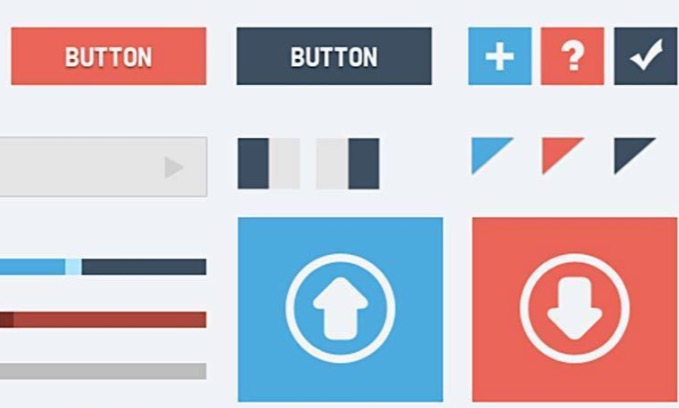
So what does in-app consistency look like? Something like this:
- If one call to action button is one color, all should be that color.
- If you use a hamburger menu for navigation on one page, then all pages should have the same menu.
- If the padding in one screen is 20 pixels, then the padding should be the same on all screens.
Incorporate Familiar Mobile Patterns
The emphasis here is on familiar. Mobile patterns come in all shapes and sizes, but to have the best impact for your app’s UX, they have to already be familiar to what the user is expecting.
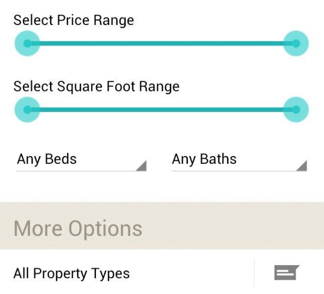
Study resources like Mobile Patterns, where you’ll see all sorts of common mobile patterns that are used on mobile devices. This will help you become adept at adding mobile patterns that make sense into your app design, patters like:
- Gestures
- Animations
- Sliders
- Popovers
- Sidebars
Don’t Discount 3D Effects Entirely
We’ve all heard that 3D effects have fallen out of favor in design in the last few years, as skeuomorphism was rejected by Apple. That ushered in flatter design and an approach that favored minimalism over the excesses of using real world images in design, which involved a lot of 3D effects like gradients and shadows.
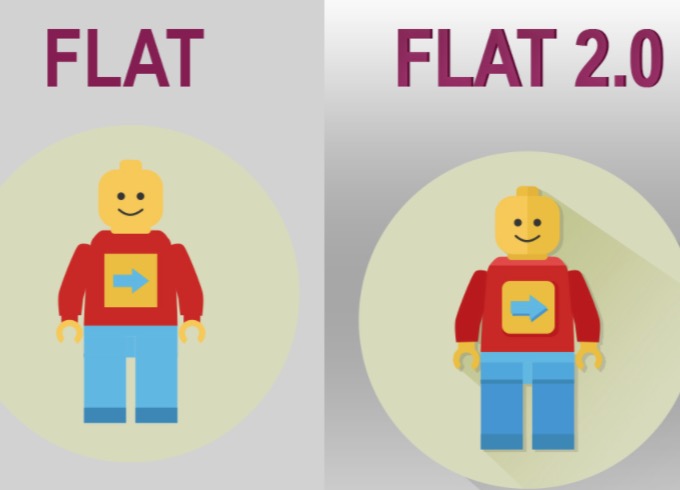
In spite of this move away from 3D, one of the biggest design trends these days, Google’s material design, actually doesn’t ditch 3D completely. In fact, it’s moved closer to flat design 2.0, in that subtle gradients and shadows have returned, while still retaining the overall, flat appearance.
That’s great because call to action buttons are more clearly clickable with some 3D shading, which helps UX.
Be Considerate of Finger Sizes
On mobile, you have to design for fingers instead of the mouse. Mouse cursors tend to be very exact on a pixel level, but fingers are a lot thicker than this. In layman’s terms: Just allow enough space on the UI to let users tap with their fingertips.

Users should be able to easily and efficiently tap on buttons of any and all kinds, and you can achieve this by ensuring that said buttons aren’t too close together or just too small.
When you design like this for your app’s UX, you increase delight because users won’t have to repeatedly tap to perform the task they want.
Make Room for White Space
White or negative space is simply the border around any elements on your mobile page. It can be any color, but it’s typically white. White space focuses user attention on the important elements on the page, thereby increasing chances that users understand and complete the page goal.
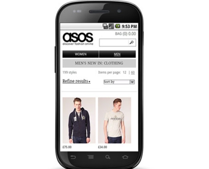
Even on mobile’s small screens, white space can direct your users’ attention more effectively to things like call to action buttons or web forms. When users easily know what to do on your app’s page, their UX also increases.
Design for Optimal Readability
Mobile screens are small, so your app needs to choose typography that’s easily legible without straining users’ eyes. Users who can read all the info on you app’s pages enjoy a great UX.

According to UXmatters, different sizes work best in different devices:
- Small phones need at least a 4-point size
- Larger phones need at least a 6-point size
- Phablets need a minimum of a 7-point size
- Small tablets need at least an 8-point size
- Larger tablets or desktops require at least a 10-point size
Chunk Your Content
Chunking your content is when you separate content so that users can more efficiently pick out vital parts on each page, thus increasing their retention of what they’re looking at and, as a result, their UX. There are a number of ways you can chunk content.
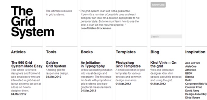
These include:
- Using subheadings
- Bolding
- Bullet points
- Smaller paragraphs to facilitate scanning and skimming
Separating content like this also creates hierarchy for better reading purposes, as users automatically know that bolded areas are usually subheadings and so can quickly read the subheading to help them determine if they’re interested in the content to follow.
Consult Specific Platform Guidelines
Designing an app to fit with its intended operating system ensures great UX because you’re properly designing for the platform on which you want to release your app. There are design guidelines available on the web for bothiOS and Android that will lead designers on the right path.
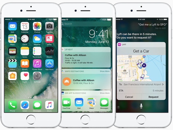
By following these guides closely, you can ensure that you never waste time designing your app in a way that doesn’t provide optimal UX.
While it can be a bit overwhelming to comb through the info in these highly detailed guides, it’s necessary for your app’s UX.
Delay Signups as Long as Possible
This is a biggie! Users usually hate being bombarded with a signup request on the very first page of their first experience with a new app. In fact, in the majority of cases, there are very few users who are already committed to signing up and providing their personal info right from the get go.
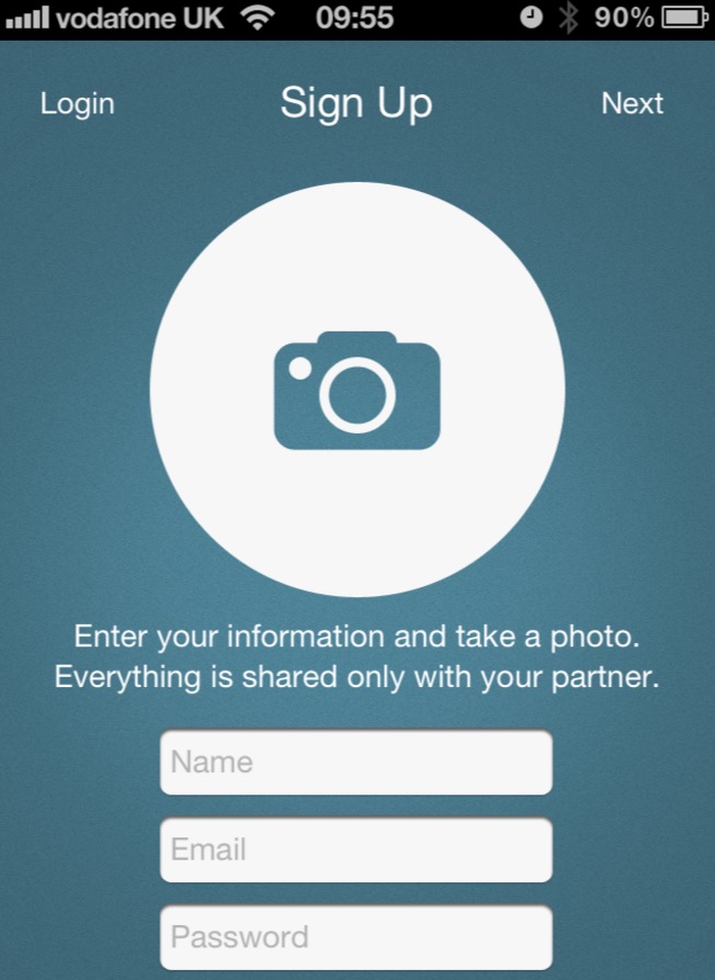
So what designers should do, according to Web Designer Depot, is postpone the signup process as long as is feasible. This delay allows your app to truly shine and first focus on persuading the user that he’s getting high value in his experience. Once the user’s satisfied, then he’ll gladly hand over his info.
Go With Card-Based Design
Using cards in your app UI is consistent with providing better UX because they act as information entry points that balance excellent aesthetics with convenience, according to software developer Nick Babich. In short, cards help designers seamlessly display content that’s constituted from various elements.
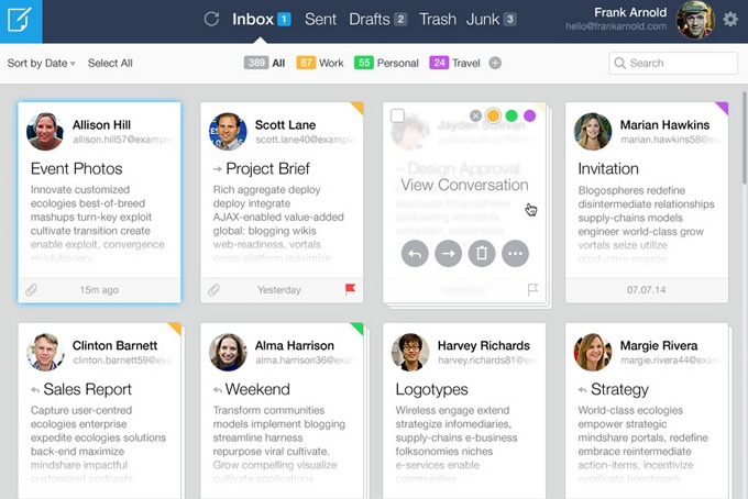
Due to the manipulable nature of cards, they’ll render well on mobile and desktop. It’s easy to scale them up or down to accommodate different sizes. This makes them responsive, which is a must in today’s design environment.
Define Your Mobile-App Strategy Today
If all of these tips seem a bit too overwhelming, don’t fret. You’re in charge of your own app-building destiny, and it’s possible for you to define your own mobile-app strategy right now. All it takes is the right knowledge to advance your goals.
When you download the “Simple First Step in Building Your Mobile App”ebook, you’ll be closer than ever to solidifying the right mobile-app strategy for your app vision.
Source: Creative Market
Author: Marc Schenker

