
The mobile web is here to stay. However, it’s important to remember that having a mobile website isn’t the key to success – it’s providing the right approach to the mobile user experience that brings success. Taking a user-centred approach to mobile (and other) design can help you keep in mind the outcomes that you intend rather than wasting time on unrewarding designs.
The mobile web is a description intended to distinguish accessing the internet on a tablet or a smartphone as opposed to a regular PC or laptop. As the world has adopted smartphones over the last decade – companies have come to understand the advantages of catering for the mobile web. However, too many businesses start with the end-point in mind; “We need a mobile app or a mobile website!” rather than considering why their users would want it.
There are advantages to delivering a mobile web experience:
- There is the opportunity to cater for the specific users’ needs at the right moment and in the right place.
- The mobile web can be accessed in places where the Internet is not easily accessible from other devices.
- Development for the mobile web can be cost effective and even be cheaper than standard websites.
- There is potential to reach a much larger user base (there are more smartphone owners than desktop and laptop owners).
- There is the opportunity to reach a much wider geographic area (in developing nations smartphones are often the only way for a user to access the internet).
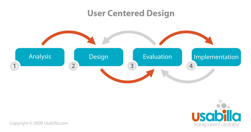
The User-Centred Mobile Design Approach
Author/Copyright holder: Paul Veugen. Copyright terms and licence: CC BY 2.0
There are 5 stages of the cycle (all development is assumed to be cyclical with products going through multiple iterations over a lifetime).
You assess the situation as it is at the moment (maybe that’s “we don’t have a mobile website” or maybe it’s “our mobile app is not performing as we’d hoped it would”, etc.).
Then you work out what it is that your users need from you. Once that’s done, you sit down and prioritize features for your mobile platform and then you work on designing those features while ensuring that you’ve put “mobile first” and finally, you review and refine the design.
1. Assessing the Current Situation
Yes, the mobile web is a big thing. Yes, there are more smartphone and tablet users than PC/Desktop users. But (and isn’t there always a but?) you can’t assume that your users want to use your website via those platforms. In fact, recent research suggests that many users (in general terms) use the mobile web for a limited array of things (mainly dating, e-mail, some apps and social media) and that when users have an option – they prefer to do more complex work from their desktops.
You need to think about whether a fully functional mobile app or website is really what you need – or is it possible that your users only need a small subset of functionality on the move and that they’ll do most of their work at a desktop?
Is it possible that your user base is less interested in a mobile web experience and more interested in an enhanced experience with the products and platforms you already offer?
2. Understanding Your User
Before you go rushing out to do any design or feature prioritization it’s important to understand your users better and in a mobile context.
You need to know things like:
- How do they prefer to access the internet?
- How much time do they spend interacting with your site at the moment?
- How much time do they spend online using a mobile access point?
- What features would be critical for providing a mobile experience?
- What are they frustrated with in your offering at the moment that could be done better via mobile?
- What devices are they using to access the mobile web?
If you have more than one user persona – you’ll need to answer these questions about each user group.
You’ll also want to tie this into a “higher-level” picture. Get out and investigate trends in your industry and on the mobile web. You may have noticed that apps are more popular than browsing on the mobile web – does that matter to your users?
3. What Will Your Mobile Web Experience Offer?
Then it’s on to prioritizing what goes in to your mobile experience. Your user research will show you what your users want but you also need to consider what the business wants from the process too. You may need to revise and modify components of the experience in order to handle conflicts between users and the business.
User experience is essential but it’s no good if it doesn’t deliver business results. Compromise can be a key part of getting this right.
Don’t forget that too much complexity early in the product lifecycle can be a major drawback. Prioritizing needs also means not being afraid to hold back ideas to future releases. A great minimum viable product can often be better than an overly complex one.
Author/Copyright holder: Daniel Würstl. Copyright terms and licence: CC BY-SA 3.0
4. Mobile Design Considerations
There are going to be mobile specific design considerations too. Are you going to integrate your mobile offering with your current offering? Will you use responsive design or adaptive design if you do?
A lot of this will boil down to context. E.g the context in which the mobile device will be used. If your users access the mobile web from their desks, that’s awesome, but many users don’t. They’re going to be trying to use them in the supermarket, on their daily commute, on the walk to the coffee shop, etc. But also from their sofas and beds and many more places that the ones we often think of.
That means you’re going to have to consider how to reduce distractions and make it easy for the user to focus on the task in hand too.
Josh Clark, the author of Tapworthy- Designing Great iPhone Apps, offers three categories for mobile web access:
- Microtasking: When the user interacts with their device for brief but frenzied periods of activity
- Local: When the user wants to know what’s going on around them
- Bored: When the user has nothing better to do and is looking to be entertained or otherwise diverted
Keeping these categories in mind can make it much easier to design for the user’s needs and focus on what makes mobile different from other access platforms.
5. Review and Refine
Sketch and prototype in early iteration phases. Make sure to test them with users. Get feedback and iterate rapidly.
Don’t forget to ensure your site is compliant with W3C standards.
Then go back to the beginning and iterate. It’s why the user-centred design process for mobile is cyclical. Well, just like all user-centred design processes!
UCD for Mobile, is it Really Different from UCD for Other Platforms?
User-centred design is user-centred design. The process for mobile should be the same as it is for any other platform. However, mobile platforms are different from desktop and laptop platforms and it’s important for a designer to take that into account when applying a user-centred design approach.
The process above is a standard UCD process, as proposed by Norman and Draper the original architects of UCD, but one which asks you to reflect on the mobile platform before moving ahead with the design.

Author/Copyright holder: Pixabay. Copyright terms and licence: Free to Use.
The Take Away
The mobile web is not a new concept. Deciding whether your users need mobile web facilities is important and then following a user-centred design process offers you the best chance of success. There are significant differences in the way that mobile devices operate compared to other devices and you need to make sure that you handle those differences with care to deliver the best rend result.
Source: The Interaction Design Foundation