
The internet is a huge part of our everyday lives. As we design experiences, we ought to remember that the internet is a part of everybody‘s lives, including those who are visually impaired or blind.
According to the World Health Organization, 285 million people in the world are visually impaired. These 285 million people still need access to the Internet, and deserve to have access to the same information that everybody else does.
Many individuals believe that if someone is visually impaired, they do not use the Internet. This is untrue.
Considering this, it is critical to design your website with this thought in mind. Making your website accessible for the visually impaired can also help people that are not. Here are some of Codal’s insights on how to do this:
1. Pay Close Attention to Colors and Color Contrast
Some eye diseases lead to a decrease of sensitivity to color contrast. Many modern design layouts are very detail-oriented, using very subtle colors to create a clean and modern interface design.
This is great for someone who has 20/20 vision. However, subtle colors make it difficult for a user who struggles to distinguish colors. Using a white font on a light gray background may look great to you, but another user may not even know there is text there.
Never use color as the only means of conveying your message or information. Instead of using color to show something, you should use color to outline and highlight information that is already visible.
Many form fields across the web use color to show when there is an error in a field. Sometimes, without being able to see the color, you would not know where the error occurred. For accessibility purposes, you should pair the color and error message with a symbol.
2. Font Size and Weights
Many modern design fonts, are clean and thin. Lightweight fonts are beautiful, but they are not very accessible for people who are visually impaired. It is important to keep your font size at least 12 pt. Any text that is smaller than that will make it hard for any user to read the content.
Your choice of fonts and colors can make a huge difference within a user’s experience on your website. Experiment with new fonts, font sizes, and weights. You may realize that it provides a better experience for everyone visiting your site.
3. Turn your Article into Audio
If your website is content-driven, being able to listen to the content instead of reading it can add a huge value to your site.
Once again, this is something that can be beneficial for everyone; busy parents who do not have time to sit down and read the news; workout fanatics who cannot read while they train, or employees who have a 30 minute walk to their job.
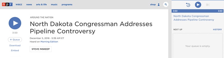
Npr.com does this extremely well. While the website allows you to press ‘play’ and listen to the article, it also lets you add new articles to your queue, so that articles will continue to play sequentially after the one you are currently listening to is complete.
4. Do not forget about Screen Readers
A screen reader is a software program that allows a visually impaired person to read the content of the website to them.
There are many aspects of a website that a screen reader cannot comprehend. If you have text that resides within an image, a screen reader will not be able to communicate that content to the user. In fact, screen readers cannot read or comprehend images and so they rely on alt tags.
One sector that tends to make use of images to replace text is the dining sector. In fact, a considerable number of restaurant websites make use of an image to provide the food menu to the user. How will a visually impaired user know what is on the menu without proper alt tag implementation?
5. “Refer to Figure XYZ”
How many times do you read on the web “Refer to figure 4.2,” and figure 4.2 is a chart? This is a common feature on a number of academic or technically-oriented websites across the web.
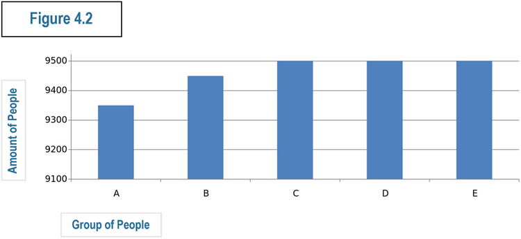
Some content writers may not realize there are people who simply cannot see what “Figure 4.2” is. Even if you are listening to the text, and not reading it, chances are that the screen reader cannot pick up what the image or chart says.
6. Be Specific with Your Alt Text
Every image that is trying to convey information should have a proper and specific alt text so that a screen reader can convey the message to the user. Your alt text should contain the same exact message that you are trying to convey when placing the image on your website. If the image contains text, that text should also be included in the alt tag.
One of the only real exceptions for this is when an image is only there for decoration purposes. Then, you will not have to worry so much about the alt text.
Conclusion
Designers tend to focus only on the visual elements; how the logo should look, which layout will be most effective, what colors the call-to-actions should be, how the content should be presented, and the like. The list could go on and on.
One thing that is highly overlooked, is assuring that the web design is accessible for people who are visually impaired. Some may think of this as being “extra” work, but not only is there an ethical element but it can also pay off in the long run.
Creating a website that is accessible should not be looked at as an option, but should instead be mission-critical. It can also help users who are not visually impaired such as those accessing your site via their smartphone or tablet, where accessibility may be impaired due to small screen size and screen glare.
Source: Usability Geek
Author: Jenna Erickson