
As a business owner, one familiar mistake you may have made on your web page is to have too many fields within a registration form.
In many situations, websites and applications will overburden their form field in an attempt to obtain the most data about their users, especially for the benefit of future marketing campaigns. This commonly results in a frustrated and irritated user.
Even before asking any information from your users, it is very important to provide them with a reason why they should register. In other words, sum up the benefits of registering with your site in 1 or 2 sentences at most. These sentences should be prominently displayed on the registration page (ideally close to the registration form itself). The benefits can take the form of receiving freebies (such as discount coupons or a free ebook) or the ability to access exclusive content that is otherwise not available to non-registered users. If users do not see that the benefit of registering outweights the ‘tedious’ task of filling in a registration form, they will simply continue browsing your site (at best).
1. Form Size: Keep It Minimal
Today, there are an abundance of ways to acquire the same information about your customer. This makes it unnecessary to force form fields upon them.
Eliminate unnecessary fields by limiting your form fields to 2 – 3 pieces of information. A simple name, email address and password will usually do the trick. This also means that there is absolutely no need for asking the user to re-type their email address or password! If more information is required, it can always be acquired post-registration.
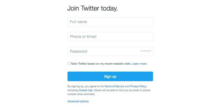
Twitter is a great example of a website that allows you to register in a fairly simple fashion, only requiring three fields. One out of the three fields even gives the user an option to enter an email address or a phone number:
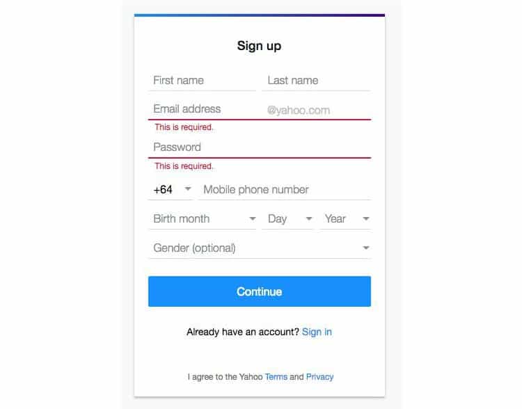
On the other hand, some websites such as Yahoo ask for almost double the information.
It has been shown that fewer form fields can result in more sign ups, resulting in more annual revenue. When Expedia removed one simple form field, their sales skyrocketed: one form field appeared to be costing them $12 million per year.
According to marketingtechblog.com, your conversion rate may be 50% higher if you stick to 2-3 form fields. This ultimately means that you are losing out on half of your potential sales just because your form is too long. Can you afford to lose 50% of your annual revenue? Probably not.
2. Consider Using Adaptive Placeholders
Float labels are fairly common – especially for registration forms. This popularity stems from their ability of combining both the ideas of a simple placeholder, and top left-aligned text. Once an input field is tapped or clicked on, the placeholder text disappears, then jumps up to the top left of the field. The animation on a float label is simple, elegant, and a clean-looking touch. Not only does it just look nice, but one of the core advantages to using float labels is that it keeps the context of the form after the user has already entered something in, eliminating any type of frustration for the user.
However, usability experts have long maintained that the fact that the label disappears strains users’ short-term memory and makes it difficult for a user to check the form before submitting (think – name and surname fields in the registration form). At the opposing end of the argument, some experts consider sign-in forms as an exception. This is because such forms essentially have two fields. Thus, if your registration form is simple, you may still opt to use float labels.
A recent improvement over float labels are adaptive placeholders. These are very similar to float labels but when the user clicks on the field, the label appears slightly above it. A real-life example can be seen on Walmart’s account sign up form. Katie Sherwin from the Nielsen Norman Group states that adaptive placeholders overcome most of the usability issues of float labels while saving space (something that is ideal especially for mobile devices).

3. Social Media: One Click Registration
In this day and age where users are interacting with numerous logins, they can become quite forgetful to remember which combination of email address and password they used to register. The only exception is perhaps if they are logging on the website or app on a fairly regular basis (or if they store their username / password combination on their browser).
A simple solution to this problem is to allow your user to register and login through a third party social media platform. According to the Washington Post, 1.35 billion people are on Facebook, and 20% of the world is logging into Facebook at least once a month.
As a UX designer, implementing a ‘Sign Up With Facebook’ button will improve the usability for your user while registering for a service on a website, as nothing is easier for the user than logging in with one click.
On top of making it easy for your user, if the user accepts to provide you with additional data by granting permission (social logins always have a popup showing what information will be shared), the social media route will let you obtain data on customers that you may not have been able to retrieve before. As stated earlier in this article, having less form fields means higher conversions. Sticking to only one sign up button, can work wonders for your marketing and sales teams.
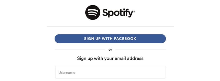
One of the cons of social media sign up is that the connection to the third party authentication can take longer to load – thereby increasing the abandonement rate. Another con is that some users may not want to share all of their information with your product, since it is a lot of information they are sharing. Then what? Giving the user an option to fill out a short 2-3 registration form, OR signing up through another social media platform can sometimes be the answer. See how Spotify does it below:
4. Validate Using Color Theory
Colors are one of the greatest tools to use when designing a form for validation. A usable registration form keeps the validation colors to three simple colors. Red, green, and yellow are instinct colors. Using these creates a simple anti-confusion solution for your users.
Users know that red is a problem and error message, yellow is a warning and green almost always shows confirmation and success, so for best usability it’s foremost to stick with these three colors.
Many usability experts will sometimes suggest to never use red because it is too alarmist and has the potential to scare users away. However, a yellow message sometimes will not be identified as an error and can become confusing for the user.
Along with this color theory, using strategic messages and icons are great way to show validation on a registration form. A combination of all three will guarantee the best possible usability on a registration form.
5. Grant Access Immediately
This is sometimes an overlooked usability guideline. Once users register, do not force them to confirm their email address before being able to log in. Grant them access just the same and then indicate to them that they need to confirm their email address within a specified time frame.
Also, once they register, log them in immediately. Re-directing users who have just signed up, back to a login form where they need to re-type their username and password combination simply does not make any sense. If the user has just registered, just log them in immediately.
Source: Usability Geek
Author: Jenna Erickson