
With all the content out there on the web and in print, the most important factors to get right are readability and legibility. After all, any piece of copy that’s worth its salt will be both. Even if you think you’ve chosen the very “best” font out there for your content, chances are that there’s still a lot you can do to ensure that every word is clearly understood as can be.
Use these 10 typography tricks to ensure that you make text easily readable in any piece of content that you create.
Balloon…Kerning
Kerning is defined as changing the space between two letters in a proportional font for aesthetically enjoyable outcomes; this technique is meant for individual letters. Kerning shouldn’t be confused with letter tracking, which is changing the spacing between letters uniformly across a group of characters.
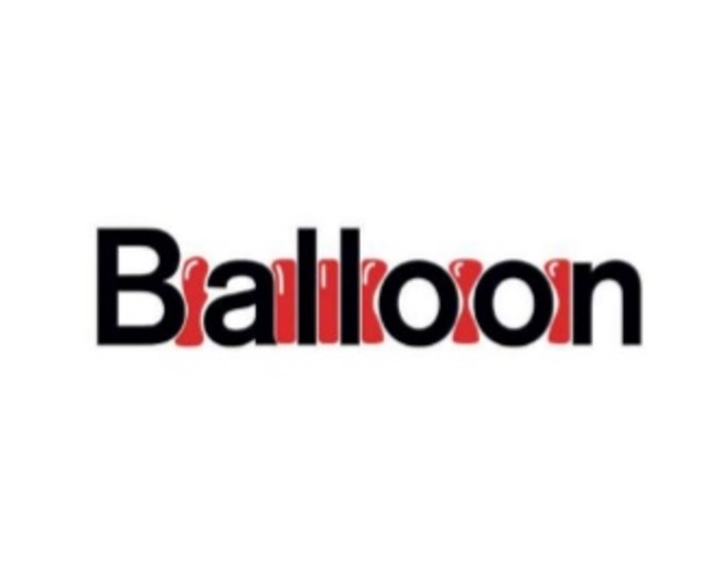
To achieve a cleaner look for your words so they stand out more, visualize balloons of consistent size and shape between the letters of your words when making typeface decisions. This highly abstract technique helps you to ensure that there are at least equal spaces between the characters in your words, which is the first step to a much more readable presentation of text.
Yeah, this takes a bit of practice to get used to, but your clients will thank you when you present them with highly emphasized words whose meaning is crystal clear.
Use More Tracking When Working With Smaller Fonts
Tracking is letter spacing in typography. Specifically, it’s a constant amount of either increase or decrease between letters, so to alter the density in a line of text. Naturally, the degree of tracking for any sentence or paragraph will have a considerable impact on emphasizing the words in the copy, either for better or worse.
This becomes an especial problem when you’re working with smaller fonts and are trying to fit in a certain length of text when you’re working with a restrictive amount of space. The closer you bring the letters of words, the harder it’ll be to read and retain that info.
While you may get away with it with bigger fonts, you won’t with smaller fonts.
The solution is, therefore, to be generous with tracking, particularly when you’re working with smaller fonts.
Hierarchy
Hierarchy refers to clues given to readers to tell them what parts of your text are of greater importance than other parts on the same page or webpage and what they, therefore, should prioritize in reading. Think of it as a way of cueing your readers, so that they can easily make sense of and organize the info that’s staring at them on the page.
You’re already likely familiar with hierarchy in text: That’s the headline, subheading and body copy.
The headline is usually bold and capitalized, which tells readers it’s the most important element to read first. The subheading is usually smaller and sometimes italicized for second priority, while the body copy has the smallest font and is expected to be read last.
When you’re mindful of this hierarchy in typography, good things happen, as the right words in the right places will be emphasized according to priority.
Don’t Alter Fonts (Except in a Specific Situation!)
Sometimes in design, it’s all too tempting for us to push the limits of tasteful design in the name of being unique and attracting attention. It’s no different with typography.
Sometimes, we want to stretch, morph or otherwise alter a font by manipulating its dimensions. The results in such cases are often monstrous and absurd, not to mention quite amateurish! It’s therefore best to leave a font as it was intended to be.
The only exception to this trick is to only alter fonts when you’re dealing with an illustrated project or if you specifically want a weird effect. Otherwise, know when to leave well enough alone, and err on the side of caution (and, by extension, readability and clarity).
Alignment Is Almost Everything
One of the best and simplest ways to ensure that you emphasize the words in your typography, headlines, paragraphs and anything else is by looking to your copy’s alignment. You see, alignment is often taken for granted, but it can be a powerful and swift weapon…if you know how to wield it.
Word to the wise: Stay away from justified alignment. While the neat and very even edges of justified text do look nice, nice doesn’t cut it when trying to improve readability. Justified text actually always creates uneven spacing and irregular portions of white space throughout text—which makes your presentation look chaotic and harder to read.
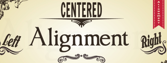
When text is harder to read your messaging could be lost completely, so try going with align left, align right, and center instead.
Pairing Fonts Properly
In typography, there’s usually a set of accepted standards as to how to determine what fonts pair together harmoniously—although, admittedly, it’s not always a hard science. Still, you can get very far in emphasizing the words in your text if you pick fonts that don’t clash or otherwise fail to complement each other.
So how do you pair fonts so that they’re in harmony?
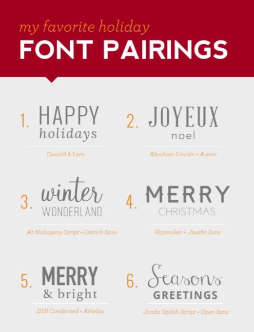
In order to strike a basic sense of balance in your words, a great starting point is always to choose one sans serif font and one serif font. Beyond that, everything from studying up on the typography basics to simply perusing a lot of newspapers, websites and magazines to understand what looks the best together will help you further.
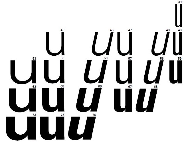
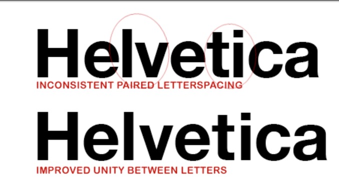
Understanding What Letters Kern and Track Better
Some letters are simply more harmonious together, making kerning and tracking more efficient for designers. Let’s look at a particular example.
Take the letters “W” and “X.” It’s not as easy to space them properly because the stroke (the part of the letter running diagonally) of each character almost ends up hitting the other. Now, if you have, for instance, a “W” and an “A,” you can see how much easier it is to space them because their strokes are parallel to each other.
Leading the Right Way
This has nothing to do with leadership. For our purposes, leading is the amount of vertical distance or height between lines of text. This is such a basic-but-crucial aspect of good typography that it will absolutely affect whether your text is easily read.
While it’s generally recommended that your leading be set at approximately 120% to 145% of your point size, you can exercise some freedom with this, too, as double-spacing provides a more luxurious read (and, therefore, an easier read).
Applying this percentage rule, then, let’s say your point size is 16. Your line spacing should be 19 to 23.
Master the Line Lengths of the Type You Choose
The line length of type is what’s known as measure. It’s in your best interest to master this because variations in the line length can turn your readers right off and cause them to quite reading!
Make a line too long, and readers can find it too exhaustive. On the other hand, make it too short, and it can be distracting for them!
Optimum readability occurs when your line length is anything between 45 and 75 characters, with the ideal length being found at 66 characters long (which counts letters and spaces).
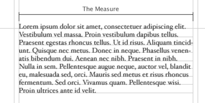
When the line length of your type is exactly the right length in this sweet spot, you make it easier for the words you want to be emphasized, as readers can efficiently pick out the words in the line.
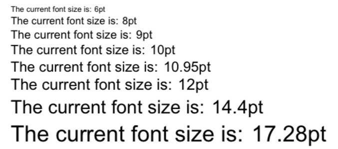
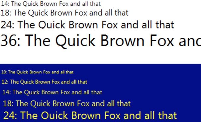
Font Size Matters
Last but not least, the size of font you choose will significantly impact readability, so you better make it something user-friendly. Let’s see what the research says about this.
In a recent study, user-experience scientists from Carnegie Mellon University conducted a study that concluded that 18-point font size offers readers the very best in readability and comprehension for the web, as far as body copy was concerned. This study was groundbreaking because it turned earlier beliefs on their head, namely that smaller point sizes were the best for web readability.
Ensure That Your Words Are Read
Thanks to these typography tricks galore, you’ll help to ensure that more of your words in your headline, subheadings and text get read. This is a hard feat to begin with when we consider that most people simply either read just the headlines on the web or don’t finish reading the whole article!
That’s why you’ve got to help your copy get noticed, and these typography tricks are designed to do just that.
When you spruce up you type and related aspects just a little, making small adjustments here and there, you’ll be amazed at how much more powerfully you’ll succeed in emphasizing your words.
Source: Creative Market
Author: Marc Schenker