
Material design has become more of a buzzword recently. While the elements of material design have supported many beautifully-designed and intuitively crafted sites, they have also created something of a bandwagon and many sites are starting to fall into a common mold.
Google introduced its material design guidelines in 2014 as a design language focused on creating a great user experience across an increasing number of connected devices. The concept is intended to provide flexible tenets that allow developers to create a responsive interface without confusing new users.
At its core, material design focuses on bringing a level of physicality into the digital experience. Key concepts of the design language include responsive design, digital paper and ink, and natural-feeling animations and transitions. Everything that happens within a digital interface, according to material design concepts, should feel intuitive and natural for the user.
Although material design offers some valuable insights, designers who have replicated these guidelines are leaving many brands with a generic digital experience instead of an exciting and intuitive one. While material design has much to offer the design world, some designers may use the principles as something that they conveniently lean on.
Material Design: Constricting or Supporting?
The paradigm behind material design is nice. The idea that interfaces should behave like real-world objects with layers and depth has changed the way we think about digital interactions and makes much more sense in an IoT-friendly era. However, as a Google-created language, material design naturally looks and feels like a Google-subsidiary. This general approach can hinder brands from differentiating themselves and creating a positive digital experience for customers.
When you look at an Android app or a website influenced by the material design concept, you may experience something that flows and looks nice but is essentially a cookie cutter site. It may remind you of something that you have seen before because you have seen something similar on any number of other websites and applications.
To avoid the pitfalls of commonality, designers do not need to completely abandon the concepts and details of material design. They do, however, need to take steps to differentiate the brand from the same look and feel that so many other brands have adopted. Material design can become a supportive tool when designers use it as a launching pad rather than relying on a material design-supported framework.
The Latest Developments in Material Design
Interestingly, one of the latest design recommendations under the material design guidelines asks web designers to transition from top-of-screen navigation to bottom-of-screen navigation – something that Apple has embraced for years. In one of its latest brand transitions, Google is updating the YouTube interface to be flatter and more streamlined.
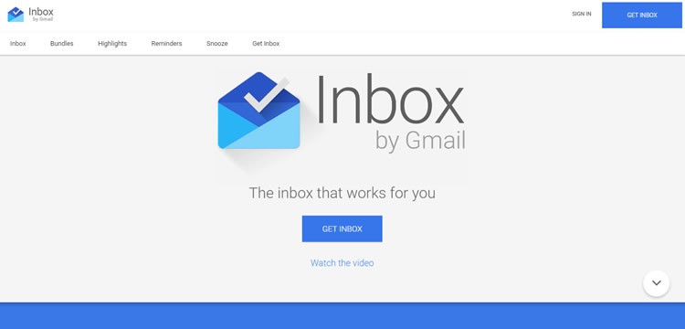
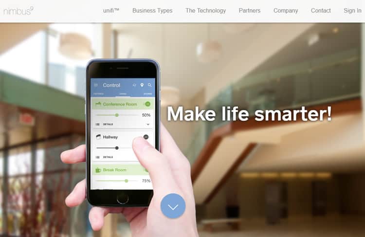
On the Inbox by Gmail interface, users can see the tell-tale features of Google’s material design. The flat buttons, font, and graphics are distinctly branded. If you go to the site, you will also see the material design-specific animations.
Another material design-inspired website, Nimbus9 clearly displays the hallmarks of the design on the homepage. The downward arrow is exactly the same as the arrow on the Inbox by Gmail interface. The two products are distinct, but the design approach is familiar.
Differentiating Your Brand Within the Material Design Framework
In 2016, device users understand how to navigate through an application and an operating system. They do not need every application to provide the same, easily-learned experience. In fact, they may subconsciously move away from brands that are boring.
To keep your website or mobile application feeling fresh and visually inviting, try using these guidelines:
- Pick and choose concepts: Nothing says you need to follow the material design guidelines verbatim. Find the usability elements that make sense on modern devices and blend those design concepts with a unique interface experience that breaks the mold. Make sure each user-facing page reflects your brand.
- Change up colors and fonts: Instead of using the design framework’s color palette and typography set, add some creativity to the mix with something other websites are not using. Create something that looks fresh and reflects your brand. Your content must appear readable and engaging, but that does not mean users expect the same experience from every brand.
- Do not ignore functionality in favor of form: A common pitfall of interaction design is choosing form over functionality, meaning, some designers are using the material design aesthetic guidelines and ignoring the usability recommendations. They want to provide the appearance of a modern website without actually changing a user experience to match the visual impression. In the world of digital design, if a website looks like a user-friendly page, it should act like a like a user-friendly page, too.
- Trust your design experience: Google often paves the way for cutting-edge UX and UI, so it is always good to use their design as a point of reference. However, you are the one who knows best your user demographics and your brand. Trust that knowledge to guide your overall design approach. For example, material design sometimes uses flat buttons to streamline the page, but this can lead to confusion regarding interactivity. Leave potentially confusing elements and busy animations off if you think it would interfere with usability.
- Get to the heart of material design: Well-rounded designers explore the merits of any major design trend. The next time you review material design philosophy, strip away all of the superfluous details. At its core, it is about blending the real world and digital world in a seamless interface. Take the essential ideas, but make your own rules for the elements that qualify as “clean” and “simple.”
- Go to competitor sites: Do your sites look similar, or do the elements contrast enough to create a different brand experience? You want to include information that matches the level of detail your competitor provides, but the overall look and feel of the site should not appear twin-like.
- Find a valid reason: Only use material design elements if you can provide a reason for doing so. Do you really need to add depth or use an FAB (floating action button)? If the addition would not enhance a user’s experience with the interface, move on to a static or flat element that supports your user’s needs.
- Keep investing in your own learning: Go to seminars, take classes, and keep reading about broader UI and UX concepts instead of relying on material design to carry you professionally. While a wildly popular philosophy, material design as we know it will eventually evolve, so it is essential that you do not fall behind in terms of the core philosophy – that of creating a great user experience. Create your own distinctive design signature that works responsively without feeling too confined.
- Listen to user feedback: Unless you are constantly in the end-user environment, you may not always notice the little inconsistencies that negatively affect the user experience. Your users, on the other hand, can provide important insights into what works and what does not. If something is not appearing as intended, the application designer will face the fallout. Ask for and listen to real user experiences as you go to make sure that you are serving your target demographic.
- Embrace material design if it makes sense: While differentiating your style as a designer is important, material design offers a lot in terms of simplicity and usability. If you like the familiarity of the language, use it to give an otherwise complex design the pared-down functionality needed for the website or application to serve its primary purpose.
Final Thoughts
Material design only becomes constricting when designers fail to push the boundaries and stay true to their own brands. Use the concepts to enhance your own unique design style to get the most benefit from this widely-used, modern and effective digital design philosophy.
Courtesy: http://usabilitygeek.com/
Author: Alam Smith