Virtual reality has introduced us to the possibility of being able to step into other peoples shoes, visit places we never thought possible and experience things all whilst sitting in the office but perhaps more interestingly it has given UX researchers a chance to immerse themselves into the perspective of their users — the chance of being able to reach previously unreachable groups, recreate specific scenarios or emulate specific attributes, all with a simple and recently inexpensive headset. This post explores how VR is powering the future of user research.
Using VR to Explore Immersive Storytelling
One of the most exciting aspects of VR is the way in which it is used for immersive storytelling. Powerful stories are already used in brand awareness to capture the attention of users but just imagine the recreation of these stories for product concepts in user testing where the response has the potential to reflect a more realistic reaction from participants.
The accessibility of these experiences becomes unrivalled. You are able to create a narrative around a product, allow the user to experience the actions and feed on their reactions straight back into your process. Yes, VR can be used for roller coasters, museums or Pornhub but I think the real trick is using it to measure the experiences of product iterations to get a better judgement of what makes peoples tick.
The Guardian created the above video, a VR experience attempting to capture what it is like being on the spectrum of autism at a family party. I used this film and a selection of others in an attempt to build a greater empathy with users with autism so that I could make better decisions moving forward in a certain project. The Party is a great example of how VR is used for immersive storytelling, I was taken away by how real the experience felt and these insights were instrumental in iterating my existing concepts without having contact with their intended users.
I’m not suggesting this is a replacement for user research, nothing can replace the relationships that are built through human contact. What I am implying is that in the correct context VR is another tool for us to utilise. Being able to share our ideas for interactions with users or even our own teams can help immerse others in the idea/problem space and hopefully result in better solutions through this increased empathy.
The final thing to keep in mind, however, is that with VR becoming a new tool for us to utilise it is important to consider the ethics and preparation that is needed for such a tool. VR could quite possibly be easily exploited in making others feel uncomfortable but is this ethically correct? No. We should provide comfort and transparency to others when using these new technologies.
What is the first thing that comes to your mind when you see the word “research?”
I am sure that the answers will vary. However, according to articles from Irish Times(2015) regarding public opinion of research, it is known that most people are still perceiving research as something that goes on behind a closed door, in which only very specialized people can engage in.
Honestly, I used to think of research just like that before I started pursuing a career as a researcher myself. I even think of researcher as an occupation that is quite nerdy. Well, here’s to prove my point:
Reverting a bit to my past, I used to study Psychology. I studied it not because I specifically want to be a psychologist, nor delve into the field of HR like most people expected a psychology graduate would be. I simply study it because I like communicating with people. What I didn’t expect from studying psychology was the countless days spent for research. During my University days, I would say that I wasn’t very good at quantitative research. However, I like qualitative research. While people who like numbers loathe it, I found myself enjoying the abstraction of qualitative data.
Little did I know, my enjoyment of qualitative research eventually lead me into my current profession. Never ever have I ever, thought that I would be UX Researcher. To be honest, 2 years ago, I didn’t know even know the meaning of “UX”, moreover the existence of job title that came with it. I used to think of researcher as a title that was related to numbers — scientist, statistician — you name it. But now I know that I was wrong.
User Experience (UX) researcher’s job encompasses a variety of investigative methods to add context and insight to design process. UX research merely translated from other forms of research. That is why anyone who has experience in running scientific research may be suitable for this role. To prove a point, my team members in Tokopedia (which consist of UX Researchers and Product Researchers) came from various backgrounds, such as biological science, IT, management, anthropology, psychology, and Chinese literature. Some even have previously worked as market researcher, field researcher, HR, business support, and data analyst. However, instead of diverting our focus as a team, those differences turn out to be empowering, as it enables the team to see things from a different point of view. Because of it, the team becomes braver in trying various method of research — to see what is working and what is not. It also opens more room for each individual to voice opinions based on his/her respective background — something that is needed to drive collaborations in the team.
While my experience in UX may not be much, I personally feel like I have learned a lot from being UX Researcher. Just like research finding that has key takeaways, every job also has it own lessons. Here are some key takeaways (or lessons) that I learned from being a UX Researcher:
Perspective taking really helps you to get through the day.
Since I begin to work, I have come to realize that many people aren’t used to the practice of perspective taking. I have seen people forcing their belief to their colleagues — be it in a harsh way, or in a more acceptable way. I also have seen people blaming others if something goes wrong, or even worse — blaming themselves too much that it ended up destroying their self-esteem.
I can say that I am very fortunate that my current job teaches me a lot about perspective taking. Since each research usually has a different goal and can be handled by multiple stakeholders, I have to accommodate their opinions in order to formulate a research plan. Be it the Designer, Product owner, Associate Product Owner, Business Development people, or even Marketing people— I need to understand how they think, how they work, and what they need so that I can conduct a research that can answer their problem. Not only I learn from the stakeholders, but I also learn so much during my time spent with users — be it directly or indirectly.
Let me give you three examples on this one. First of all, seeing quantitative data from survey enables me to see how different kinds of variable, such as demography, roles, and economic standing — can affect people’s sentiment or behavior toward things. Secondly, talking with different kind of users makes me realize that every person has their own story, and even when some of it seems similar, each one of them is actually unique. Last but not least, visiting users to their natural environment give me depictions of their daily life and also the limitation that they have to face every day.
By knowing lots of aspect regarding users, I have more or less been put in the position where I have to consider their point of views when solving a problem. It really helps me on making sense of the things that happened in my life – be it work-related or not. Without those experience, I would still probably think of things only from my point of view. I would also more likely to have problems in understanding people who had different opinions than I did— which would lead me into higher tendency to be frustrated because I can’t make sense of what’s going on, or being in conflicts with other people.
2. There’s always time to try or learn, even when you feel like you don’t.
When you are working, it is really easy to be caught up in work and abandon everything else. Sure, working can be fun, especially if you love your job. However, even when I love my job, there were days when I felt like I was just running my work responsibilities instead of improving myself. After a long time reflecting on what could have been wrong, I found out by then that it wasn’t my job that was wrong — it’s just the way I did it that was wrong. I forgot that there were actually so many things that I could do rather than just sat down and tried to finish my job as good as I could.
Working as a researcher pretty much drives me to be aware of many things since the job enables me to be in contact with so many people and topics. It somehow drives me to be more open to change. At some point, I then learned to challenge myself to do things that were out of my habit, starting by attending various meetups or workshops, volunteering in an event, embarking on outdoor adventures and even spending more time to do my hobby — something that I previously do in rare occasions. By spending time to do other activities, I become more able to pursue new knowledge and skills that otherwise wouldn’t be there had I chose to be caught up with my usual work routines.
If you open your eyes, you can always try and learn — whenever, wherever, from whoever it is — be it from books, movies, parents, friends, communities, colleagues, strangers, etc. Learning doesn’t always involve something that is really new. Sometimes, the things we learn might be more subtle — it can be from the things that we have heard or maybe have experienced before. If that’s the case, you can try seeing things from another point of view. As long as you are willing, you can always find that there are many things in the world for you to learn. If you ever feel empty despite your best efforts to do your routines, just take the chance to try and learn more things to break out from the feeling. You have countless better versions of yourself, inside you. They are waiting to be expressed and realized. After all, you can only regret the things you don’t do or try, right?
3. It’s very important to communicate things clearly with othersI remembered a day when I sent a report to my lead. I thought that I have done the report well until she asked me to check her feedback. Eager to see it, I found that she told me that some of the written sentences were hanging — leaving the reader with ambiguous meaning. I decided to re-read it, and turned out what she said was true. I have just realized that I have forgotten to explain things in context — something that is very important when communicating things to others.
Sure, the word “context” has various definitions. One of the widely acknowledged definitions of context is the one according to the Merriam-Webster dictionary, in which it is defined as “theparts of a discourse that surround a word or passage and can throw light on its meaning.” I previously read an awesome article regarding the importance of context that is written by Julien Samson in the Writing Cooperative. In the article, it is said that “context adds specificity to your writing and directs the reader attention to a particular train of thought, thus avoiding unwanted interpretation.”. However, it is also said that while the context is important, too much explanation will further confuse the reader and will make writing becomes harder to understand.
As a researcher, I can’t guarantee that stakeholders will always have time to meet with me and discuss the findings of the research altogether. More often than not, stakeholders can’t meet the researcher in person due to various circumstances (ie: stakeholders are residing outside the country, different schedule with researchers, etc). Given the situation above, it is very important to make sure that the audience can understand research findings in a glimpse, by delivering the findings in clear and concise words.
Now, back to my experience where my lead asked me to revise my writing — so, in order to make it easier for the audience to understand what I wrote in the report, I then learned to add more context to it. Adding context doesn’t mean that you need to write a long explanation — it means that you have to find the most effective way to communicate things in a way that will avoid misunderstanding. For example, I started by explaining numbers of user base (ie: answered by 315 participants who have bought pulsa), and make sure that I have written all the base for the graphics and chart that I have included in the report. The information that I added regarding user base may seem simple, but it can help readers to better understand what I write. From that time until now on, I will always keep in mind that I have to put context when communicating with people. Without context, people can’t relate to your story — and that is just sad because the most powerful stories are usually the ones people can relate to.
4. Practice makes everything better — but not perfect.
“Practice makes perfect” is one of many age-old sayings that is still popular until this time. Well, the concept itself is believable. For example, if you are learning to drive a manual car, where you constantly have to think about shifting the gears — it’s logical that you have to practice to drive over and over — until you just can do it instinctively. However, after mastering the driving skill, does it really make your driving skill perfect? what if you are put in the situation where the road is steep? what if the road is bumpy? can you still drive successfully? During my time working, I have done many usability tests, interviews, surveys, and other methodologies to gain information from users and make use of it to improve products. Due to that, there was a time when I thought that I was good enough in this field — probably better than certain people at it. Fortunately, that feeling of superiority didn’t last long, because, in one event, I found that my colleagues were able to give better explanations and practical solutions to stakeholders regarding a topic. That event made me feel like I was kicked in the guts. It left me thinking “ What the hell did I do wrong? how come I didn’t think of better solutions? how did she/he able think of that while I couldn’t? ”. That was also the time where I realized that falling in the illusion of perfection is very easy.
Since it’s the researcher’s job is to unravel the truth through various kind of analysis, I have come to the term where I realize that I need to know more today than I did yesterday. By falsely believing myself to have expertise in a certain field, I have shut down my curiosity, and that is the death of my growth. Embarking from my mistake, now I believe that there is no such thing as perfection no matter how hard you try — but you can always learn to be better, and curiosity is the key. As long as you are curious, you will never stop learning — which is good because explosive growth is usually triggered by curiosity, not knowledge.
Designing a good user onboarding is all about activation and retention of users. Check out these 12 tips and wow your users from the get-go!
All users need a little guidance when they first come to use your product — its only natural that you take them by the hand around the key parts of your design. Right? Yes, but a good user onboarding flow is much more than a simple tour of the product.
You need to illustrate why the product is a good thing for the user, how they can make the most of it and help them get the ball rolling. You want to leave users feeling like they have known your product for a while, and they they can start building up a habit of using your design in their everyday lives. No easy task, eh? But don’t worry!
We got these 12 best practices that will work as a framework for the next time you find yourself designing a user onboarding experience. Read on to find out more.
What is user onboarding experience and why does it matter?
User onboarding experience is the initial phase when a new user downloads your product and is using it for the first time. Usually most products will have some sort of walkthrough the key features of showing off the main advantages that the product can bring to the user.
The reason why a user onboarding flow is crucial to any product is that users will download a lot of things onto their devices — but most of those things are removed within a few days by a bored and unconvinced user.
Most designers will be surprised to see how quickly products lose users after the first use. Andrew Chen and Quettra carried out a study on Google Play Store that came up with this terrifying graph on user retention:
It’s only normal for many of the new users that a discovering your product to abandon its use if it’s not their cup of tea. In fact, the study found that on average, apps will lose 77% of new users within the first 3 days! Within 30 days, that number jumps to 90%. But how can we explain that difference in user retention from the top 10 apps when compared to the rest? After all, the top 10 apps lose only about 50% of new users over 90 days.
According to Chen, that difference comes from both the general quality of the UX design of the product, and the effectiveness of their user onboarding flow. This only works to illustrate that users will allow new apps a brief period of grace in which the product must impress the user, or risk losing that user to the competition.
Tips on designing a great user onboarding experience
By now, you’ve probably realized that an effective user onboarding experience is more than just showing the user the ropes or laying down the key benefits of the product. For you to keep those users, you need to captivate users from the first use. It needs to bring the user and product closer. It’s about introducing the product, activating the user and retaining that user until the product is a part of their life.
Find balance between benefits and how-to
People acquire your product for a reason. And even though it’s easy to fall into the trap of thinking that users want the upsides your product brings to the table — that is not accurate. In fact, users want a solution to a problem. They want a better version of themselves that your product can make come true.
The way to make good on those promises you made when users first got your product is to make sure you highlight the benefits your product has and how it will affect the user. This approach works well to make the user see how those benefits can bring the desired solution to fruition. But there’s a catch. Building up expectations of your product can be a good thing — but it does nothing to help users understand how to operate your product.
The user onboarding flow isn’t just an opportunity to build on your marketing. This is when you should also guide the user around the key points of the product and give them a quick class on how they can actually use those benefits you promised before.
If you don’t address the educational side of user onboarding, you risk leaving users disappointed at their inability to make use of those benefits. On the other hand, focusing exclusively on the walkthrough the product, you may leave users wondering why they downloaded the product to begin with — and why they need to process so much new information for the sake of this product. Since there is no supreme recipe for finding the right balance between the two, you will need to adjust the onboarding to the market — which brings us to the next tip.
Know your user
Saying that not all users are the same is understatement. But even though you’ll have quite a variety of people downloading your product, it’s possible to find a broad definition of who those people are, and that is valuable information when designing the user onboarding experience.
You’ll want to focus on a key matter: how tech-savvy are your users? Are you making a product for people who don’t necessarily know tech terminology, such as “delete data” or “reload the page”? This is particularly true for audiences that don’t include millennials — the people who want to enjoy your product but may not know too much about how any software works. Those users will need a user onboarding experience that doesn’t include fancy tech words, and carefully shows them around the crucial actions they can perform with the product in a simple and intuitive way.
Other audiences are mainly composed of young people who are considered tech natives. They are always closely familiar with their phones and computers and don’t need to you show them how to load files onto any platform, not do they need you to show them what the notifications icon means.
Here is how you can reflect the type of user on your user onboarding flow: take the time to include the workings of the phone or the website for users who don’t know much about technology. Include simple things such as the meaning of icons, stay away from jargon of any kind and open the window for the user to seek more information should they desire. For tech-savvy users, focus only on your product and how its features can be found and used.
Be consistent in the user onboarding experience
We’ve talked about how important it is to be consistent in your UX design before, and we cannot stress it enough. Just like your icons need to be consistent across the entire design, your user onboarding flow should follow the same tone and visual design as the rest of your product.
Think of things such as branding and brand identity. You want users to get introduced to the personality of the product straight away. Think of it like this: users are meeting your product for the first time, and just like when we meet new people we create a judgment of that person, so will users have an opinion of the product after that first use.
You need to make sure that opinion is favourable and that it really speaks to the identity of the brand and of the product. This includes thinking of the language and tone you use in the copy of the onboarding flow, the use of visual components that suit the branding and creating an overall first experience that represents the whole product in a nutshell.
Some products such as Evernote make good on this guideline by the use of custom illustrations that represent both instructions with new information and the brand identity of the young and practicality-focused brand. That’s visual storytelling that works for user onboarding!
Being consistent in your design will help make your product’s navigation be more predictable, but that’s just part of it. Aside from having a coherent design so you ensure good discoverability and learnability, you want to keep the user informed of where they are and how many more steps there are ahead of them in the onboarding flow.
When users come to to a brand new product, they look forward to playing around the features and not to have a long class on how it works for hours. And what’s worse: when we are excited about a final goal, anything that comes before that goal can feel like hours. You want to give users a clear picture of the onboarding experience they are about to get on.
Consider having indicators of long they have to go, such as progress bars or navigations icons with the remaining steps until the users are good to go. This will work to keep users from feeling restless, and have them know just how close they are to the light at the end of the tunnel.
Put users in the driver’s seat
Consider giving users control over the user onboarding flow. This may sound slightly strange, considering that users won’t know the product at all — so how can they make a decision regarding the onboarding experience? How can they decide what will and won’t help them in using the product?
That’s a fair point. But here is another point that is equally fair: not everyone has the desire, inclination or the time to endure the whole onboarding process. Sometimes, people prefer to take their time in messing around with the product and exploring it by themselves. And when users want something within your product, forcing them to do something else can lead to a feeling of frustration and eventual abandonment of the product.
Instead of going against the tide, give the user the option to skip a few steps in the onboarding or at least give them control over what gets shown.
Here at Justinmind, we do that by giving new users the choice to experience the onboarding in two modes: beginner or expert mode. While the expert mode lets the user dive into the full array of features and palettes, the beginner mode will guide users around the key features in an interactive way, and link users with support or Youtube tutorials.
Don’t overload users
Learning to use anything for the first time can be demanding — even riding a bike for the first time can be stressful. Your users are already dealing with something that’s unfamiliar to them, which by itself requires quite the cognitive effort on the user’s part.
That’s the main reason why your user onboarding experience needs to be very selective of what it shows the user. If you can, limit your flow to 5–6 screens or popups and make sure each screen has only one key message. After all, can you recall ever reading the 50-page manual that came with your washing machine? Ain’t nobody got time for that! Intead, go straight to the point and don’t make the user sit through 50 screens of information.
This can be quite tricky, especially if your product has a few extensive and complex features. If this is the case, consider breaking up your onboarding into phases. That would mean that users get the initial onboarding UX, and will come into a second onboarding experience as they grow familiar with the use of the product — allowing them to venture deeper into the complex features.
Follow up: send more information
If need be, of course. As we saw from the quick user onboarding flow of WhatsApp, not all onboarding flows have so much information that you would need to account for emails or notifications that can deliver further information to the user. But if your product does have some complexity to it, you may want to consider giving users a way to get better informed.
You can design a complementary side of the user onboarding by offering follow-up emails. These emails can be either a gentle reminder if the user didn’t get to finish the onboarding UX, or contain more helpful information.
Youtube tutorials are a great way to illustrate how to use the product, and are a great way to offer in-depth information while not overloading the initial onboarding flow with too much detail. Similarly, you can choose to send emails with short and visual guides on smaller features that didn’t quite make the cut of the onboarding flow.
There is something to be said about trying to bring users that haven’t finished the onboarding flow back with emails: don’t overflow user’s inbox with reminders. If after two reminder emails the users hasn’t come back, they most likely won’t. It’s important to know boundaries when it comes to sending users emails — when was the last time you felt good about receiving 20 messages in 2 days from the same app?
Ask to send push notifications — at the right time
Sending push notifications to users can be a great way to get users to finish the onboarding flow, as you can send them reminders if they don’t. But the risky thing about asking user’s permission to send notifications is that the timing of your request for that authorization is going to have a direct impact on how many users agree and how many decline.
If you ask for permission to send push notifications too early, the vast majority of users will automatically say no. After all, they only just started using your product and giving that sort of permission can feel like giving a stranger access to your personal information… which is enough to make most users decline your request.
You need to wait until the user has a clear picture of why the product brings them certain advantages and how the product will help the user be a better version of themselves. Give them space to grow familiar with the product before they give you permission to send them notifications — the same can be said about requests regarding access to pictures or data.
Logically, this can be tough if your product needs the use of notifications to operate correctly as is the case with messenger apps. Sometimes, there’s no running away or postponing the request to send notifications.
Test, test and test!
No one can expect to get it right the first time. As you know by now, designing a good user onboarding flow comes with many variables which the designer has to consider — all of which have some impact on the final onboarding flow. It’s normal and even recommended that you have several versions of the flow and that you test all of them.
Narrowing down what is truly crucial and needs to be a part of the onboarding flow is difficult, and finding a way to convey that information is even more challenging.
User testing is a time to learn from your users. You want to pay attention to people’s reaction to every step of the onboarding — are they bored? Do they feel confused at any moment? You also want to take notice of how users apply what they learned from onboarding to their first use of the product. Did they get lost even though they were shown the way in the onboarding?
Each little issue you notice should work as a building block for a better and updated onboarding UX in the final product.
Celebrate user’s achievements
Learning how a new thing works can be tough. Just like employees like getting recognized for their hard work, so do users enjoy recognition of their achievements. Small things like successfully uploading a picture, writing a post or sending a message are achievements your user has accomplished in unmapped territory (for them, at least).
Mailchimp understands the need for recognition. Once users have sent their first email using the platform, you get a screen that celebrates that fact. The illustration is on branding, has a funny side to it and works to encourage the user to use the product.
The wrap up
User onboarding experience is a crucial side of your product. It needs to both introduce the user to the product, give the highlights on how people can use the product and leave the user feeling both familiar and invested in its use.
Sounds pretty complicated, eh? But with some planning and the right mental framework, you can design an onboarding flow that will have both impact and meaning. Your overall UX will require something that adds value to the product in the eyes of the user — and the onboarding flow is a building block for great UX.
One of the key design trends of this year is the diversity of digital illustration. We come across original artworks on websites and landing pages, they effectively support blog articles, product presentations, events, and video production. For the recent year, we’ve created a big bunch of illustrations for not only our clients but also studio projects, Tubik Blog, Dribbble and Behance portfolios, etc. No wonder, among the variety of themes, designers and design process were the central ones. So, in our today’s post, we’ve collected the digital artworks by studio designers Yaroslava Yatsuba, Arthur Avakyan, and Marina Solomennikova to share with you bright, catchy and sometimes cute metaphors, characters and environments reflecting different sides of the creative process.
Get inspired and catch the vibe!
This illustration was designed as a title image to the article telling about the variety of visual content in web design. It is based on the literal method: it reflects a quickly-recognized workspace of a designer with details such as a computer with a graphic sketch on the monitor and a graphics tablet used right at the scene. To make the artwork catchy, the designer uses a bright and rich color palette and adds cozy vibes to the image with interior details, shadows, and textures.
This artwork is devoted to the theme of applying illustrations to user interfaces. The composition is dynamic, proportions are thoughtfully broken to make the image even more artistic. The palette is also quite emotional itself, using a lot of warm colors. The illustration harmonically combines the worlds of digital and traditional art, featuring pencils and brush in the characters’ hand together with a mobile device transferred into aircraft.
Although the process of UI design often reminds cooking cool stuff of different ingredients, we bet nobody wants their website or app rare or medium. No way. Only well-done! That’s what our fresh and tasty illustration is about. This illustration is based on the allegorical method projecting design process in a totally different area of human activity.
They are small and sometimes we don’t even notice them. Meanwhile, iconsare the superpower of the usability: designed well, they make the app or website navigation intuitive. That’s why designers invest so much time and creativity into icons design — and that’s what inspired this illustration. It applies the combination method: characters interact with exaggerated images of icons.
In branding for products, services, and companies, we often come across mascots, personified characters that support memorability and communication of the brand with users or customers. This illustration presents the whirlpool of mascot power for the article devoted to this theme. The detail symbolizing a bird mascot is featured as a logo on a website header, an image on a splash screen and a graphic element on the branded T-shirt.
Alone we can do so little; together we can do so much. This illustration for an upcoming blog article is all about the power of teamwork which is a solid foundation for big projects. The designer creates the depth of composition with a distant lighter part and darker elements of the foreground. It uses a bit cartoonish style to set the atmosphere of pure creativity which is typical for children that know no limits.
Working as a designer, you sometimes feel like diving deep into psychology to understand users. How do they think? What catches their attention? What are their heads full of? That’s what this illustration reflects. The composition is not too much dynamic allowing the viewer to examine all the details. The color contrast of backgrounds creates the feeling of outer and inner worlds of the character, and thin yellow curve lines support their integrity.
In the given illustration to the article about UI animation, the smartphone plays the role of a curtain wall like the one used in a puppet theatre and designers imitate actors, each showing a specific model of motion performance. Here we can see a group composition where all the characters are equally important. Textures are drawn by hand and palette is based on a rich color of the background to draw a user’s eye to the center.
This experimental illustration was created for the article devoted to the theme of negative space in UI design. Unlike most of the artworks in today’s collection, this one exploits limited palette of bold and contrasting colors. Broken proportions and composition, creative usage of negative space and unexpected combination of elements — all that stuff resulted in an attractive and a bit mysterious illustration showing how much can be found beyond the empty spaces.
Creating clear and intuitive navigation of a website or mobile app is one of the biggest design challenges. This illustration presents the topic of interface navigation as a process that needs balance and thoughtfulness. So, the metaphor is transferred with a character in a sort of zen yoga pose on the foreground and a mobile interface image as a frame. Light background supports the feeling of balance and serenity while textures make the image soft and eye-pleasing.
One more example of a literal approach is the illustration for an article Gestalt Principles in UI: Principle of Proximity. Simple static composition catches attention with textures and bright color accents. The atmosphere of the design process is supported with faded but clear background image featuring user interface.
On the way to a user-friendly app or website, it’s so easy to get caught up in the whirlpool of variants, elements, or options. To transfer this feeling in the illustration, the designer made the composition dynamic and used a catchy color palette. The picture also presented the article about UI design trends.
The illustration created for the article 3C of Interface Design: Color, Contrast, Content is another example of allegorical illustration integrating the attributes of different spheres into metaphors about the design process. In it, the keyword “Color” was chosen as a core semantic element and is reflected literally with the process of coloring something with paint. The contrast is reflected in the color palette of the artwork while the content is shown with the elements of the furniture in the office shown in the picture. The cat becomes a bright detail which adds dynamics and humor to the scene.
This illustration is about those for whom design never stops and feels like home where life is bright and elegant. Playing with textures and layers, the designer creates the feeling of the application cut out of paper which has become one of the trends in graphic design this year. The artwork also served as a title image for the article on home page design strategies.
It’s often thought that design is far from science. Yet, practice shows that logic, balance, and precision are vital in creating effective user interfaces for web and mobile. This illustration presented a post devoted to Golden ratio in UI design. It features dynamic composition strengthened with a variety of geometric shapes and curves.
The creative process for web and mobile UI design can be compared with rising a new building: you need to consider tons of factors, think over functionality, structure and “facade” and step-by-step make it live from digital bricks and mortar. That is the metaphor behind the illustration. A background featuring silhouettes of city buildings is based on a catchy contrast and all the composition makes a mobile device the center of attention.
One of the crucial challenges for graphic designers is finding the original style. The artwork was made as a title image for an article on flat illustrationthat shared practical tips on how to catch this golden fish, so the same metaphor was applied to the main visual.
This digital illustration presented a post with the color glossary for designersto share the basic terminology. The character and bright exaggerated splashes of paint immediately set the theme building the bridge between digital and traditional art, and dark background creates pleasant contrast, making the colors even more vivid and deep.
This bright picture is a title image of an article exploring the ways of improving website scannability. The designer took the time to find the cool palette which will look original and create positive emotional feedback. The details of interior and character’s outfit create cozy homey atmosphere, as it what users feel on well-crafted and easy-to-use websites. And schematic website layouts on the wall of the room set the instant connection with the theme of web design and usability.
This is a metaphoric illustration devoted to the theme of CTA buttons design in UI. Its plot is based around a character of surfer that reflects the idea of confidence and determination. The designer uses an unusual perspective and this way makes the composition original and attractive.
A title illustration for a big review of interactive elements in user interfaces echoes the title of the article that calls them “small stars of big design”. The illustration applies vivid colors and splits the composition with bold color contrast made by sky part.
Designers have to make so many decisions and choices that it sometimes seems design is an endless universe. That metaphor inspired the illustration applied as a title image for the blog article about using light and dark background in UI design: with the contrast of plus and minus as well as light and dark it quickly sets the atmosphere of choice.
One more creative experiment resulted in the title illustration for the post about the psychology of shapes in design. It is inspired by a famous artwork by Pablo Picasso but features a laptop with a graphic editor software as an attribute of modern art instead of canvas. The gradients and color combinations make the connection with modern times and trends even stronger.
The process of mobile app creation sometimes reminds the big race consisting of sprints, targets, and anticipation of the finish line of the app release on the horizon. This metaphor inspired this illustration, combining UI design and sports dynamics.
The dynamic composition of this digital illustration is developed around the spiral. Original looks are achieved with an interesting combination of details and textures. It was designed as a title image to the tutorial telling how to create illustrations for an IT blog or website.
Mobile designs need to take into account the way that users work with a mobile phone. That means understanding that distractions can come into play when the smartphone is in use and also ensuring that you make the input process as simple as possible to counteract their impact. Luke Wroblewski suggests the “one thumb, one eyeball” test as an efficient way of coming to grips with this problem. It may help make your mobile designs more user friendly and enhance the mobile user experience.
Analysing usage patterns for smartphones is a complicated affair. The ThinSlices app design site takes a close look at how smartphones are utilized in daily life and some of the emerging patterns of use for mobile devices.
The Usage of Smartphones
ThinSlices offers these insights into mobile usage:
People use their phones in 68% of cases at home rather than in work
72% of smartphone users don’t let their phones out of their reach at any time
More than half of all mobile phones are now smartphones
Half of all smartphone users consider their phone to be their primary access point for the Internet
There are 7 categories of usage on mobile – 3 categories account for 77% of all time spent on the smartphone – socializing, shopping and “me time”. (Source: Harvard Business Review)
self-expression (interests and hobbies),
discovery (seeking information),
preparation (getting ready for other activities),
accomplishing (managing health, productivity or finances),
shopping,
socializing and
“me time” (relaxing or being entertained). “Me time” is the most dominant usage with 46% of all time spent on a smartphone dedicated to this activity.
Nearly half of mobile users only use their smartphones for traditional phone activities – calling and texting. These users do not download apps or surf the web. Indicating the potential for growth in the app/mobile web space on smartphones.
The most used apps in the world are social apps (Facebook, YouTube, Google+, WeChat, Twitter, Skype, Whatsapp and Instagram) but the most used app is Google Maps (suggesting that “on the go” access is very common on smartphones).
Usage times vary by culture (Chinese use theirs most after lunch, Europeans in the afternoon and Americans in the evenings).
The average user interacts with their phone 150 times a day!
This data is interesting not just because of the opportunities it represents for UX designers in terms of the app market itself, but also because it suggests that there is no standard pattern of mobile usage either. This confirms that the best UX design for mobile is one which will take into account the possibility of the user being distracted from the task(s) they set out to do.
The One Thumb, One Eyeball Test for Good Mobile Design
Luke Wroblewski, Product Director at Google, notes that in a distracted environment, the best form of interaction with a smartphone is one which delivers high speed interaction with very easy to use functionality. He calls the typical mobile usage experience a “one thumb, one eyeball” experience, since the highly distracted environment causes most mobile users to engage in one-handed use with short spans of partial attention.
The one thumb, one eyeball test is thus about finding out if your mobile design allows users to easily use the app with one hand and partially distracted attention. In other words: Can users perform a certain number of tasks with just one hand in under 60 seconds?
If an interaction is measured in minutes or seconds, anything that complicates it is likely to hinder the user experience. Users engaged with smartphones in that 150 uses a day are often not going to have the time to play around for 5-10 minutes working out how to interact with an app or mobile website. They expect that you will cater for their “need for speed” in the design, and if you don’t, they’ll go elsewhere to someone who will.
The one thumb, one eyeball test was proposed by Luke during the design of “Polar”, an app designed to create photo polls and allow voting on them. The objective was that a user should be able to create a new poll in less than a minute using only one thumb to do so.
The results were impressive: Luke’s team delivered a process so simple that most users could deliver a new poll in thirty seconds. They also tested whether voice input could deliver a faster experience, and concluded that it wasn’t any significant amount faster than the one thumb input process. (Note: This may be because users are more familiar with one thumb input processes than voice input processes and the efficiencies might improve as voice input becomes a more widely used form of interaction with smartphones).
User experience designers may find that the one thumb, one eyeball test is a great way to conduct simple usability research for mobile apps and mobile websites. Certainly, it will not be an expensive test to conduct and may appeal to even the smallest design/development teams on the tightest budgets.
The Take Away
Mobile app and web use is very different from the desktop. Users face a variety of different situations throughout the course of the day and in order to deliver a high-quality user experience, designers need to optimize the interaction with their products to enable the highest chances of user acceptance. The one thumb, one eyeball test is a simple measure to see if the design delivers this simplicity of interaction.
There are two things that are always in short supply on any project; time and money. The Pareto Principlecan, in the long-term, help you save both. It can also help you make intelligent decisions based on your user research.
Our story begins with a Management Consultant Joseph M Juran back in the 1940s. He noticed that there is a general rule in business and in life – that 80% of the effects of a process come from just 20% of the inputs. He named this principle the “Pareto Principle” after the Italian Economist Vilfredo Pareto (1848-1923).
Pareto had published “Cours d’economie politique” back in 1896. He had observed that 80% of Italy’s land was owned by 20% of the population. He’d also noticed that 20% of the peapods in his garden contained 80% of the peas.
Why Does This Matter?
The Pareto Principle is useful because it allows us to focus our efforts on the areas that bring the most rewards. It’s used in almost every business discipline. For example, sales people will note that 20% of their accounts bring 80% of their sales. Marketers will find that 20% of their campaigns generate 80% of their leads and so on…
It’s important to note that 80%/20% is not exact. For example, you may find that these numbers change when you examine your own situation. So in the UK at the moment you’ll find that the top 20% of the country owns just over 50% of the wealth of the nation.
What is almost always true is that a small proportion of the efforts (inputs) will generate a larger than expected level of results (outputs).
The Pareto Principle and UX
It doesn’t matter how complex your website or application is, you will find that when you dig down into user analytics – the Pareto Principle will come into play. A small fraction of the functionality (or pages) will receive the majority of user time; this doesn’t mean that the rest of the functionality or content has no value but it does mean that some functionality and content is more important to the majority of your users than some of the rest.
This is important because it enables you to focus your research on the things that matter most and ensuring that you protect these things when you come to revising the user experience. If you degrade or reduce the impact of what most users want from you; you’re going to lose users along the way. Conversely if you can improve the user experience of these core attributes of your product – you’re more likely to win over new users and encourage user loyalty.
Again, if you start to talk to users about what they’d like to see when it comes to enhancing the user experience – you’re going to see the Pareto Principle at play as often as not. The vast majority of users are likely to feel strongly about a narrow range of improvements; again this doesn’t mean that other improvements are not valuable but it does show which improvements you should prioritize.
This can be really useful on projects with tight timescales or small budgets. Focusing on the areas that will bring the largest benefits to the most people is a very sensible way to manage a project in these circumstances.
A note of caution should be applied here – just because a lot of users ask for something, it doesn’t mean that they will value the eventual implementation. You can’t use the Pareto Principle to eliminate ongoing user research; it’s for focusing your attention on what should matter rather than guaranteeing it in this case.
You will find the Pareto Principle in play in other areas of your research too. For example, the customer support/helpdesk function will find that the majority of their calls/e-mails/etc. concern a few simple problems. Again concentrating on fixing these problems will have the greatest impact for the largest portion of your user base.
How to Use the Pareto Principle
Whenever, you have quantitative data – you may be able to apply the Pareto Principle. It’s simply a question of grouping that data and seeing how large a section of your audience is affected by any given unit of data.
It’s important to consider the sample size when you use the Pareto Principle. You need to ensure that your research or analysis covers a sufficient sample size to be statistically relevant. If you base, for example, your customer care analysis on 5 helpdesk calls – you probably don’t have enough data to apply the Pareto Principle sensibly to it.
There’s also another issue to be careful of – one set of figures may be more important than another. Many companies will have a few clients that represent the lion’s share of their revenue. If you are conducting analysis that will lead to a Pareto Principle driven decision making process… you probably want to give these customers more weight than the customers who don’t make you as much money.
So, for example, you have 500 helpdesk calls and 400 of them relate to a problem with Feature A, 80 relate to Feature B and only 20 relate to Feature C – it’s normally a no-brainer at this point to focus your efforts on fixing Feature A but if all the calls relating to B or C come from high revenue clients and the calls relating to Feature A do not… you may still want to focus your efforts on fixing B or C first.
Data should always be used in the largest context available and Pareto Principle decision making is no different.
The Take Away
The Pareto Principle or 80-20 Rule can be very effective in helping you make decisions in your user experience work. From research and analytics to higher level stuff like project management, wherever there is data that can be quantified there’s the possibility that you can use this rule to focus your efforts on the areas of your work that bring the most results.
However, you always need to be mindful of sample sizes and of other forms of data which may override the Pareto Principle in practice.
Service design is all about taking a service and making it meet the user’s and customer’s needs for that service. It can be used to improve an existing service or to create a new service from scratch. In order to adapt to service design, a UX designer will need to understand the basic principles of service design thinking and be able to focus on them when creating services.
The principles here are drawn from the design ethos of Design4Services, the organization that is committed to developing service design and promoting business transformation. These are widely accepted in the commercial sector. There are other ways of approaching service design, which are not as widely used but which may add value to the service designer’s toolkit; we have listed some of these approaches in the resources section at the end of this piece.
General Principles of Service Design
The general principles of service design are to focus the designer’s attention on generic requirements of all services. They are complemented by principles that relate to process design, organizational design, information design and technology design – we will come to these complementary principles in a few moments.
The general principles of service design are:
Services should be designed based on a genuine comprehension of the purpose of the service, the demand for the service and the ability of the service provider to deliver that service.
Services should be designed based on customer needs rather than the internal needs of the business.
Services should be designed to deliver a unified and efficient system rather than component-by-component which can lead to poor overall service performance.
Services should be designed based on creating value for users and customers and to be as efficient as possible.
Services should be designed on the understanding that special events (those that cause variation in general processes) will be treated as common events (and processes designed to accommodate them)
Services should always be designed with input from the users of the service
Services can and should be prototyped before being developed in full
Services must be designed in conjunction with a clear business case and model
Services should be developed as a minimum viable service (MVS) and then deployed. They can then be iterated and improved to add additional value based on user/customer feedback.
Services should be designed and delivered in collaboration with all relevant stakeholders (both external and internal)
Process Design Principles for Service Design
Much of service design is found in the design of processes, both internal and external, and these principles underpin this:
Any activity that fails to add value for the customer should be eliminated or minimized
Work is always structured around processes and not around internal constructs such as functions, geography, product, etc.
Work shall not be fragmented unless absolutely necessary. This enables accountability and responsibility from a single individual and reduces delays, rework, etc. It encourages creativity,innovation and ownership of work.
Processes should be as simple as possible. Focus on reducing process steps, hand overs, rules and controls. Wherever possible the owner of the process should have control over how it is delivered.
Processes should reflect customer needs and many versions of a process are acceptable if customers have different needs.
Process variation should be kept to a minimum.
Process dependencies should be kept to a minimum. (I.e. process in parallel)
Processes should be internalized rather than overly decomposed (e.g. training is better than work instructions)
Process breaks and delays must be kept to a minimum
Reconciliation, controls and inspection of process must be kept to a minimum
KPIs for processes will only measure things that matter
Organizational Design Principles for Service Design
People are the key to service delivery and some basic principles for organizations can help them realize their full potential:
Work groups are to be organized so that they match the processes and the competencies required
Individual workers will be given sufficient autonomy to make useful decisions
Work will take place in a location where it is done with the most efficiency
Information Design Principles for Service Design
Information flow is key to delivering high quality services; if people don’t know what they’re supposed to and when they’re supposed to know it – service suffers. These are simple principles for information design in service design:
Data shall be normalized between the organization and its customers and within the organization itself
Data shall be easy to transfer and be reusable within the organization and within the partner network
Wherever possible data entry shall be avoided and be replaced by data lookup, selection and confirmation utilities instead
Technology Design Principles for Service Design
Technology design principles are used to support the delivery of service. They include:
Technology should always be used to enable a service; it should not be the driver of a service.
Technology should be pulled into a service design rather than pushed into it.
Technology design is to be flexible enough and agile enough to allow fast modification in the face of changing customer requirements
The Take Away
Service design principles support the development of services which deliver high quality experiences to users and customers. Many of these principles are similar to principles already employed in UX design and it should be relatively easy for an experienced UX designer in products to transition to UX design for services.
Interaction design is an important component within the giant umbrella of user experience (UX) design. In this article, we’ll explain what interaction design is, some useful models of interaction design, as well as briefly describe what an interaction designer usually does.
A simple and useful understanding of interaction design
Interaction design can be understood in simple (but not simplified) terms: it is the design of the interaction between users and products. Most often when people talk about interaction design, the products tend to be software products like apps or websites. The goal of interaction design is to create products that enable the user to achieve their objective(s) in the best way possible.
If this definition sounds broad, that’s because the field is rather broad: the interaction between a user and a product often involves elements like aesthetics, motion, sound, space, and many more. And of course, each of these elements can involve even more specialised fields, like sound design for the crafting of sounds used in user interactions.
As you might already realise, there’s a huge overlap between interaction design and UX design. After all, UX design is about shaping the experience of using a product, and most part of that experience involves some interaction between the user and the product. But UX design is more than interaction design: it also involves user research (finding out who the users are in the first place), creating user personas (why, and under what conditions, would they use the product), performing user testing and usability testing, etc.
The 5 dimensions of interaction design
The 5 dimensions of interaction design(1) is a useful model to understand what interaction design involves. Gillian Crampton Smith, an interaction design academic, first introduced the concept of four dimensions of an interaction design language, to which Kevin Silver, senior interaction designer at IDEXX Laboratories, added the fifth.
1D: Words
Words—especially those used in interactions, like button labels—should be meaningful and simple to understand. They should communicate information to users, but not too much information to overwhelm the user.
2D: Visual representations
This concerns graphical elements like images, typography and icons that users interact with. These usually supplement the words used to communicate information to users.
3D: Physical objects or space
Through what physical objects do users interact with the product? A laptop, with a mouse or touchpad? Or a smartphone, with the user’s fingers? And within what kind of physical space does the user do so? For instance, is the user standing in a crowded train while using the app on a smartphone, or sitting on a desk in the office surfing the website? These all affect the interaction between the user and the product.
4D: Time
While this dimension sounds a little abstract, it mostly refers to media that changes with time (animation, videos, sounds). Motion and sounds play a crucial role in giving visual and audio feedback to users’ interactions. Also of concern is the amount of time a user spends interacting with the product: can users track their progress, or resume their interaction some time later?
5D: Behaviour
This includes the mechanism of a product: how do users perform actions on the website? How do users operate the product? In other words, it’s how the previous dimensions define the interactions of a product. It also includes the reactions—for instance emotional responses or feedback—of users and the product.
Important questions interaction designers ask
How do interaction designers work with the 5 dimensions above to create meaningful interactions? To get an understanding of that, we can look at some important questions interaction designers ask when designing for users, as provided by Usability.gov(2):
What can a user do with their mouse, finger, or stylus to directly interact with the interface? This helps us define the possible user interactions with the product.
What about the appearance (colour, shape, size, etc.) gives the user a clue about how it may function? This helps us give users clues about what behaviours are possible.
Do error messages provide a way for the user to correct the problem or explain why the error occurred? This lets us anticipate and mitigate errors.
What feedback does a user get once an action is performed? This allows us to ensure that the system provides feedback in a reasonable time after user actions.
Are the interface elements a reasonable size to interact with? Questions like this helps us think strategically about each element used in the product.
Are familiar or standard formats used? Standard elements and formats are used to simplify and enhance the learnability of a product.
So what do interaction designers do?
Well, it depends.
For instance, if the company is large enough and has huge resources, it might have separate jobs for UX designers and interaction designers. In a large design team, there might be a UX researcher, an information architect, an interaction designer, and a visual designer, for instance. But for smaller companies and teams, most of the UX design job might be done by 1-2 people, who might or might not have the title of “Interaction Designer”. In any case, here are some of the tasks interaction designers handle in their daily work:
Design strategy
This is concerned with what the goal(s) of a user are, and in turn what interactions are necessary to achieve these goals. Depending on the company, interaction designers might have to conduct user research to find out what the goals of the users are before creating a strategy that translates that into interactions.
Wireframes and prototypes
This again depends on the job description of the company, but most interaction designers are tasked to create wireframes that lay out the interactions in the product. Sometimes, interaction designers might also create interactive prototypes and/or high-fidelity prototypes that look exactly like the actual app or website.
Diving deeper into interaction design
If you’re interested to find out more about interaction design, you can read Interaction Design – brief introby Jonas Lowgren, which is part of our Encyclopedia of Human-Computer Interaction. It provides an authoritative introduction to the field, as well as other references where you can learn more.
The new entrant into UX in an established business often has a tough time of things. People understand what UX stands for (some of the time at least), they may even have an idea of why it is important but they often have no real understanding of what is required to achieve a good UX.
This lack of understanding and particularly from management; leads to conflict with the UX team. This can be avoided, or at least made less painful, if all managers were to understand these 7 critical UX ideas.
User Research is Not Optional
Product managers, customer service managers, marketing managers, development managers, etc. can all feel somewhat threatened when the new UX guy on the block starts talking about talking to their users. This results in defensive displays in meetings where they will argue that they talk to the users and customers all the time and thus – you don’t need to.
Perhaps the easiest way to overcome this issue is to explain the purpose of user research and one of the outputs – user personas. Show how existing research cannot build these pictures accurately and that the benefit of user research is better understanding of users so that the whole business can align on user objectives. Show how existing research can complement this picture and you should slowly starting winning people round to your way of thinking.
Is Not a Single Process
Big business, in particular, has become very process focused over the last few years. The introduction of quality management like Lean, Six Sigma and TQM has driven that. This often leads to senior figures demanding UX processes from their UX team. They want a nice consistent approach that they can then measure on each and every project to track some awesome numbers for their spreadsheets.
You need to show that UX is flexible. That each project is unique and that you may need to develop a unique process for each project to reflect that. Part of your process is selecting the right tools for the job, an iteration of a project may follow a very different UX path from the one chose for a brand new product.
UI Is a Part Of UX But Not the Whole of It
There is often an assumption that UX design is solely concerned with screen flow, buttons and other inputs. Yet, as any good UX designer can tell you, that’s only part of the job. That doesn’t mean that UI is not important (far from it) but it does mean that UX is going to be involved with other areas too.
Talk about the internet of things and how in a few years there may be no screens associated with a product at all. Talk about how UX can help with business process and product process development (things for which there are no screens in the here and now). Talk about the UX of content and why it matters. In essence, show the range of UX and show why it matters.
Usability Tests Matter
In business people tend to have faith in expertise. It’s good because that’s what got you your job – you were seen as an expert in UX. Unfortunately, that faith can be expressed in a resistance to your conducting user testing.
After all, if you’re the expert and you did the design work, surely that’s enough? If you do know what you’re doing – there’s no need to test is there?
This is really about explaining checks and balances. Yes, you are the expert but experts make mistakes too. If Coca-Cola had taken a few steps back to conduct in depth checks on their customers – they’d have realized that New Coke was maybe not such a good idea. It is the results of usability testing that enable you to decide whether investing in product development is worth the effort.
Usability Is Also a Part Of UX But Not the Whole of It
Another area where it’s easy to find UX pigeon-holed is as the “usability people”. Yes, usability is a vital part of what we do but once again, it’s not the whole of what we do.
It can be best to show examples of where usability, think the Sinclair C5 or the Betamax video, didn’t make a jot’s worth of difference to the final success of the product. Just because something is easy to use – it doesn’t mean that there’s a market for that product. It’s the overall experience of that product in context that matters.
Takes Time and Is Iterative
How can it take that long? What do you mean the product won’t be perfect at this release? The investment in UX from a business perspective is a good thing but there’s a tendency to assume 100% immediate returns on investment. The UX professional knows this isn’t likely but the management team doesn’t.
This is really about explaining the process in more detail. That initial insights require time to be refined to produce the best User Experience and that requires prototypes, wireframes, testing, etc. In the longer term it’s about understanding that nearly every experience can be improved, even if the experience is excellent at the time of release. Most businesses live by that mantra anyway so it shouldn’t be too tough a sell.
UX Requires Many Hats
The instinct to save on the staff bill should never be under-estimated. When recruiting for a UX team there’s a tendency for other managers to expect one person to be an ethnographer, a UX researcher, a UX designer, a usability engineer, etc.
You need to be able to show that while multi-skilled professionals do exist that they are rare. You also need to be able to show that even if you could find these wondrous people – there’s a limit to how much work one person can do anyway. UX is not normally a one man job even if it would be cheaper that way.
Summary
These 7 ideas should help managers better understand what can and can’t be achieved through the UX team. It’s not that they’re not already on your side (you already have a job don’t you?) but it’s just that they don’t really know much about UX yet – it’s your job to help educate them.
It’s time we start addressing accessibilitybeforeaesthetics in our design processes to create meaningful products for our diversified societies and cultures. Before diving into the Why, How and What of it, let’s revisit the definitions of these terms to set the context.
Accessibility
As the definition goes, it’s simply the quality of being able to be reached or entered. In terms of Design, it however refers to the characteristic that products, services, and facilities can be independently used by people with a variety of disabilities.
Aesthetics
As the definition goes, it’s a branch of philosophy which deals with questions of beauty and artistic taste. While it is mainly relates to the study of sensory values, in Design it’s about the visual attractiveness of a product.
As stated in Interaction Design Foundation here, studies have proved that creating good aesthetics in a product leads to better usability and user experience which is further catalyzed by references in Don Norman’s Emotional Design: Why We Love (or Hate) Everyday Things, that visually appealing websites are rated as more usable than they actually are, because their attractiveness evokes pleasant emotions in users.
Let’s see how Aesthetics work in design today. It has grown into a common belief that usability of a product is often defined by the attractiveness, i.e., the aesthetic appeal of the design. It’s a general belief that their attractiveness provides a sense of pleasure to the user’s mind and that will surely increase downloads, active users, reduce the drop off rates, reach a larger user-base. I’m sure many would agree that it happens to the best of us: we open any new product, new mobile app, new website, a sleek animation on dribbble, any design project, which is beautifully designed (aesthetically), crafted and presented, we go through the entire content to realize whether we missed out on something or did we really understand the purpose behind the product, though it visually appealed a lot. If one refers to Don Norman’s three layers of design, Visceral Design level plays an integral role in this context, which more or less explains the belief that aesthetics enhance the UX of the product but it surely lacks on the other two layers (Behavioral & Reflective Design). In a way,
Let’s talk about the elephant in the room, Accessibility. In alignment to the idea of Accessible Design, there’s another concept which apparently is bigger and arduous today, is Inclusive Design; but how does it differ?
Well, Inclusive Design, as the understanding goes, is like an environment which can be accessed and used by as many people as possible, irrespective of their age, gender, location, disabilities and other differential factors. So naturally, accessibility is a core subset of inclusive design and means much more. Nowadays, as more and more organizations are addressing the 1 Million+ Users, Next Billion Users, we often come across the idea of Design for All, which in simple sense is an ideal state. The amount of diversity we witness among our users in the society, it is surely an ideal scenario, if not impossible, where one design solution fits all. But it also signifies that we must work towards it, the more we address these diversified aspects, the better we create. While it is potentially fruitful for both users and businesses, designing for as many users as possible is indeed a daunting prospect .
Our products today, as they aim to reach more and more users, have to be designed with more inclusion for the businesses to sustain in this competitive market. People nowadays tend to focus more on aesthetics of a product expecting usability to be default but often usability aspects are lost or compromised in the process. An aesthetically brilliant product might only address a small set of users because good aesthetics demand more and more criteria like for visual aesthetics, it ranges from color, shape, pattern, texture, hierarchy, balance, scale, line, proximity and movement. Naturally, more the filters, smaller the user group, and addressing this challenge of finding more inclusivity and accessibility in our design process is the need of the hour.
How can we address Inclusive Design?
There is an endless range of things which can be addressed to attain inclusiveness in design and believably it can be retrieved through our standard design thinking methods of ethnographic study, empathy, user research, usability analysis. But let’s start with some of the distinct ones; first up the King of Aesthetics: Color.
• Color
As designers, it seems odd to consider a scenario that not everyone sees color in the same way, or even at all. Color Vision Deficiency (CVD), commonly known as Color Blindness is among one of the most common and widespread disabilities in the world, which we don’t easily accept or address in our day-to-day living, unless critical. A reported 50 million cases exist in India with 9% of world population suffering from this, often inherited, incurable disability. Putting a billion users in perspective, the user-base is humongous.
One way of addressing color while designing for inclusion is the concept of Color Contrast. WCAG guidelines say that a contrast ratio of 4.5:1 between foreground and background color is required to suffice accessibility index. There are various tools across the internet which helps one select a color palette. To list a few common ones: WebAIM Color Contrast Checker , WCAG Contrast Checker. In the below image, all the 10 text blocks might appear legitimate to most of us, but the five blocks on the left are surprisingly NOTaccessible by WCAG standards .
• Shape
Shapes work wonders where color fails. Using shapes as visual cues to show various states of the product is significant for accessibility, and when complemented with color, can be a great combination to address accessibility with aesthetics. The application of solid and hollow icons to show two states of any action button is being widely adopted today which is a great way of making our products more inclusive. The image below is one great example of how any product can use the concept of simple shapes and play only with strokes of a neutral color to communicate so much.
• Labels
Designing an icon which clearly communicates the action in itself is a challenging task and when your product has some unfamiliar actions, which users aren’t expected to know, it becomes an even bigger challenge to communicate. An assistive method of using text labels with icons for any action button, or wherever applicable, caters to our non-literate users and the ones with cognitive disabilities. Usage of text labels can also apply to form fields where a labelled textbox speaks more than a blank one.
The image below is a representation of how accessibility is being addressed in a bottom navigation bar. It reflects how these old, new, big, small platforms are using the concepts of color, shape, and labels, to achieve certain levels of inclusivity. The index here can be put to a scale of least accessible (red circle) to fairly accessible (amber square) to most accessible (green triangle). Obviously, aesthetics are then integral as well with some probable trade offs.
• Multilingual Support
Companies today are building products for larger audiences spread across borders and cultures. Understandably, to reach out to more and more users, the products must relate to those users’ needs. Considering the Indian stretch, where attire, food, language, and culture alters every 400 km, it becomes immensely critical that our products cater to users of different regions and languages. Multilingual support in applications is amongst one of the primary requirements for a user today. Once that aspect is considered, then it brings in the aesthetic challenges of font families, font weights, font legibility, linguistic accuracy. The image below shows how some applications, especially serving in the public domain for universal payments, map navigation, easy media content, have prioritized multilingual support for reaching out to more users.
• Situational Optimization
Our products are today used under different circumstances, different environments, different restrictions, which challenge the accessibility of these products. Google’s Android Auto is a great example how an entire device optimizes to a Drive Mode, carefully restricting functionalities but without compromising on the experience with a drastically different set of design guidelines. It is actually helping a lot of players in this domain to learn and improvise their own products. Voice Command is another way of enabling accessibility in situations when the users are often left paralyzed or disabled with basic interactive modes.
• Gender Neutrality
While working in the field of automotive UX, we realized that most of our products haven’t really been addressing women drivers, primarily because the number of women drivers are quite less but that’s what inclusive design is all about, looking at the excluded. Another great example is the dating app Bumble’s challenge towards outdated heterosexual norms by empowering women to make the first move and ensuring safe communications. Gender Neutrality is indeed a big challenge in the society and addressing exclusions in design might prove useful.
• Product Scalability
Responsive Design has long been an established concept. With Mobile Onlytrends catching up in the industry, the concept of Progressive Web Apps has also grown many folds. Also, people nowadays have access to multiple devices with various aspect ratios, dimensions, across wide budget ranges. While most products are available across platforms/devices by default, they aren’t optimized enough to scale accordingly to maintain a consistent user experience. To improve on inclusion of more users, our products must seamlessly scale across platforms/devices, a requirement which also extends to technical stakeholders. Another aspect of scalability is functioning under irregular network speeds or offline modes. Evidently, network coverage is often very sluggish, and/or unreliable in parts of the emerging world which puts our product accessibility into challenge.
The image below are a few examples of how companies are addressing offline accessibility for their services assuring users continue to function without any dependency on network connectivity.
The no. of ways we can address inclusivity in design is relentless and these are just a few ways of how we can start redefining our products and services for more and more people. Like aforementioned, ironically, one valid approach of addressing Inclusive Design can be to start with Exclusion, i.e., by trying to understand which users are being excluded from reaching or using our products. While accessibility needs to be a priority, on the other hand, the value of aesthetics can’t be undermined as well in our products. With the King of Aesthetics: Color potentially taking a backseat, aesthetics of the product ought to take a blow or find better trade offs to maintain the visual appeal.
Today, it might seem like a major alteration in our thinking process and design approach but as we learn more about it, accessibility and inclusivedesignshould become the default rather being the elephant in the room creating a hullabaloo. But the more we empathize and understand these larger user groups, unlearning many established conventions of design, the more challenging it will get to design a solution, and that’s what promises to impact our products for the next billion users more than aesthetics alone.
Thanks for reading about the impact of inclusive design and aesthetics in our design process. Feel free to share it, share your views, feedback and more great examples on how we are addressing inclusive design practices in our products so that we can further learn and implement. There are some great content on Inclusive Design practices across Microsoft, Google and other major players of the industry.

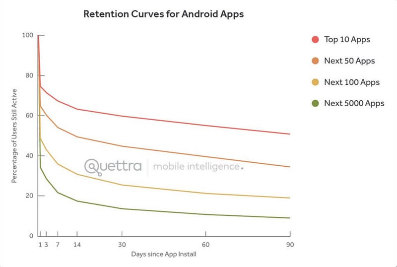