

Figma, the new age interface design platform, appears to be at the epicentre of collaborative design culture. The way its enhancing productivity and efficiency of designers is impeccable and I am realizing its potential over the past one year since I came onboard. While a lot of credit for a seamless performance is bestowed upon its various features, a lot of due credit must also go to the overall User Experience Design (UX) of the product as well. A few months back when I started using Sketch and Figma in parallel, I had shared a story – The Future of UX: Design & Collaborate with Figma, on the various features of Figma which promised to be disruptive in the world of Sketch’s dominance, ranging from Collaboration, Shortcuts, Components, etc.
While most of the product UX is laudable, here I am addressing a few UX elements that I have had an experience with, things that appreciably work well and on the hind sight, things that doesn’t work well in Figma.
• First up, things that work well!
Its feels nice to realize the attention Figma has given to the smallest and simplest of tasks, enhancing performance for intricate steps, concentrating on improving the experience of some of our daily activities and making it a better product, bit by bit. Here’s a list of some Pros of Figma I felt good about:
1. Entering a Hex Code
Entering a hex code for colour has never been as easy as it is in Figma, especially the neutral ones like White, Black, shades of Grey. In Adobe CC products like Photoshop, Illustrator, After Effects, for entering the HEX Code #FFFFFF (say), we have to type the full code. However, it uses some intelligence by adding zeros if one doesn’t want to type the entire code. For e.g., if the HEX Code is #0000FF, one can simply type FF in the code field and press Tab/Enter button on the keyboard to fill it with 0s, where 0s precede those characters. So, if the user is aware of the hex code which has preceding 0s, say #0000AA, #000333 #00AFAF, etc., the user only needs to type the non zero characters of the hex code. On the other hand Sketch provides no such intelligence as we always must enter the full hex code to get the colour.
But is this intelligence of much help? Personally, I didn’t really feel this functionality of great value yet, because its not intuitive enough as it demands complex calculations like separating only the preceding 0s from a hex code, and hence I often tend to type the entire code, or copy paste the code.
However, Figma proves much smarter and its intelligence for neutral colours is way more handy and intuitive. For e.g.,
For colour #FFFFFF, user only needs to type F and press Tab/Enter button to fill the desirable hex code.
For colour #1A1A1A, user only needs to type 1A and press Tab/Enter button to fill the desirable hex code.
For colour #AAEEFF, user only needs to type AEF and press Tab/Enter button to fill the desirable hex code.
Basically, Figma’s intelligence reads patterns in hex codes and populates it automatically thus saving the effort of typing in full hex codes.

This intelligence of Figma has proved much more valuable to me as entering colours like, #FFFFFF, #000000, #1A1A1A, #363636, #AAEEFF, #11BB44 etc. is very easy now and since this intelligence is specific to hex codes with patterns, its intuitive enough and easier to remember when to apply. Working with hex codes is really faster now. ✌️
2. Corner Radius Controls


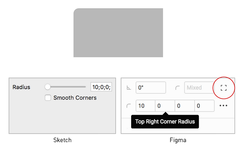
The independent corner radius control in Figma for rectangles is indeed well thought through, designed and implemented. I had used corner radius in Sketch and was very annoyed with the functionality. One has to activate corner controls to access the radius of that corner and then type in the radius field for changing other corner radii. However, in Figma, it has an Independent Corner control which allows the user to enter radius for each corner of a rectangle which actually is pretty fruitful while working.
Consider the below rectangle with Top Left corner radius as 10px. The image below shows how the controls appear in Sketch and Figma. In Sketch, entering 10px as the radius itself is cumbersome when one needs to double click on the rectangle to first control the corners, then click on the top left corner, enter the radius and then it appears as below for changing other corners. In Figma, simple click on the Independent Corners option and manually control all corner radii. Brilliant!
3. Object/Content Controls


A simple press of Enter button on your keyboard activates the vector controls of any shape or the content of a textbox. While, Figma concentrated on making things easier to control, it has also maintained familiarity principle in basic functions like double click on the object to control content, as usual.
This practice of maintaining familiarity can be also seen with the Eye-dropper tool which works with shortcut “I”, like most design tools, but also works with the Sketch shortcut “Control+C”, which is actually a poor UX, but addresses ease of use for users shifting from Sketch to Figma. Similarly, an ESC button to exit a text edit state works same as a Cmd/Ctrl+Enter option to exit edit state.
Working with vectors is extremely easy in Figma and apparently is the closest to Illustrator functionalities, considering its not a complete vector software. The overall platform is pretty efficient for keyboard shortcut users.
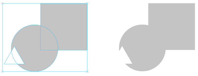
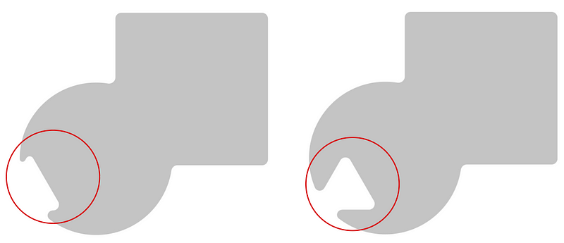
4. Deleting Vector Curves
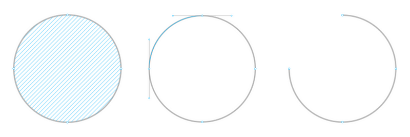
While vector controls in Figma is the closest any software has gone to Adobe Illustrator, in some aspects I felt it has outscored Illustrator as well. Let’s take the below example of a circle A where the aim is to delete the first quadrant curve to get a shape like image C.
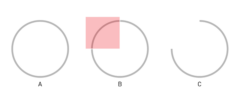
In Adobe Illustrator, its a pretty tedious task whereby the user needs to use the Add Anchor Point Tool (Shortcut +) to add a point on the curve, select it with Direct Selection Tool (Shortcut A), and delete (Del) it obtain image C.
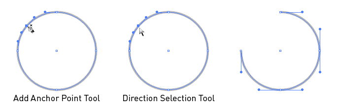
In Sketch, the approach is similar but the objective image C is not achievable.
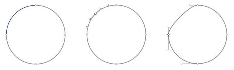
In Figma, deleting the first quadrant curve to get the desired shape (image C) is very convenient. Press Enter and simply click on the curve and delete (Del), that’s it. If you want to delete the fill or the stroke or any particular section of a shape, even that is possible by simply clicking on that area and press delete. It’s as simple as it could get.
5. Deleting Layer from Child Components
Component in Figma is a pretty powerful tool. One can simply make a component with multiple layers which acts as a parent, and you can simply change the text or colour or fill or stroke or opacity or visibility of these layers in the child components without impacting the parent instance. You can read more about Components in my previous story The Future of UX: Design & Collaborate with Figma.

At anytime users, quite naturally, tends to press Delete (Del) button to remove any unnecessary layer from the child instance. However, on pressing Delete (Del) button, that layer in the child instance automatically hides itself rather than completely deleting it. It felt like an example of great UX whereby the user’s need to delete any layer from the component is met by turning visibility off, but also keeping the instance layers intact for adding in future scenarios while keeping the parent unaffected. Pressing the Delete (Del) button visually removes the layer from the component by simply turning off its visibility. Excellent!

6. Boolean Groups
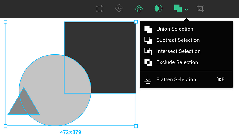
One amazing functionality of boolean groups is its ability to flatten (Cmd/Ctrl+E) multiple shapes into one vector and control it as a whole but still being able to control each shape separately. Simply selecting all the shapes and performing Flatten (Cmd+E) allows this functionality.
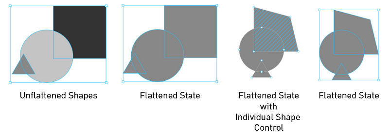
Another amazing functionality lies with the boolean controls Union, Subtract, Intersect, Exclude, which are quite common functionalities, but its integration with Flatten option works wonders. In Figma, once a boolean grouped layer (Union/Subtract/Intersect/Exclude) is flattened, the vector shape gets its own vector controls and not for each aggregating shape, like in Sketch.
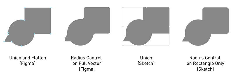
And finally the most amazing feature of boolean groups is the radius control in an unflattened boolean group. Controlling radius on the boolean group as a whole gives the shapes an organic and fluidic feel. It is a beautiful feature to have when it comes to designing vector icons.
Must admit, this is a masterpiece of design and engineering, producing an easy, seamless, delightful function. This is simply one of my favourite feature and moment of Delight through Design . Kudos Figma team!
• On the contrary, things that doesn’t work well!
Every great product has always had incremental growth and similarly with Figma, there are always things which can improve, things that must improve, things which somewhat neutralizes the wonders. Listing out a few Cons I have faced with the tool:
1. Assigning an Instance
While components open the door to a lot of great features, exploring components become an extremely hideous task in Figma. Like we all know, UI Design is an iterative method and designers naturally tend to create a lot of versions and similarly in one of my project draft I ended up creating a huge number of iterative components.
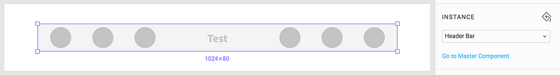
Consider the Header Bar in the image above, for which I had to assign a different component instance, titled v6-Header-Bar. Now I use the drop-down LOV in the right panel of Instance to explore the list of components as below.
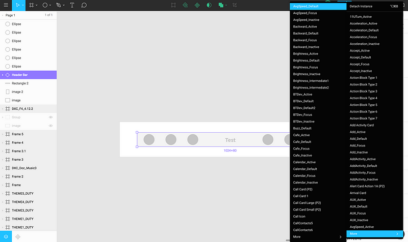
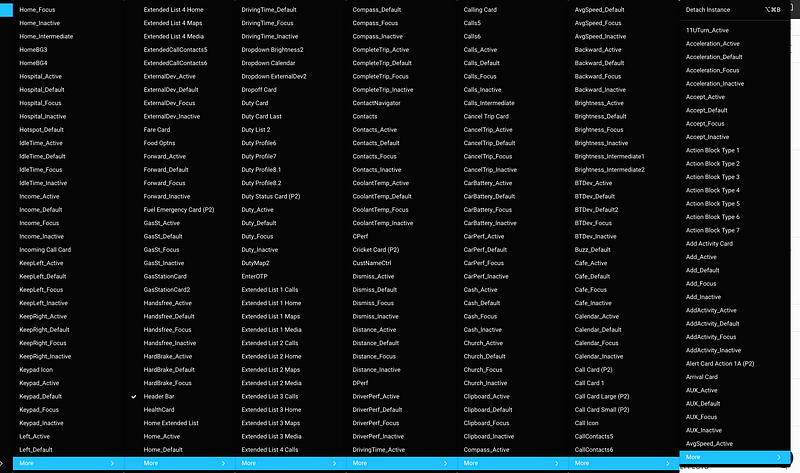
The components are arranged in alphabetic order and hence I go from More (Block 1) to More (Block 2) to More (Block 3) and so on to reach components starting with V (v6-Header-Bar). But, after 7 blocks of More, I have reached components starting with L and all corresponding components have amazingly gone outside my screen to the left as seen below.
Surely there must be a better way of doing this activity. For e.g., a quick elastic search approach in the instance title box can automatically filter out unwanted component names from the drop-down.
Another work around of handling an extensive number of components can be to have separate pages for every iterations like in Sketch where new component versions can go into new pages. However, Pages have since been introduced by Figma but that’s obviously not the purpose behind introduction of Pages. Meanwhile assigning a new instance to an existing instance from an exhaustive list is still cumbersome.
2. Rotation

Rotation has always been one annoying functionality on most vector tools. Though hovering on the corners allow the user to rotate the object easily in Figma (like in Sketch and most Adobe CC products), but defining a point of rotation is still mysterious in Figma. Personally I have often felt the need to rotate a shape around a certain vertex but never really succeeded in identifying a way to fix a point of rotation and evidently it always rotates around its center. Sketch provides a really nice Rotate tool for controlling the anchor point but I remember going through the pain of identifying the method for defining a point of rotation in Adobe Illustrator which is really not that easy and intuitive. I hope Figma eventually makes it easier.
3. Real & Dummy Data
Working with any real data is a major setback in Figma which brings me to the concept of Sketch’s third party plugins. Since the entire concept of plugins doesn’t exist in Figma, there’s often the need to fill in mockups with dummy data rather than lorem ipsum. Amidst all the pros of third party plugins, something like content generator is a huge necessity with Figma.
4. Mirroring
Figma provides a Mirror app which unlike Sketch is OS independent but lacks a certain great feature of Sketch Mirror. For using Figma Mirror, it is a necessity to stay connected to the internet, and select each frame you want to view in the mobile. However, with Sketch Mirror, it provides me a way to cache the art-boards and access the prototype, though only in an iOS device, but the prototype is available. Figma Mirror, as of date doesn’t support prototyping.
5. File Exports
Exporting files in multiple file types though hasn’t been a major necessity yet, but Figma provides very limited export file types like:
PNG, JPG, and SVG,
whereas, someone using Sketch can extract files in:
PNG, JPG, SVG, TIFF, WebP, PDF, and EPS as well,
which at times can prove fruitful. Moreover, I cannot open any Figma file in Sketch but the reverse is possible which further restricts me.
Exporting any file to external platforms like Zeplin also hasn’t been as smooth as expected. Files being on cloud apparently slows down the syncing process but often exporting to Zeplin times out, fails with some parse errors and feels very buggy. I have been trying very random work-arounds like detaching all components in the frame to be synced or deleting hidden layers from the frame and trying to upload and strangely, at times, I have succeeded and failed.
Source : uxplanet.org
Author : Arijit