
We talk about details a lot in design. It’s for good reason. Paying attention to even the smallest of details can make or break a design.
Today’s we’re going to dive deeper into one of those details and look at ways to design buttons that users want to click (or tap). Even though buttons might be one of the smallest elements in your design, they are one of the most important. How else would you communicate actions to a user? How else would they provide information in that feedback loop?
Think back for a moment to one of the big complaints about flat design in the early stages: Users did not know what was and what was not interactive in the design. Hence, the importance of great button design.
It Should Look Touchable
Users should see a button in the design and think they need to – um, want to – reach out and touch it. While almost any size button is clickable on a screen, the size and padding around a button on a touch device is vital.
The average user has a fingertip size that is between 8 and 10 millimeters across. With that in mind a target of 10 by 10 millimeters is a great starting target size for buttons on touch devices. (That’s slightly smaller than the standard keys on your keyboard.)
There are a few design things you can do to make an element look touchable as well.
- A subtle shadow can “lift” the element off the background to make it feel a little closer to the user.
- Increased padding around buttons makes them appear easier to click and helps guide the user to the element.
- Colored hover or toggle actions can show users what they are doing in real time and signify action.
Color Matters
Button color needs to be special throughout the website design. This is a good place to employ a particular accent color and use it only for button actions.
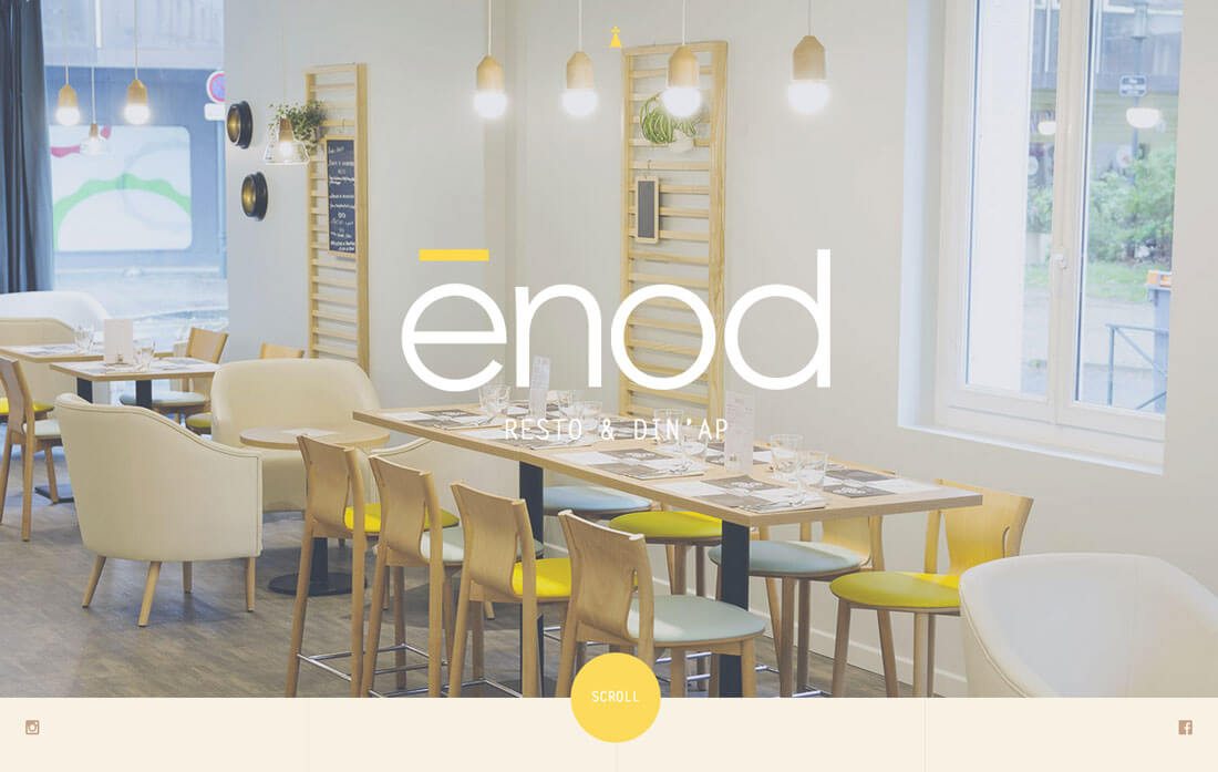
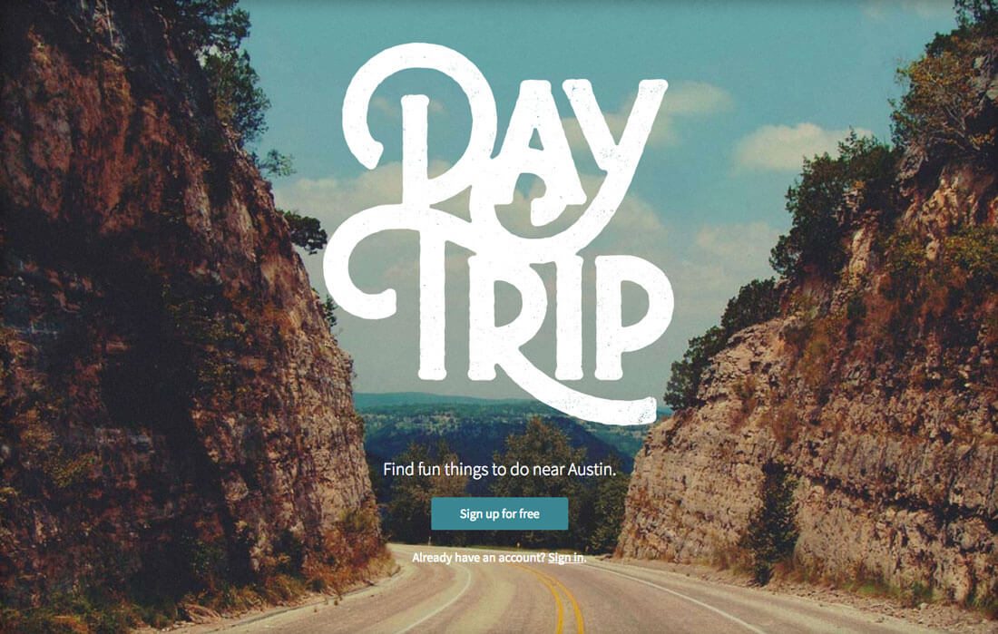
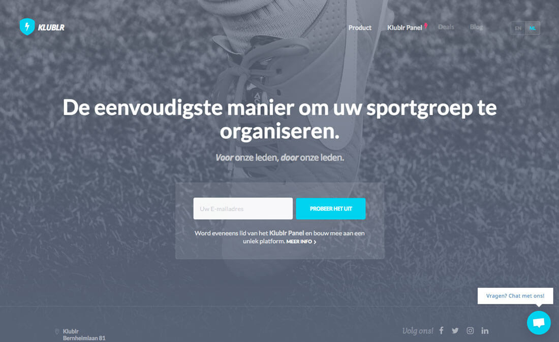
Button color should be bright and engaging. There’s a reason that so many designs include yellow, blue or green buttons. They are easy to see and stand out from the rest of the design. For a button that really stands out, select a color that is a complementary pair to the main color in the design (opposites on the color wheel).
The other color concern is brand. You want to select a button color that works with your color palette and brand identity. No matter how much you want a button color to stand out in the design, it should work with – not against – your primary color scheme.
Size Matters Even More
Make it big!
Buttons need some heft so that users are drawn immediately to them on the screen. The ghost button trend – outlines with no distinct button color – focused on large buttons in terms of pixel count but lacked visual weight. In terms of size, a button needs to be large in both regards. (This is one reason that trend has fallen out of fashion.)
There is a tricky spot though when a button goes from being perfectly sized to embarrassingly oversized. Exactly when this happens depends on the scale of other design elements, but you will know for sure when it happens. If the button is all you see in the design, chances are that it is too big.
Placement is Key
Where in the design should the button go? Is there a location that will help generate clicks more than others?
In most cases, buttons should follow the content they are designed to complement.
- At the end of a form
- To the right of a call to action message
- At the bottom of the page or screen
- Centered beneath a message
Why these placements? Because it follows the natural path of action and the way users read and interact with websites.
Focus on Contrast

With all design elements, contrast is an important consideration. This is true of the techniques used within the element itself but also the relationship between the element and its placement in the design and those surroundings.
Remember to think about the following techniques in this dual environment:
- Color
- Type weight and size
- Size of elements
- Shape as it relates to the background
- Transparency or animation
- Shadows or graidents
- Whitespace and padding
Use Standard Shapes
When it comes to buttons there are only two shapes you should consider:
- Circles. The circular button has become popular thanks to Material Design and Material Lite concepts. With any similar aesthetic, a round button works with the design and fits the user pattern.
- Rectangles. This default shape should be your go-to for all buttons unless you are using a circle in the instance above. It is what users know and are used to. Most button rectangles tend to be at least twice as wide as tall (sometimes three or four times as wide). Users see this shape and immediately know what to do. While some may argue the merits of rounded corners versus 90-degree angles, either is equally appropriate based on your design style.
Tell Users What To Do
Every button should include a text instruction that tells users exactly what to the button will do. You want to keep the language short and simple and it should match the tone of the rest of the website design.
Then, deliver on that promise. The next thing that pops up should tell the user they have arrived at the expected destination. Whether it is submitting a form, making a purchase or just moving on to another link, the user should get the desired result from interacting with the button. (If not, make sure there is an error indicated in the feedback loop for you so you know what corrections need to happen in the website design.)
Examples of button messaging include:
- Click here
- Create an account now
- Try it for free
- Add to cart
- Read more
Give Buttons High Visual Importance
Most designs are filled with small UI elements. One trap that happens is the design for these elements gets pushed until the project is near completion. And then you pick one design for all the UI elements, with a few small differences.
Don’t get stuck in this dangerous situation.
In the design, buttons should look like only buttons! Nothing else in the design should have the same shape, color and visual weight as a button. They need to be different. Think about creating a style for buttons that’s larger than any other similar element in the design, or use an accent color that’s only for buttons. These techniques can help make a button look special and emphasize its usage.
Conclusion
Are you starting to rethink some of your button design choices? Do you think you can create something that will better encourage clicks?
Try some of these tips while keeping an eye on your website analytics to see precisely what design changes your user base responds to. Use that information to help you create even more clickable buttons for future projects.
Source: Design Shack
Author: Carrie Cousins