
This is not your typical roundup of textures to use for website backgrounds. If you are looking for a specific texture, we have those here. But what if you want to create your own? Or find a way to customize a texture to fit your project? That’s what we’ll focus on today.
While there are many ways to use textures in web design, you’ll get a lot more mileage out of those backgrounds if you take a modern approach, and follow a few simple rules. Here are seven tips to help you use background textures in web design well (and in-line with 2018 design patterns and trends).
1. Go Simple and Understated
A great background texture might not even get noticed by many users. It should be a nearly invisible element that contributes to overall readability and usability while providing depth or visual interest.
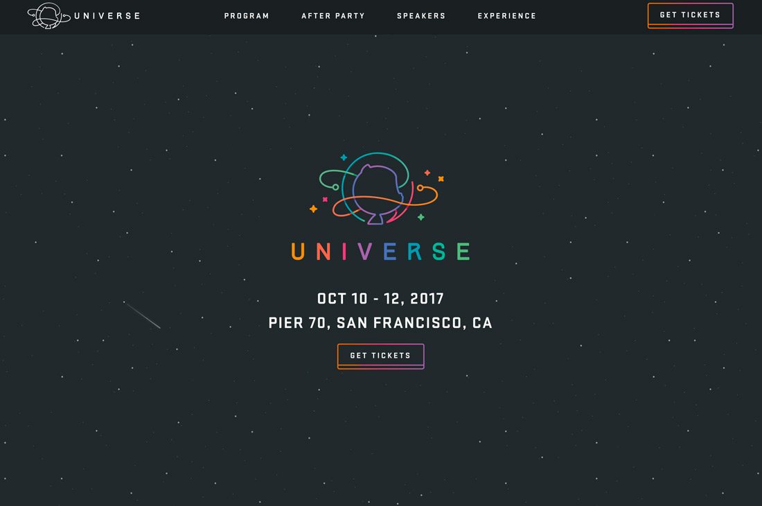
Simple and understated background textures are the perfect way to do this. For an event late last year, Github’s Universe Conference used a design that included a simple black background with white dots. The night-sky effect really does fall into the background so that the fun gradient logotype and event information are easy to find.
Simple background textures tend to have small or tight repeating patterns and can be almost any color. The idea is that these background textures aren’t a focal point; they serve to help bring attention to the rest of the design.
2. Go Big and Bold

Maybe subtle isn’t your thing. If that’s the case, opt for a big and bold background texture or pattern.
These larger-than-life styles work for designs where the foreground is more text- or user interface element-heavy, and there aren’t other competing images to deal with. Using this type of background texture can get tricky, from creating a tiling pattern that invisible to the user to keeping the background from inadvertently becoming the main focal point of the entire design.
To ensure that your oversized background texture is working, keep an eye on analytics and user habits once to make the change. A sharp decrease in traffic or conversions is a sign that you visuals and users might not be connecting.
3. Incorporate a Trend

A background texture with a trend can make your design feel super-modern and fresh.
With geometric shapes as all the rage right now, it’s no wonder that Apacio’s website is appealing. With a mix of bright colored geometry on a dark background, the pattern creates a nice texture and depth that helps the user focus on the large text and call to action because these elements contrast with the background. The text – simple sans serif lettering – seems to lift right off the green shapes.
The layering of textures contributes to this overall effect as well. Note that color separates two layers of backgrounds with darker elements “behind” brighter elements.
4. Use an Image

A background texture doesn’t have to be a repeating pattern that you pull from a download site. Some of the best background textures are images that relate to the brand or main messaging to add another level of visual interest and engagement.
The trick is to fade the image into the background effectively. (And that doesn’t necessarily mean to use a fade technique.) Fading the image means that it drops out of the main image area and into the distance.
In the example above, Oxeva does this in two ways: It darkens the photo so that only outlines are visible of the cityscape, and it uses a bold color treatment in the foreground to draw the eye naturally. The photo also has somewhat of a blur to it, so that the image is discernable, but not with a level of detail that makes fine points of the photo important.
5. Use Color Variations

Mix and match tints and tones from the same color palette to create a bold texture from lettering or shapes. Color variations, even those in the same family, can create depth and visual interest.
Types of Type uses a fun combination of colors with giant letters to create the background texture. Even without techniques such as gradients or shadows, the lines from letterforms establish depth and balance while helping to draw the eye to where the colors in the background meet and the main headline is located.
6. Grab a Gradient

Gradients are trendy and visually engaging. When it comes to using a gradient as a background texture, you can use it alone or layer it with a photo.
Almost any color combination goes, so using a gradient to create texture and depth isn’t difficult. You can find a gradient combination you love from WebGradients if you don’t already have swatches in mind to work with. https://webgradients.com/
Mobipad uses multiple, subtle gradients to create depth and texture in the background. Illustrated animations in the foreground almost pop off the gradients, and the dark-colored call to action is easy to see. Lighter and darker spaces in the gradient texture help move the user move through the design at a glance.
7. Animate It
While many of the tips have focused on static background elements, there’s no rule that says a background can’t be dynamic.
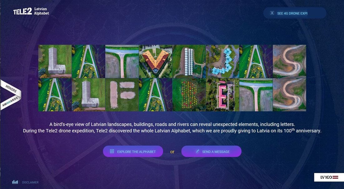
To make the most of this type of background texture, the movement should be subtle so that it doesn’t detract from the main image or messaging. Including a muted or subtle color palette, such as Latvian Alphabet, above, is a great option as well.
This animation can include elements that move or twist or turn or video. Motion is a good way to grab the attention of users. Make the most of an animated background texture by ensuring that this motion doesn’t overwhelm the foreground of the design.
Conclusion
A great background texture can add depth and visual interest to your overall website design. While many designers are still using more flat backgrounds – such as single color – adding a hint of texture can make your project stand out.
The trick to using textures is that they have to be subtle and actually fall into the background so that foreground elements are easy to read and understand. That can be a pretty delicate balance. Remember to establish plenty of contrast between background textures and foreground images, user interface elements and text to maximize the impact of the overall design.
Source : DesignShack