
one of the most telling characteristics of data visualization is that you don’t know in advance what the resulting data visualization will be.
You may have an idea, or a dataset, or maybe even a dataset that has been analyzed and the insights in the data are known. But still, once you start making a data visualization, only then you will learn if your initial idea will work, what the shape of the data actually looks like, or if there is enough potential to create that animation you had in mind.
It is, therefore, very important to listen to the data, and look for the characteristics that the data tells you.
Hi, my name is Jan Willem Tulp, and I call myself a “data experience designer”. I’m an independent data visualization designer for my company TULP interactive, based in the Netherlands.
I create custom data visualizations, and for me that means that I write my own code to visualize a certain dataset. I have the honor to work for clients such as Nature, Scientific American, Google, Unicef, and more. I’d like to talk a little about how data drives a visualization, and how that influences the process of creating a data visualization.
Here are five important data visualization tips.
1. What, Why and How
First, there are always three major components to any visualization: the What, the Why and the How.
The What is the data, what are you visualizing. The Why is the questions you’re answering with your visualization, the story you’re telling. And the How is the mapping of data to visual elements and, optionally, the interaction of your visualization.
All of these three components determine the potential of your visualization. For instance, with a rich dataset, or a unique dataset, your visualization will probably be more interesting than a poor quality dataset or a very common dataset.
Similarly, if you can come up with an interesting story to tell, or a burning question everybody has, then your visualization will probably be more interesting than visualizing a very common question.
And finally, if you can create a sophisticated, beautiful design, or engaging interactions, your visualization will probably be more attractive than a poorly designed visualization.
So, these three components–the What, the Why and the How–are the foundation of every visualization. And if you are thinking of ways to make your visualization better, these are the three components to play with:
- Enrich your data to make it more interesting.
- Come up with better questions to visualize.
- Apply good design principles to make it look stunning.
At the same time, data visualization has something unique compared to “traditional” graphic design. There is one important constraint that drives your entire process: the data. You are answering questions and presenting insights–for this particular dataset. And, you are visually representing: this particular dataset.
You cannot just make something up to make it look better. No, the data drives your visualization.
2. Listen To The Data
It is crucial to listen to what the data has to say. This means that you need to get a sense of a dataset, and there are two ways to do that in particular: performing a data analysis.
Doing statistics, trying to find some correlations, getting a sense of missing values, of ranges of the data, etc. And the other way is to make visual prototypes.
Because, even if you have some sense of your dataset, statistically, it might still not work visually. Maybe you have too many overlapping circles for the idea you had in your mind. Maybe there is not enough data after all to show the pattern you thought you would see. Maybe it looks too complex for your intended users.
Therefore, the process of designing a data visualization is a very iterative and explorative process: every time you look at your results critically, evaluate what works and what doesn’t work, and then you improve it.
3. Constantly Improve Your Design
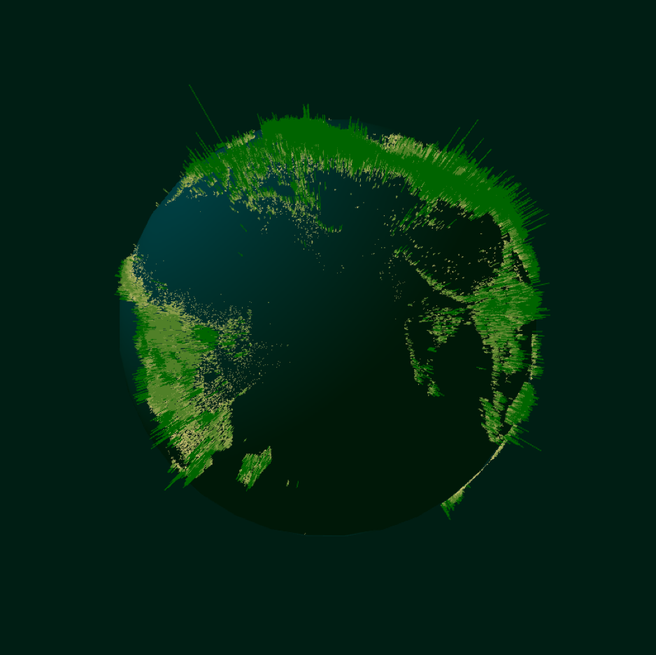
To illustrate all this data visualization tip, I’d like to show an older project of mine, called Three Trillion Trees, that Idesigned for Nature magazine. A still image of the visualization animation ended up on the cover of the print magazine, and parts of the visualization were used in a two-page spread in the magazine. The main visualization was a narrated animation.
Researchers have been able to make a more accurate estimate of the total number of trees in the world. They did this partly based on satellite images, but also partly by having people all over the world actually count trees.

The aim of the visualization was to show where the trees are, and the densities of trees at these locations. My initial thought was to show a transparent globe and then dots for each location where there are trees, and based on the density of the trees these dots would move out from the invisible surface of the globe.
As you can see in this image, that did not work at all: the shape of the globe is kind of lost, and overall it’s very hard to understand what you’re looking at. So, this is a good example of having an idea in your mind, trying it out, and then it doesn’t work well.
You have to look at your design critically: what can be improved?
 4. Pick Colors Deliberately
Another challenge was getting the colors right. This is quite often a very difficult thing to get right. In data visualization, colors have some kind of meaning, either to:
- represent some quantitative value, or
- represent some kind of identity (a country for instance).
And when you start using more colors, or transparencies, then you end up with many variations or combinations of colors, and if you still want to communicate information, then you have to play around with colors until it works properly and you still see the insights you want to communicate.
For instance, you want to make sure that you have enough contrast between your colors. Colors that look the same too much are harder to distinguish. When using transparencies, you have to check if the colors are still clear if shapes are overlapping.
Sometimes you have to take color blindness into account, and so your visualization should basically work in black and white as well. Red and green should therefore often be avoided, even though red often means bad and green means good. Red and blue is a better alternative.
Colors can also have a cultural meaning: red in the western world has a different meaning than read in the eastern world.
You also have to make sure that it’s all looking aesthetically pleasing, colors should not scream at you. And many times, color is one of the channels you want to use to make something stand out or draw the user’s attention to. This does require that the color you use for making something stand out really does stand out enough, and in all possible situations.
And what if you have too many items that you want to make identifiable? Can you still use color? These are just some of the things you need to consider, so there is a lot to take into account when deciding on which colors to use.
Here you can see that the colors are not right for example. What I was aiming for, what I had in mind, was a kind of appearance you see when you looking at a photo of a jungle and seeing all the treetops.

This obviously didn’t have that appearance. And it was pretty hard to get this right.
What I eventually ended up doing was giving each line a gradient that started with the blueish color of the globe and ended with a green color. Because of the difference in height of the lines, the appearance suggests a kind of tree top coverage.
5. Balance Effectiveness, Aesthetics and Originality
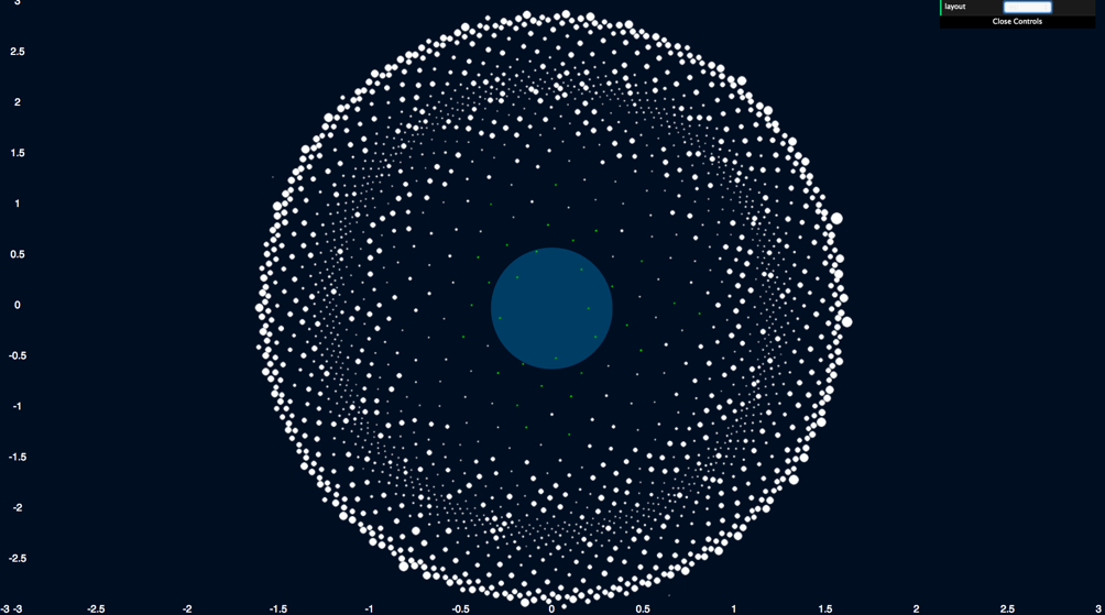
Another project that nicely illustrates the search for a good representation of a dataset, and listening to the data and how that can be nicely represented is Goldilocks.
This is project that visualizes that exoplanets (planets outside of our own solar system) that were known at that time. The visualization was created for the space themed opening night of the Visualized conference in NY, USA.
There were already several exoplanet visualizations, including one from myself for Scientific American magazine. So, my intention was to come up with a different angle.
For this particular visualization, I focused on the Habitable Zone, an area around a star that is considered to be an area where there is possible potential for life. There are other criteria which would mark an exoplanet to be potentially habitable, and this visualization explores some of them.
One of the images is about the Earth Similarity Index, and index that ranges from 0 to 1, with 1 being exactly like Earth, and 0 being not Earth-like at all.
Now, this subset of the data is actually really simple: just an ordered list of exoplanets. The order is based on the Earth Similarity Score, and this particular view was all about showing this index in an interesting way.
There are, of course, multiple ways to show a ranked list, and one of the ways you can do that is just put them all on a circle and have the radius determined by the Earth Similarity Index. You end up with a kind of spiral like image like this.

But although it does communicate exactly what it should, at the same time, it is also a bit of a boring image. When you have a specific audience in mind for your visualization–for instance, a group of experts who may use your visualization on a regular basis–then you have a different objective in mind than when you create something for the general public.
The general public, rather, wants to be informed and entertained by your visualization. And in the case of “Goldilocks,” the general public was the target audience, and therefore I wanted the visualization to show something more visually compelling than just being as effective as possible.
Amongst several other ways to represent this, I eventually ended up with the image below:
What’s happening here is that the distance from the center (which is where Earth Similarity has a score of one is still based on the Earth Similarity Index, but the radial position is not just a sorted list laid out on a circle. It is a layout based on the Golden Ratio. You can see this exact same pattern in nature everywhere, for instance the way the seeds of a solar flower are positioned.
The end result is a pleasing image of a rather simple subset of the data. And the reason why I think so is that there is a nice balance between large and small dots. It has some kind of organic look to it, and at the same time also shows some structure.
Circular shapes are often considered aesthetic and it also turned out a surprisingly unusual representation of that data that reveals some different patterns than the well known one, according to astronomers to whom I’ve shown this.
Consider These Data Visualization Tips Every Time You Design
When it comes to data visualization, take these data visualization tips into account. Understand that there are many ways that you can have influence on the result, either by working on the What (the data) the Why, (the questions and the stories) or on the How (the way you visually represent data and interact with it).
Ultimately, a visualization is always driven by data. So listen to what the data has to say, what it’s characteristics are, and try to find a good visual representation for it.
Be critical of your own data visualizations and continuously improve on them.
Source: Venngage
Author: Jan Willem Tulp