
Designing a good user onboarding is all about activation and retention of users. Check out these 12 tips and wow your users from the get-go!
All users need a little guidance when they first come to use your product — its only natural that you take them by the hand around the key parts of your design. Right? Yes, but a good user onboarding flow is much more than a simple tour of the product.
You need to illustrate why the product is a good thing for the user, how they can make the most of it and help them get the ball rolling. You want to leave users feeling like they have known your product for a while, and they they can start building up a habit of using your design in their everyday lives. No easy task, eh? But don’t worry!
We got these 12 best practices that will work as a framework for the next time you find yourself designing a user onboarding experience. Read on to find out more.
What is user onboarding experience and why does it matter?
User onboarding experience is the initial phase when a new user downloads your product and is using it for the first time. Usually most products will have some sort of walkthrough the key features of showing off the main advantages that the product can bring to the user.
The reason why a user onboarding flow is crucial to any product is that users will download a lot of things onto their devices — but most of those things are removed within a few days by a bored and unconvinced user.
Most designers will be surprised to see how quickly products lose users after the first use. Andrew Chen and Quettra carried out a study on Google Play Store that came up with this terrifying graph on user retention:
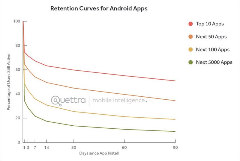
It’s only normal for many of the new users that a discovering your product to abandon its use if it’s not their cup of tea. In fact, the study found that on average, apps will lose 77% of new users within the first 3 days! Within 30 days, that number jumps to 90%. But how can we explain that difference in user retention from the top 10 apps when compared to the rest? After all, the top 10 apps lose only about 50% of new users over 90 days.
According to Chen, that difference comes from both the general quality of the UX design of the product, and the effectiveness of their user onboarding flow. This only works to illustrate that users will allow new apps a brief period of grace in which the product must impress the user, or risk losing that user to the competition.
Tips on designing a great user onboarding experience
By now, you’ve probably realized that an effective user onboarding experience is more than just showing the user the ropes or laying down the key benefits of the product. For you to keep those users, you need to captivate users from the first use. It needs to bring the user and product closer. It’s about introducing the product, activating the user and retaining that user until the product is a part of their life.
Find balance between benefits and how-to
People acquire your product for a reason. And even though it’s easy to fall into the trap of thinking that users want the upsides your product brings to the table — that is not accurate. In fact, users want a solution to a problem. They want a better version of themselves that your product can make come true.
The way to make good on those promises you made when users first got your product is to make sure you highlight the benefits your product has and how it will affect the user. This approach works well to make the user see how those benefits can bring the desired solution to fruition. But there’s a catch. Building up expectations of your product can be a good thing — but it does nothing to help users understand how to operate your product.
The user onboarding flow isn’t just an opportunity to build on your marketing. This is when you should also guide the user around the key points of the product and give them a quick class on how they can actually use those benefits you promised before.
If you don’t address the educational side of user onboarding, you risk leaving users disappointed at their inability to make use of those benefits. On the other hand, focusing exclusively on the walkthrough the product, you may leave users wondering why they downloaded the product to begin with — and why they need to process so much new information for the sake of this product. Since there is no supreme recipe for finding the right balance between the two, you will need to adjust the onboarding to the market — which brings us to the next tip.
Know your user
Saying that not all users are the same is understatement. But even though you’ll have quite a variety of people downloading your product, it’s possible to find a broad definition of who those people are, and that is valuable information when designing the user onboarding experience.
You’ll want to focus on a key matter: how tech-savvy are your users? Are you making a product for people who don’t necessarily know tech terminology, such as “delete data” or “reload the page”? This is particularly true for audiences that don’t include millennials — the people who want to enjoy your product but may not know too much about how any software works. Those users will need a user onboarding experience that doesn’t include fancy tech words, and carefully shows them around the crucial actions they can perform with the product in a simple and intuitive way.
Other audiences are mainly composed of young people who are considered tech natives. They are always closely familiar with their phones and computers and don’t need to you show them how to load files onto any platform, not do they need you to show them what the notifications icon means.
Here is how you can reflect the type of user on your user onboarding flow: take the time to include the workings of the phone or the website for users who don’t know much about technology. Include simple things such as the meaning of icons, stay away from jargon of any kind and open the window for the user to seek more information should they desire. For tech-savvy users, focus only on your product and how its features can be found and used.
Be consistent in the user onboarding experience
We’ve talked about how important it is to be consistent in your UX design before, and we cannot stress it enough. Just like your icons need to be consistent across the entire design, your user onboarding flow should follow the same tone and visual design as the rest of your product.
Think of things such as branding and brand identity. You want users to get introduced to the personality of the product straight away. Think of it like this: users are meeting your product for the first time, and just like when we meet new people we create a judgment of that person, so will users have an opinion of the product after that first use.
You need to make sure that opinion is favourable and that it really speaks to the identity of the brand and of the product. This includes thinking of the language and tone you use in the copy of the onboarding flow, the use of visual components that suit the branding and creating an overall first experience that represents the whole product in a nutshell.
Some products such as Evernote make good on this guideline by the use of custom illustrations that represent both instructions with new information and the brand identity of the young and practicality-focused brand. That’s visual storytelling that works for user onboarding!
We included Evernote in our post with the top 10 examples of user onboarding done right — we recommend you take a look! See some great examples and why they work.
Be predictable!
Being consistent in your design will help make your product’s navigation be more predictable, but that’s just part of it. Aside from having a coherent design so you ensure good discoverability and learnability, you want to keep the user informed of where they are and how many more steps there are ahead of them in the onboarding flow.
When users come to to a brand new product, they look forward to playing around the features and not to have a long class on how it works for hours. And what’s worse: when we are excited about a final goal, anything that comes before that goal can feel like hours. You want to give users a clear picture of the onboarding experience they are about to get on.
Consider having indicators of long they have to go, such as progress bars or navigations icons with the remaining steps until the users are good to go. This will work to keep users from feeling restless, and have them know just how close they are to the light at the end of the tunnel.
Put users in the driver’s seat
Consider giving users control over the user onboarding flow. This may sound slightly strange, considering that users won’t know the product at all — so how can they make a decision regarding the onboarding experience? How can they decide what will and won’t help them in using the product?
That’s a fair point. But here is another point that is equally fair: not everyone has the desire, inclination or the time to endure the whole onboarding process. Sometimes, people prefer to take their time in messing around with the product and exploring it by themselves. And when users want something within your product, forcing them to do something else can lead to a feeling of frustration and eventual abandonment of the product.
Instead of going against the tide, give the user the option to skip a few steps in the onboarding or at least give them control over what gets shown.
Here at Justinmind, we do that by giving new users the choice to experience the onboarding in two modes: beginner or expert mode. While the expert mode lets the user dive into the full array of features and palettes, the beginner mode will guide users around the key features in an interactive way, and link users with support or Youtube tutorials.
Don’t overload users
Learning to use anything for the first time can be demanding — even riding a bike for the first time can be stressful. Your users are already dealing with something that’s unfamiliar to them, which by itself requires quite the cognitive effort on the user’s part.
That’s the main reason why your user onboarding experience needs to be very selective of what it shows the user. If you can, limit your flow to 5–6 screens or popups and make sure each screen has only one key message. After all, can you recall ever reading the 50-page manual that came with your washing machine? Ain’t nobody got time for that! Intead, go straight to the point and don’t make the user sit through 50 screens of information.
This can be quite tricky, especially if your product has a few extensive and complex features. If this is the case, consider breaking up your onboarding into phases. That would mean that users get the initial onboarding UX, and will come into a second onboarding experience as they grow familiar with the use of the product — allowing them to venture deeper into the complex features.
Follow up: send more information
If need be, of course. As we saw from the quick user onboarding flow of WhatsApp, not all onboarding flows have so much information that you would need to account for emails or notifications that can deliver further information to the user. But if your product does have some complexity to it, you may want to consider giving users a way to get better informed.
You can design a complementary side of the user onboarding by offering follow-up emails. These emails can be either a gentle reminder if the user didn’t get to finish the onboarding UX, or contain more helpful information.
Youtube tutorials are a great way to illustrate how to use the product, and are a great way to offer in-depth information while not overloading the initial onboarding flow with too much detail. Similarly, you can choose to send emails with short and visual guides on smaller features that didn’t quite make the cut of the onboarding flow.
There is something to be said about trying to bring users that haven’t finished the onboarding flow back with emails: don’t overflow user’s inbox with reminders. If after two reminder emails the users hasn’t come back, they most likely won’t. It’s important to know boundaries when it comes to sending users emails — when was the last time you felt good about receiving 20 messages in 2 days from the same app?
Ask to send push notifications — at the right time
Sending push notifications to users can be a great way to get users to finish the onboarding flow, as you can send them reminders if they don’t. But the risky thing about asking user’s permission to send notifications is that the timing of your request for that authorization is going to have a direct impact on how many users agree and how many decline.
If you ask for permission to send push notifications too early, the vast majority of users will automatically say no. After all, they only just started using your product and giving that sort of permission can feel like giving a stranger access to your personal information… which is enough to make most users decline your request.
You need to wait until the user has a clear picture of why the product brings them certain advantages and how the product will help the user be a better version of themselves. Give them space to grow familiar with the product before they give you permission to send them notifications — the same can be said about requests regarding access to pictures or data.
Logically, this can be tough if your product needs the use of notifications to operate correctly as is the case with messenger apps. Sometimes, there’s no running away or postponing the request to send notifications.
Test, test and test!
No one can expect to get it right the first time. As you know by now, designing a good user onboarding flow comes with many variables which the designer has to consider — all of which have some impact on the final onboarding flow. It’s normal and even recommended that you have several versions of the flow and that you test all of them.
Narrowing down what is truly crucial and needs to be a part of the onboarding flow is difficult, and finding a way to convey that information is even more challenging.
User testing is a time to learn from your users. You want to pay attention to people’s reaction to every step of the onboarding — are they bored? Do they feel confused at any moment? You also want to take notice of how users apply what they learned from onboarding to their first use of the product. Did they get lost even though they were shown the way in the onboarding?
Each little issue you notice should work as a building block for a better and updated onboarding UX in the final product.
Celebrate user’s achievements
Learning how a new thing works can be tough. Just like employees like getting recognized for their hard work, so do users enjoy recognition of their achievements. Small things like successfully uploading a picture, writing a post or sending a message are achievements your user has accomplished in unmapped territory (for them, at least).
Mailchimp understands the need for recognition. Once users have sent their first email using the platform, you get a screen that celebrates that fact. The illustration is on branding, has a funny side to it and works to encourage the user to use the product.
The wrap up
User onboarding experience is a crucial side of your product. It needs to both introduce the user to the product, give the highlights on how people can use the product and leave the user feeling both familiar and invested in its use.
Sounds pretty complicated, eh? But with some planning and the right mental framework, you can design an onboarding flow that will have both impact and meaning. Your overall UX will require something that adds value to the product in the eyes of the user — and the onboarding flow is a building block for great UX.
Time to get to work and get designing!
Source: uxplanet.org